

eslite BOOKSTORE “TIMES Vol.09”
誠品松菸書店 時光O9期
PLAY MIND GAMES
Surprise Lab.
Surprise Lab.
驚喜心機!
對你越好的事,我越願意去做。
對你越好的事,我越願意去做。
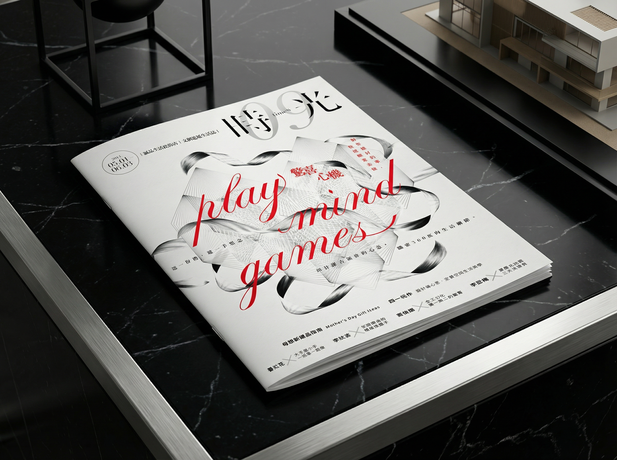
This concept begins from the premise that “surprise = an engineerable emotional cadence.”
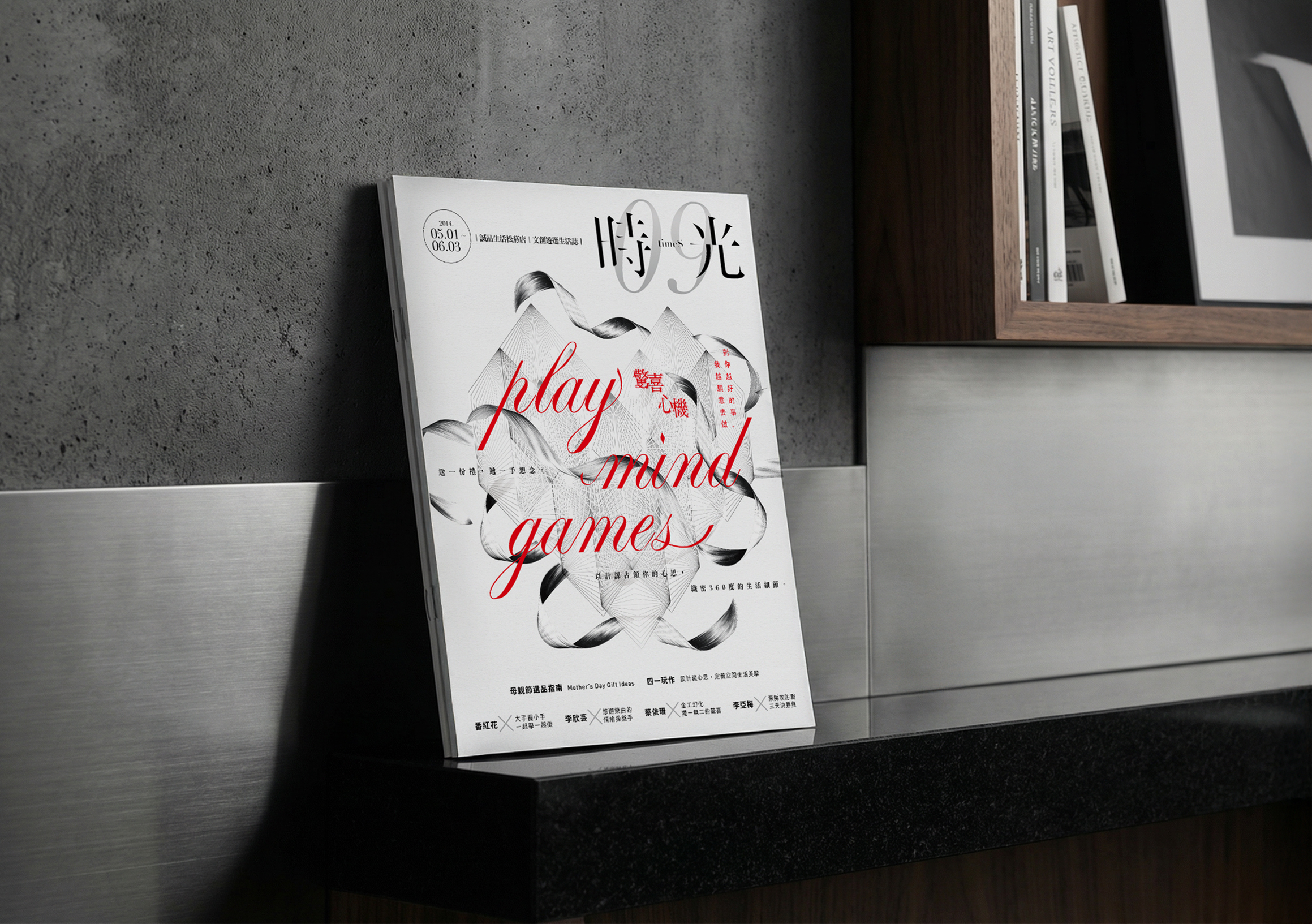
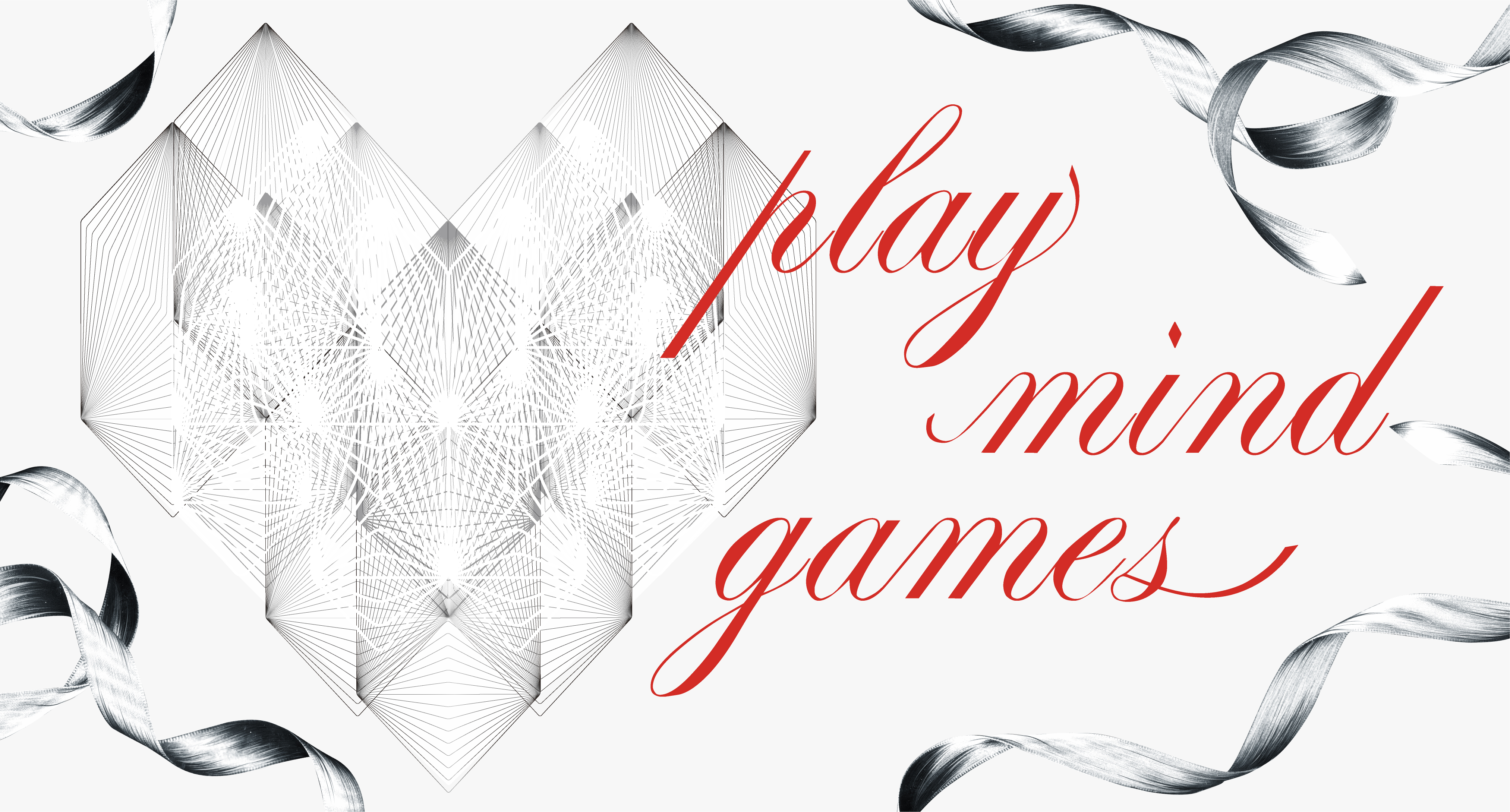
The ribbon is chosen as the core vocabulary because it simultaneously embodies three functions: wrapping (temporarily folding information), guiding (directing the path), and release (the moment of untying).
The heart shape is not a flat fill, but an interwoven construction of precisely structured ribbon-like paths—symbolizing emotions being layered, packed, and only released just before the peak of anticipatory tension. The typography extends the ribbon’s sensorial qualities—color presence, fluidity, and nuanced thick–thin transitions at turning points—paired with a rational auxiliary typeface to establish structural contrast.
The overall strategy: visually offer a psychological cue of “not fully opened yet,” while in content rhythm progressively delivering secondary messages—designing multiple, low‑intensity yet high‑memorability micro‑surprises that accumulate into a perception of brand precision and trust.
本概念從「驚喜=可被工程化的情緒節奏」這一前提出發。
緞帶被選為核心語彙,因為它同時體現三種功能:包覆(暫時折疊資訊)、引導(指引路徑)、釋放(解開瞬間)。
心形並非平面填色,而是一種由精準結構的帶狀路徑交織構成的建築,象徵情感被層層堆疊、打包,並僅在預期張力達峰前釋出。字體系統延伸緞帶的感官特質—色彩存在感、流動性、轉折處細緻的粗細過渡,並搭配理性輔助字體建立結構對比。
整體策略:在視覺上提供一個「還沒完全打開」的心理暗示;同時在內容節奏上逐步遞送次級訊息,設計多個低強度卻高記憶度的微驚喜,累積成對品牌精密與可信的感知。
緞帶被選為核心語彙,因為它同時體現三種功能:包覆(暫時折疊資訊)、引導(指引路徑)、釋放(解開瞬間)。
心形並非平面填色,而是一種由精準結構的帶狀路徑交織構成的建築,象徵情感被層層堆疊、打包,並僅在預期張力達峰前釋出。字體系統延伸緞帶的感官特質—色彩存在感、流動性、轉折處細緻的粗細過渡,並搭配理性輔助字體建立結構對比。
整體策略:在視覺上提供一個「還沒完全打開」的心理暗示;同時在內容節奏上逐步遞送次級訊息,設計多個低強度卻高記憶度的微驚喜,累積成對品牌精密與可信的感知。
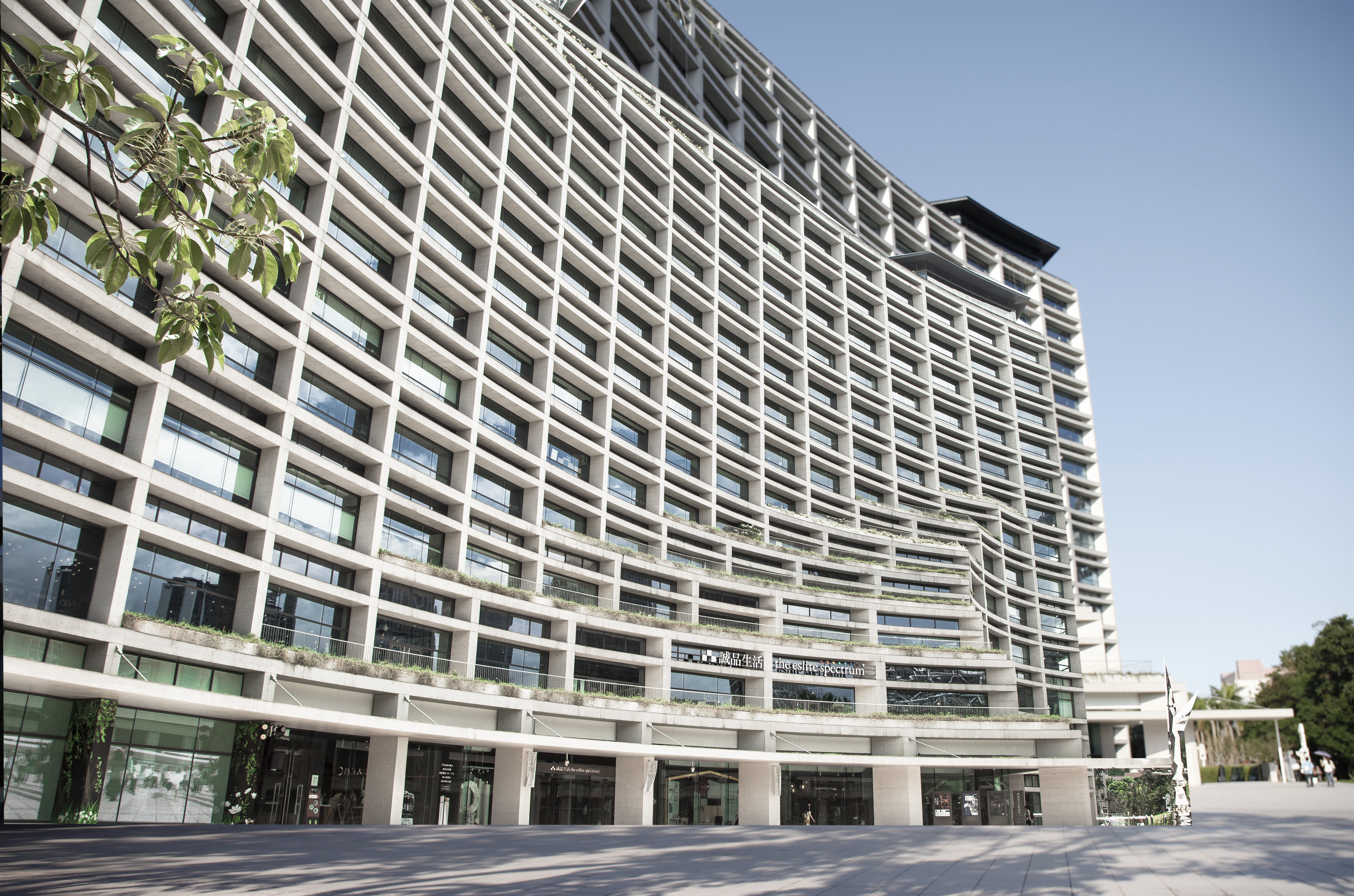
eslite Songyan: Discovering Delight in Everyday Gestures
From books and design objects to cultural events, eslite Songyan brings together discoveries that invite people to look more closely at everyday life. A thoughtful selection or an unexpected encounter can give an ordinary moment personal meaning.
eslite TIMES Vol.09 explores surprise as an expression of care. Its theme brings attention to the thought behind a gesture and the anticipation of discovering something prepared for another person. LIUJIAYUN’s publication and campaign design uses ribbon forms, intertwined hearts and expressive lettering to give this idea a tangible visual character, connecting cultural and lifestyle content through warmth, curiosity and play.
International Recognition: eslite was named Asia's Best Bookstore by TIME Magazine and recognized by CNN as one of the World's Coolest Bookstores.
誠品松菸|在日常裡發現驚喜與心意
從書籍、設計選物到藝文活動,誠品松菸匯集不同形式的生活發現,邀請人們細看日常。一份用心的選擇、一次意料之外的相遇,都能讓平凡時刻擁有屬於自己的意義。
《時光》09 期「驚喜心機」從關心與付出的角度,探索驚喜背後的心意,以及為另一個人準備事物時的期待。LIUJIAYUN 以緞帶、交織心形與富有表情的字體,將這份情感轉化為具體的刊物及檔期視覺,讓文化與生活內容在溫暖、好奇與趣味之間展開。
國際肯定: 曾獲《時代雜誌》評選為「亞洲最佳書店」,並被 CNN 評為「全球最酷書店」之一。
從書籍、設計選物到藝文活動,誠品松菸匯集不同形式的生活發現,邀請人們細看日常。一份用心的選擇、一次意料之外的相遇,都能讓平凡時刻擁有屬於自己的意義。
《時光》09 期「驚喜心機」從關心與付出的角度,探索驚喜背後的心意,以及為另一個人準備事物時的期待。LIUJIAYUN 以緞帶、交織心形與富有表情的字體,將這份情感轉化為具體的刊物及檔期視覺,讓文化與生活內容在溫暖、好奇與趣味之間展開。
國際肯定: 曾獲《時代雜誌》評選為「亞洲最佳書店」,並被 CNN 評為「全球最酷書店」之一。

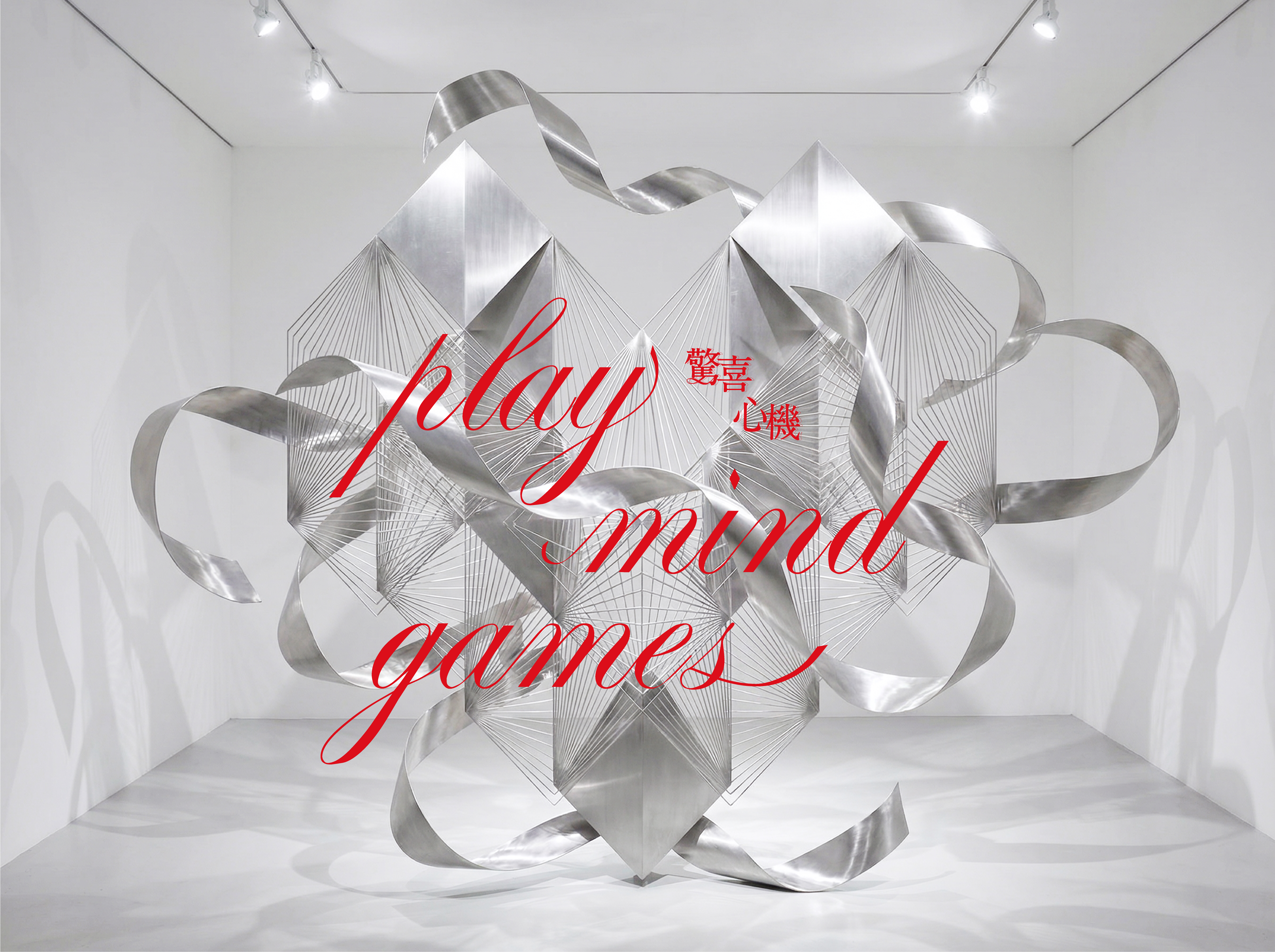
From an emotional opening to clear information A ribbon heart and expressive lettering introduce eslite TIMES Vol.09’s emotional theme; restrained information layout carries the details. The key visual and supporting content guide readers from an immediate impression into cultural and lifestyle information.
先感受,再閱讀 誠品《時光》09期先以緞帶愛心與多變字體傳遞情感,再由理性的資訊編排承接細節。主視覺與內文分工,讓讀者從一眼感受的主題,走向可逐項閱讀的文化生活內容。
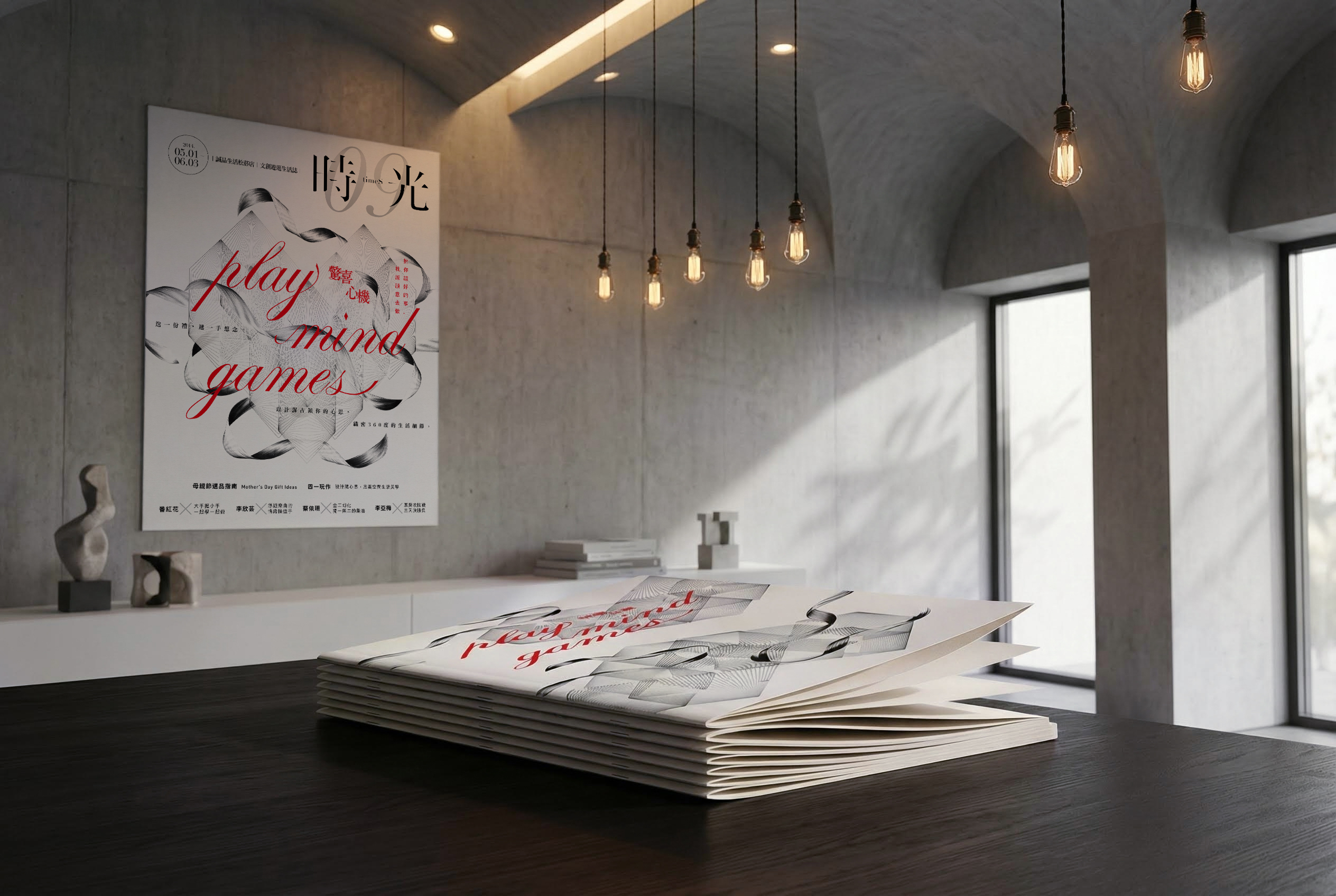
Publication Design / Key Visual Design / Typography / Storewide Campaign Visual Design / Print Finishing Planning
eslite TIMES Vol.09 translates surprise into a ribbon-led system for cultural publication and storewide campaign design. Interwoven heart forms, flowing display typography and structured supporting type connect the cover, editorial layouts and retail visuals, giving cultural and lifestyle content a playful yet coordinated identity.
eslite TIMES Vol.09 translates surprise into a ribbon-led system for cultural publication and storewide campaign design. Interwoven heart forms, flowing display typography and structured supporting type connect the cover, editorial layouts and retail visuals, giving cultural and lifestyle content a playful yet coordinated identity.
刊物設計/主視覺設計/字體編排/全店檔期視覺設計/印刷工藝規劃/文化零售視覺/情感圖像設計
誠品松菸《時光》09期以緞帶與交織心形呈現「驚喜心機」,串連文化刊物設計及全店檔期視覺。流動字體搭配清楚的輔助文字層級,讓封面、內頁與場域應用相互呼應,在有秩序的資訊編排中保有趣味及情感。
誠品松菸《時光》09期以緞帶與交織心形呈現「驚喜心機」,串連文化刊物設計及全店檔期視覺。流動字體搭配清楚的輔助文字層級,讓封面、內頁與場域應用相互呼應,在有秩序的資訊編排中保有趣味及情感。