
HOLISTIC BRAND DESIGN & STRATEGY
BRAND IDENTITY /
LOGO / VI
/ PACKAGING / TYPOGRAPHY
ART DIRECTION / BRAND COPYWRITING
BRAND MASCOT / WEBSITE / PRODUCT
BESPOKE MUSIC
LOGO / VI / PACKAGING / TYPOGRAPHY
ART DIRECTION / BRAND COPYWRITING
BRAND MASCOT / WEBSITE / PRODUCT
BESPOKE MUSIC
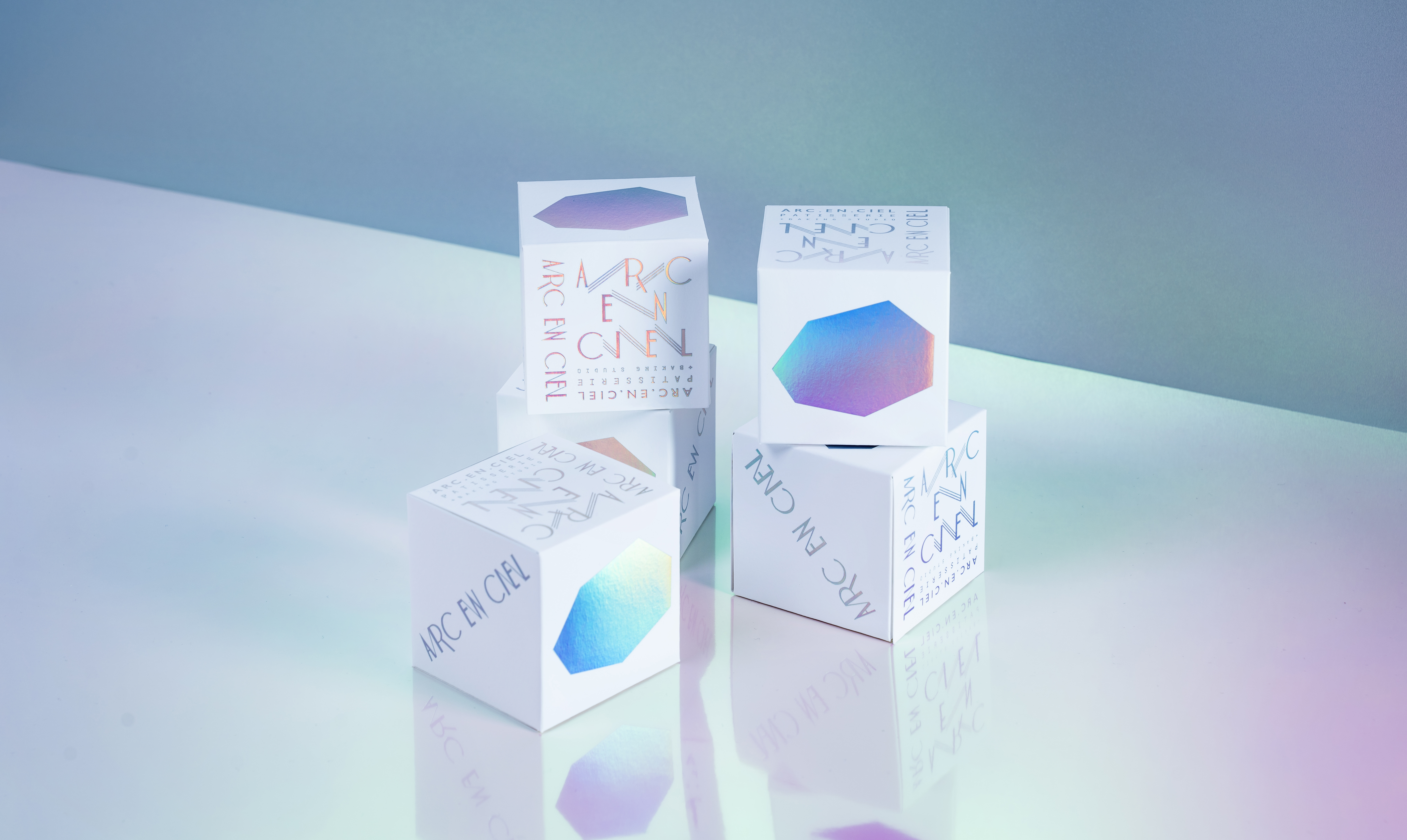
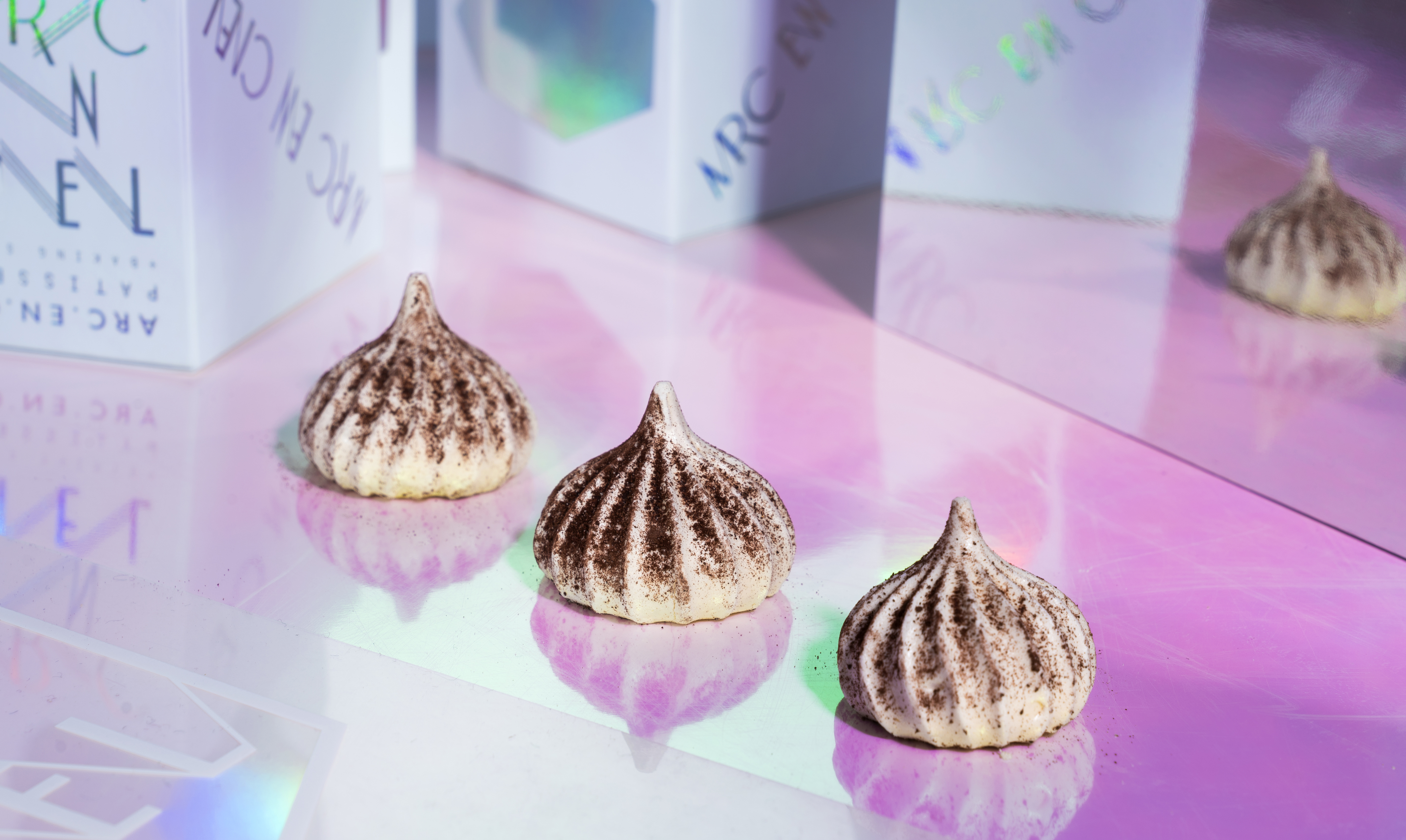
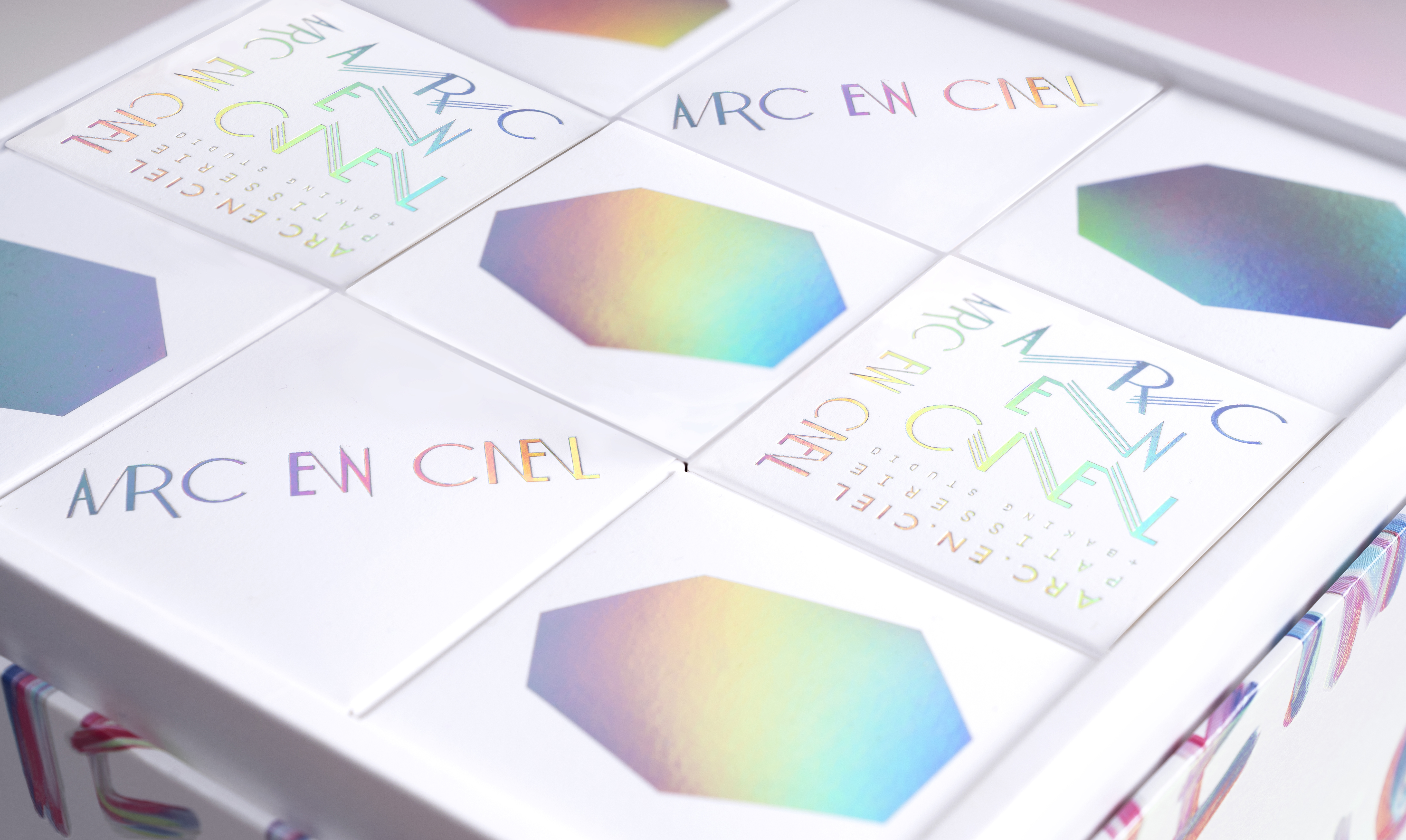
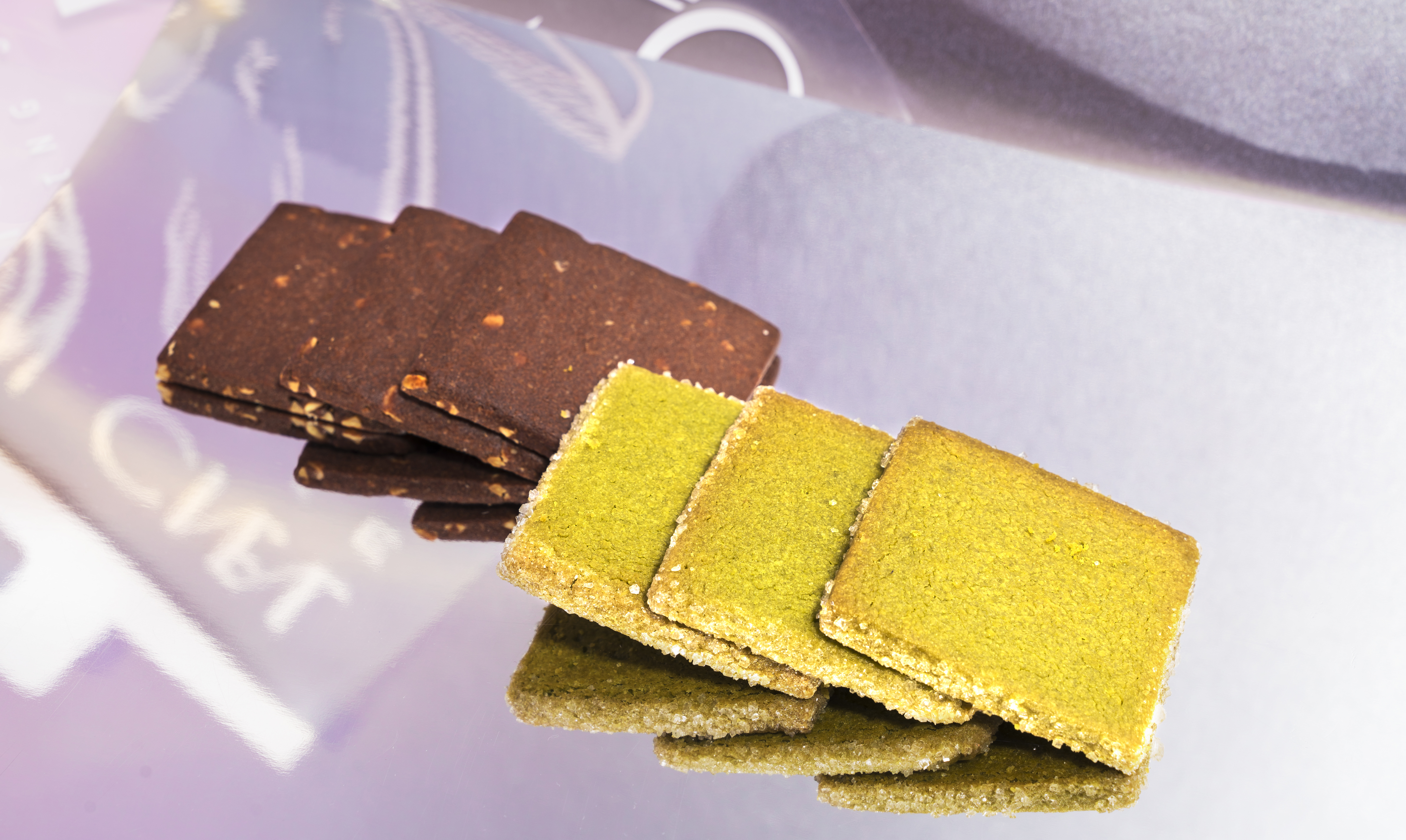
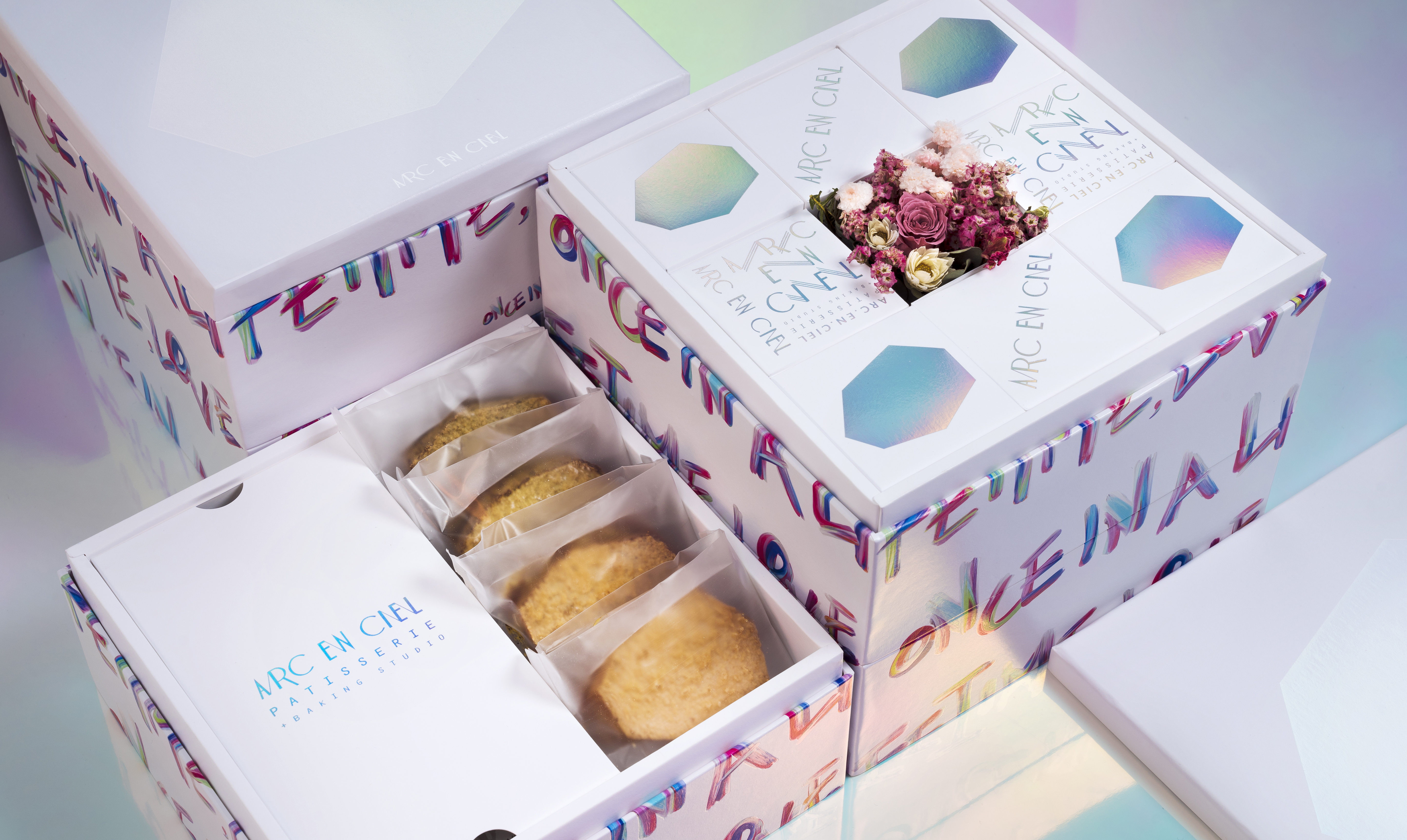
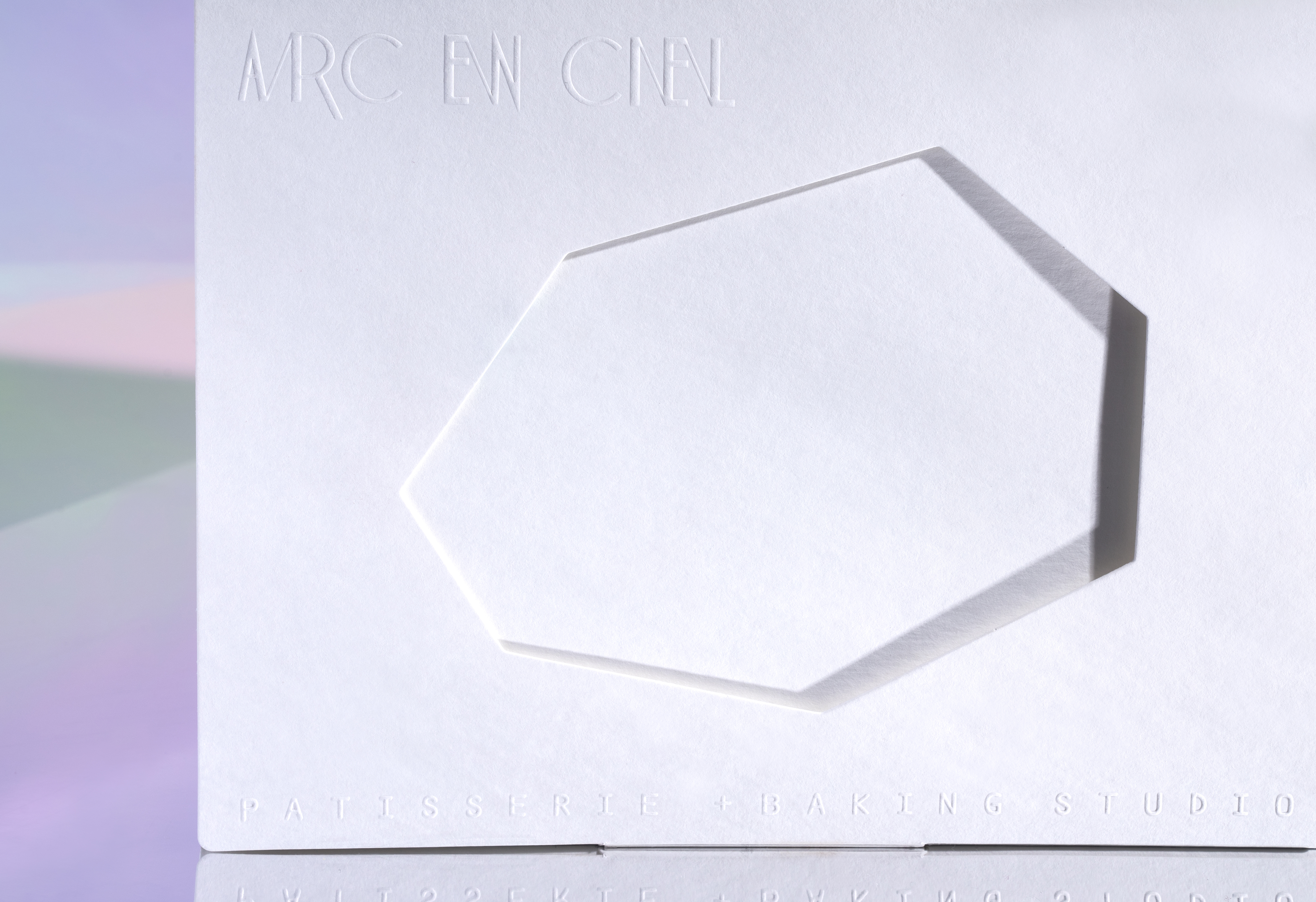
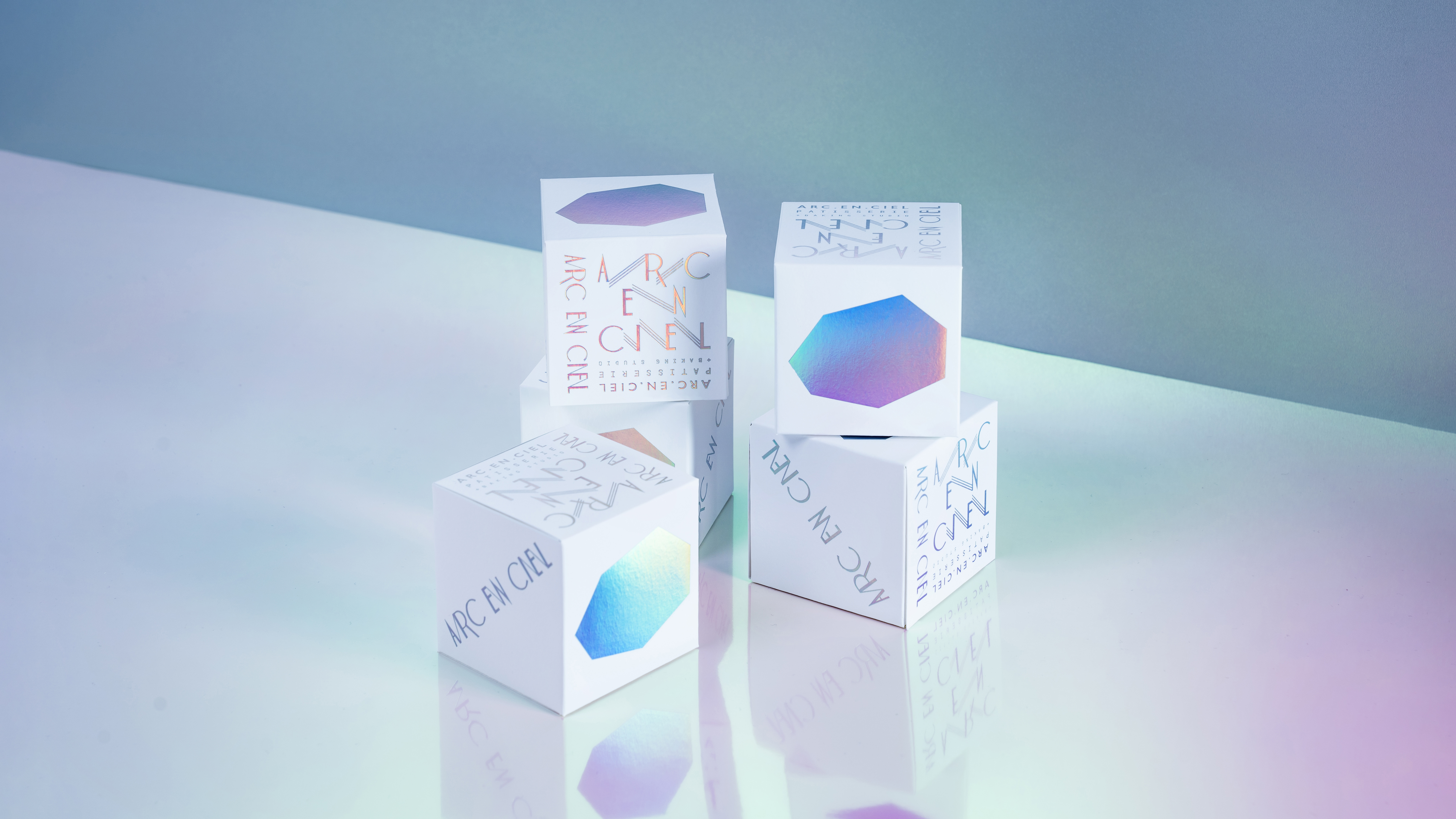
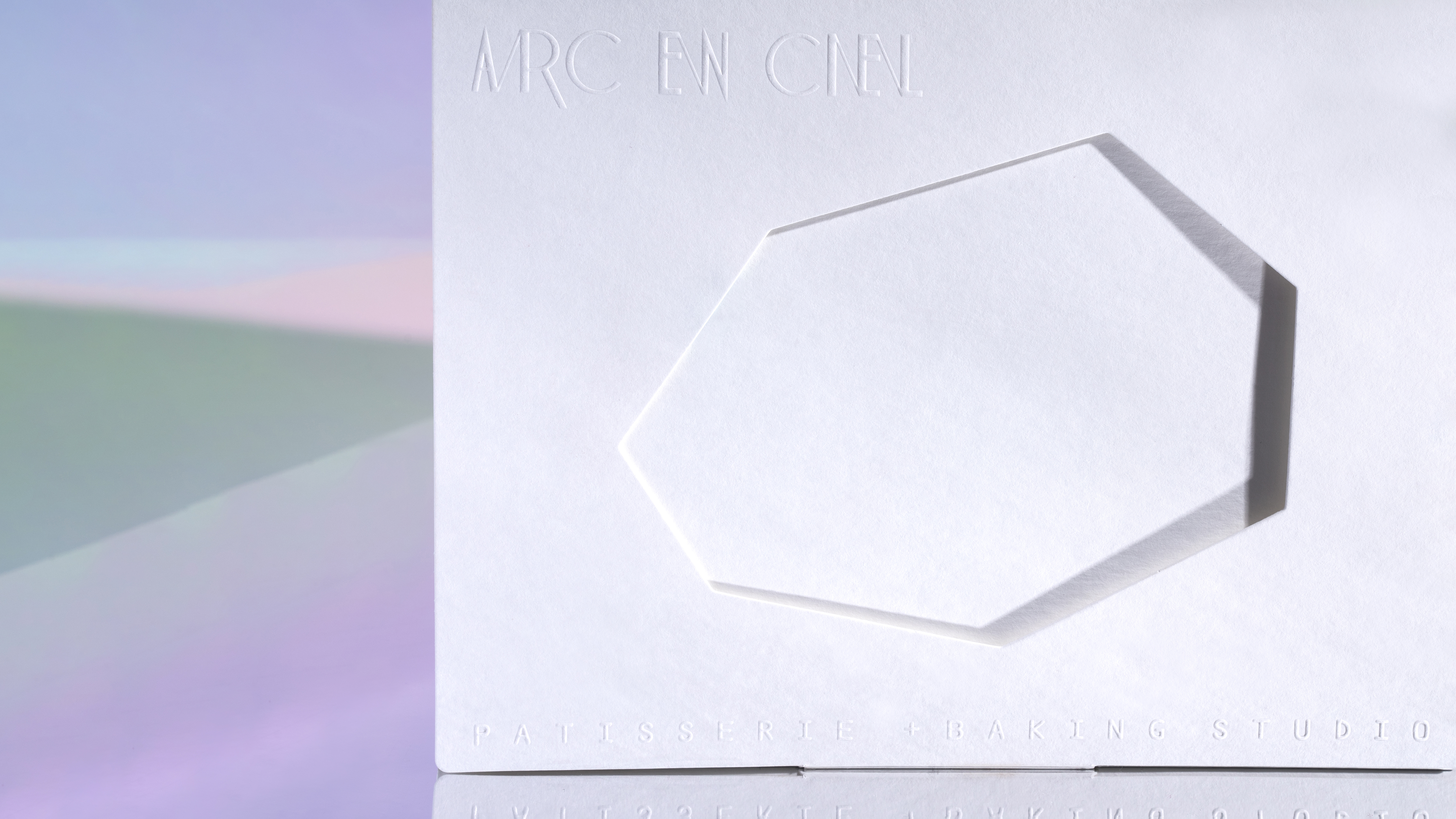
ARC&ART
ARC EN CIEL
CONTAIN EXPERIENCE INFINITE COLOR
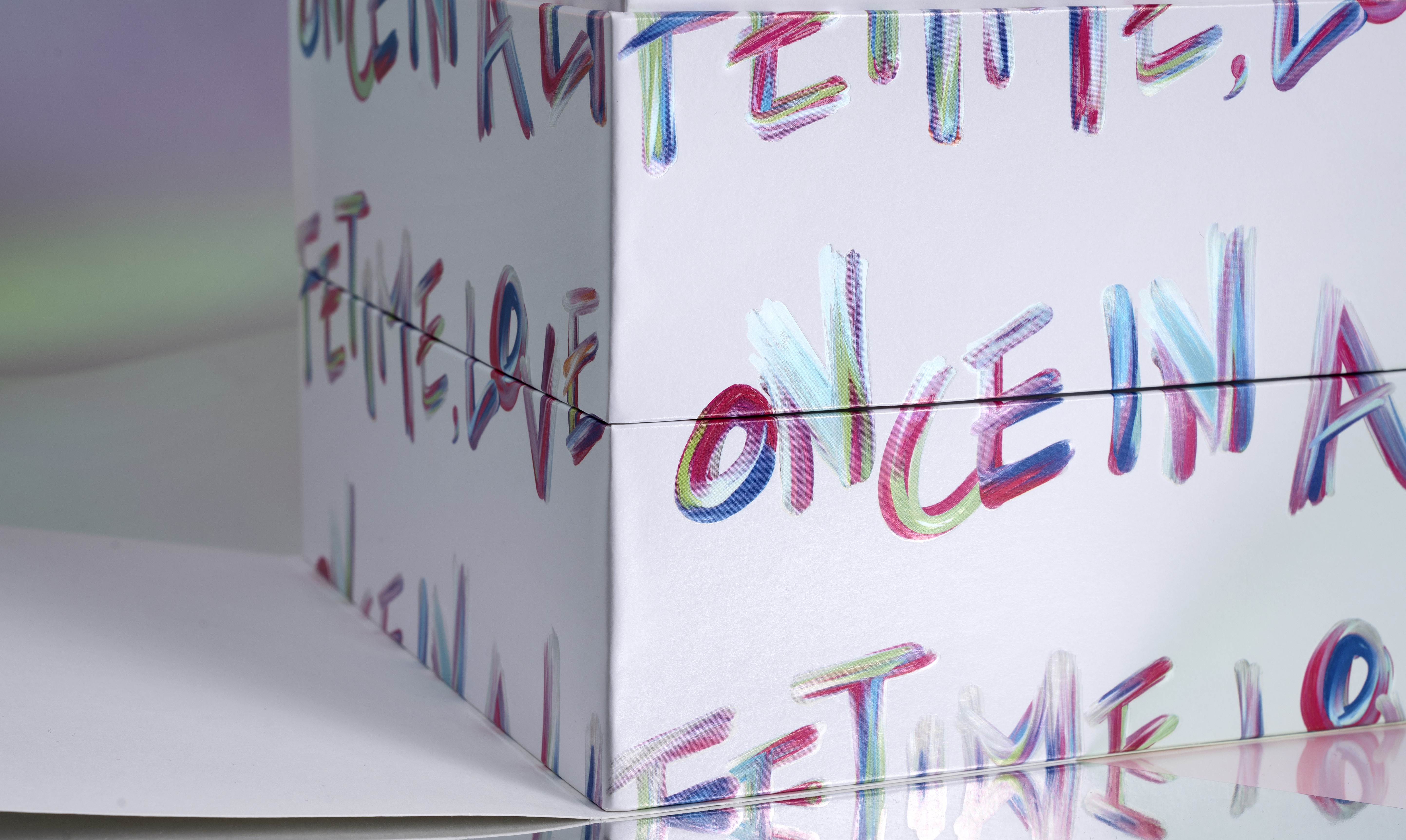
What the wedding gives people is not only a tangible ceremony but also an infinite future. Life is just like rainbow (Arc en ciel) with kaleidoscopic unlimited color. When you experience it from different angles, you can deeply feel it from the inside. When you taste in different moods, you can feel the warmth contained inside. Arc en ciel/Life contain Infinite Color.
For modern people, marriage requires a touch of courage, impulse, and the desire to build a wonderful future.
This design transforms the wedding gift into a bold declaration of love. Through vibrant colors and direct, hand-drawn typography—'Once in a lifetime, love!'—it not only celebrates a beautiful union but also inspires everyone to pursue love fearlessly.
☞ Market Impact: Following the product launch, the brand achieved a remarkable sales revenue growth of over 200%☞ Works have been published in, ‘Asia-Pacific Design No14’, ‘DESIGN360°’, ‘Typography in Graphic Design’, ‘Color appeal in packaging’ ☞ Design website, ‘Destacado en, ‘Dr Wong-Emporium Of Tings’, ‘Bashooka’, ‘Circle’

BEAUTE ON
BEAUTE NMN
β-Nicotinamide mononucleotide.
BEAUTE NMN“Recreating the perfect moment with a precise formula”
Life blossoms with a unique flair and dances gracefully across the world.
The ripples created by each step carve out the trajectory of life.
With the precise formula to unlock the blueprint of golden proportions, let the flowers continue to blossom and let life return to the most dazzling stage.
NMN 9600 / Recreating the perfect moment with a precise formula
NMN is the most sought after and effective anti-aging product on the market today. By taking NMN orally, the level of NAD+, a DNA repair enzyme that decreases with age, can be increased rapidly to reverse the aging process.
☞ Luxury Health Supplement: The Age-Defying Miracle of 99.9% Pure NMN
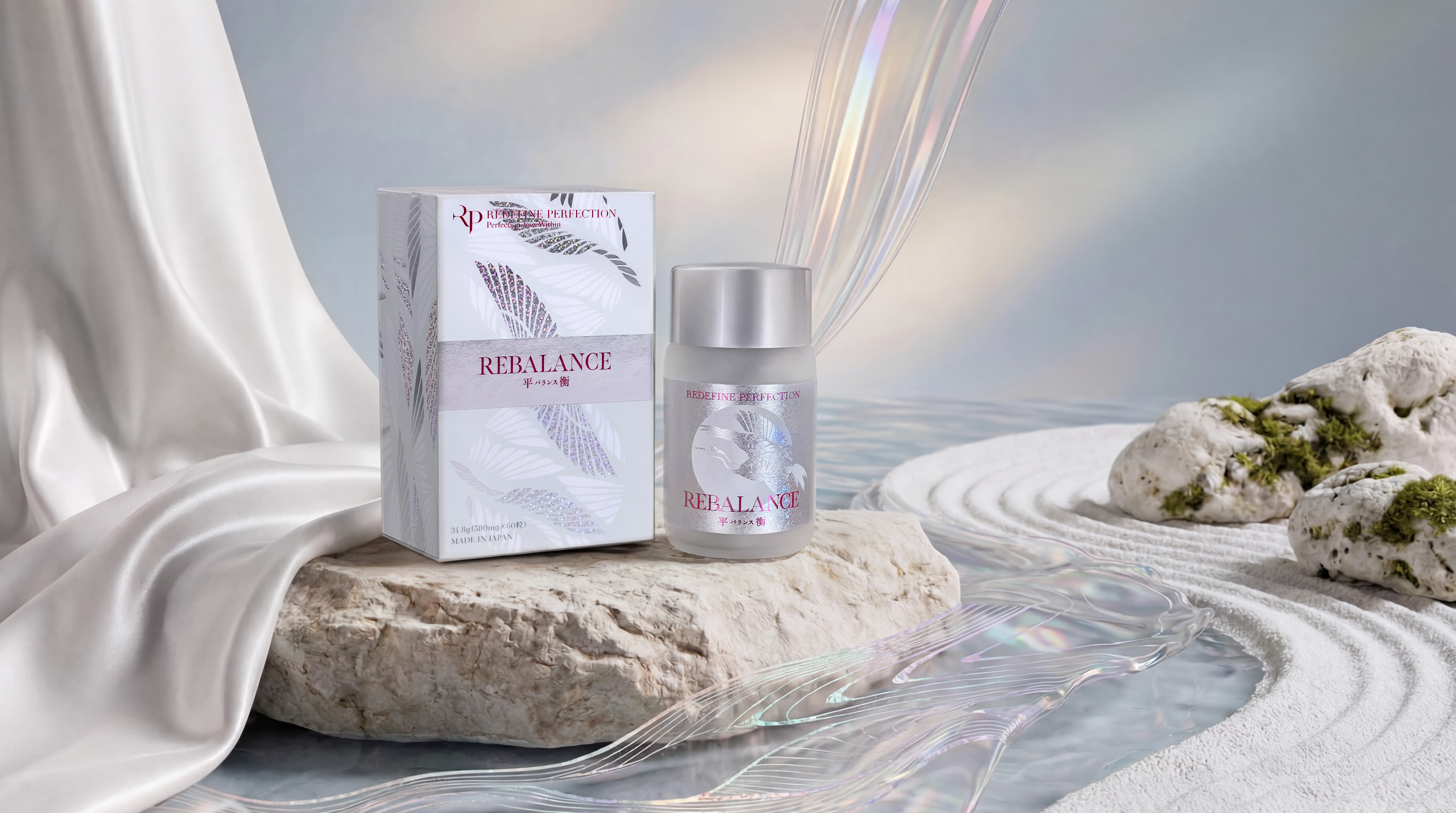
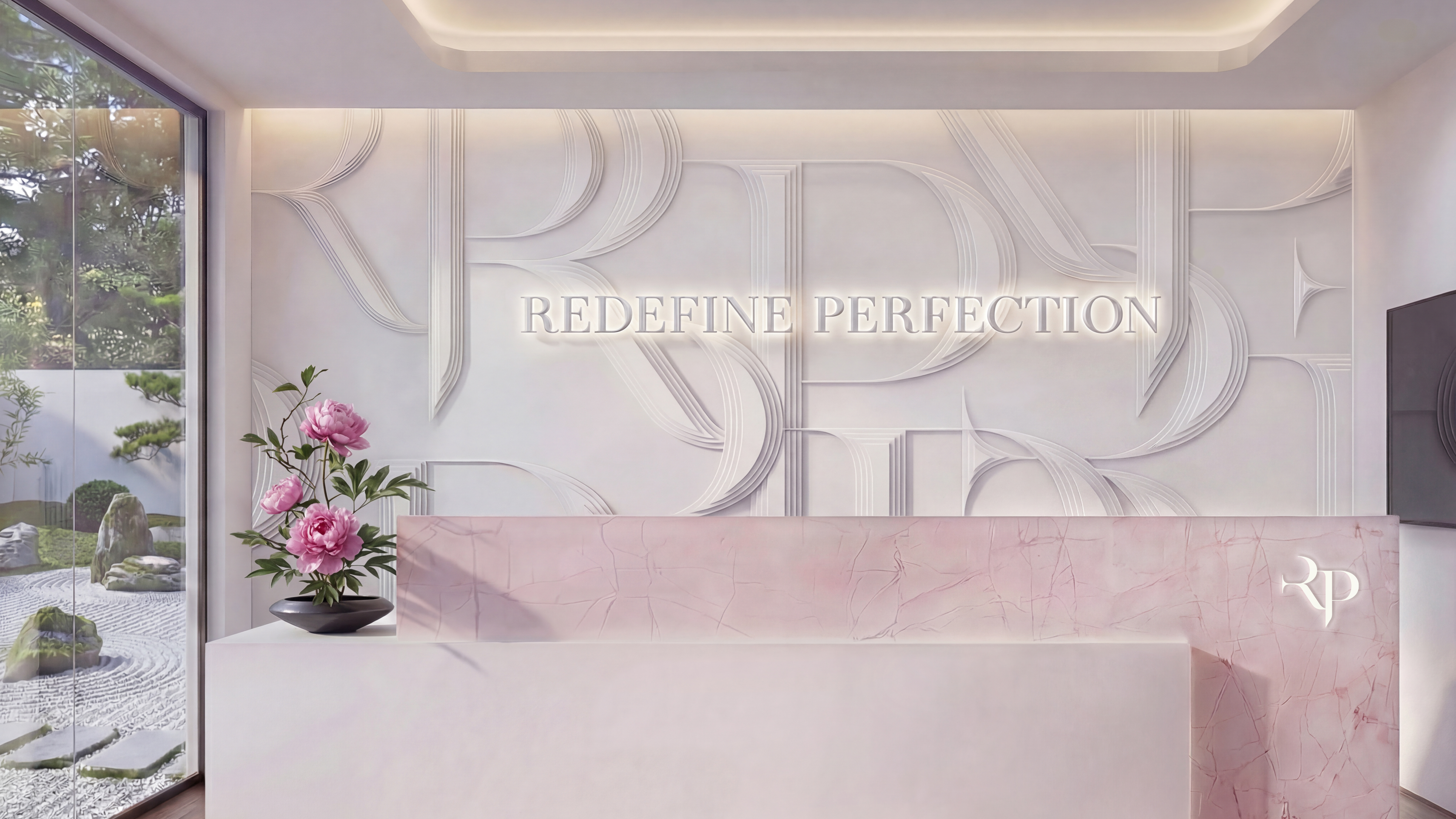
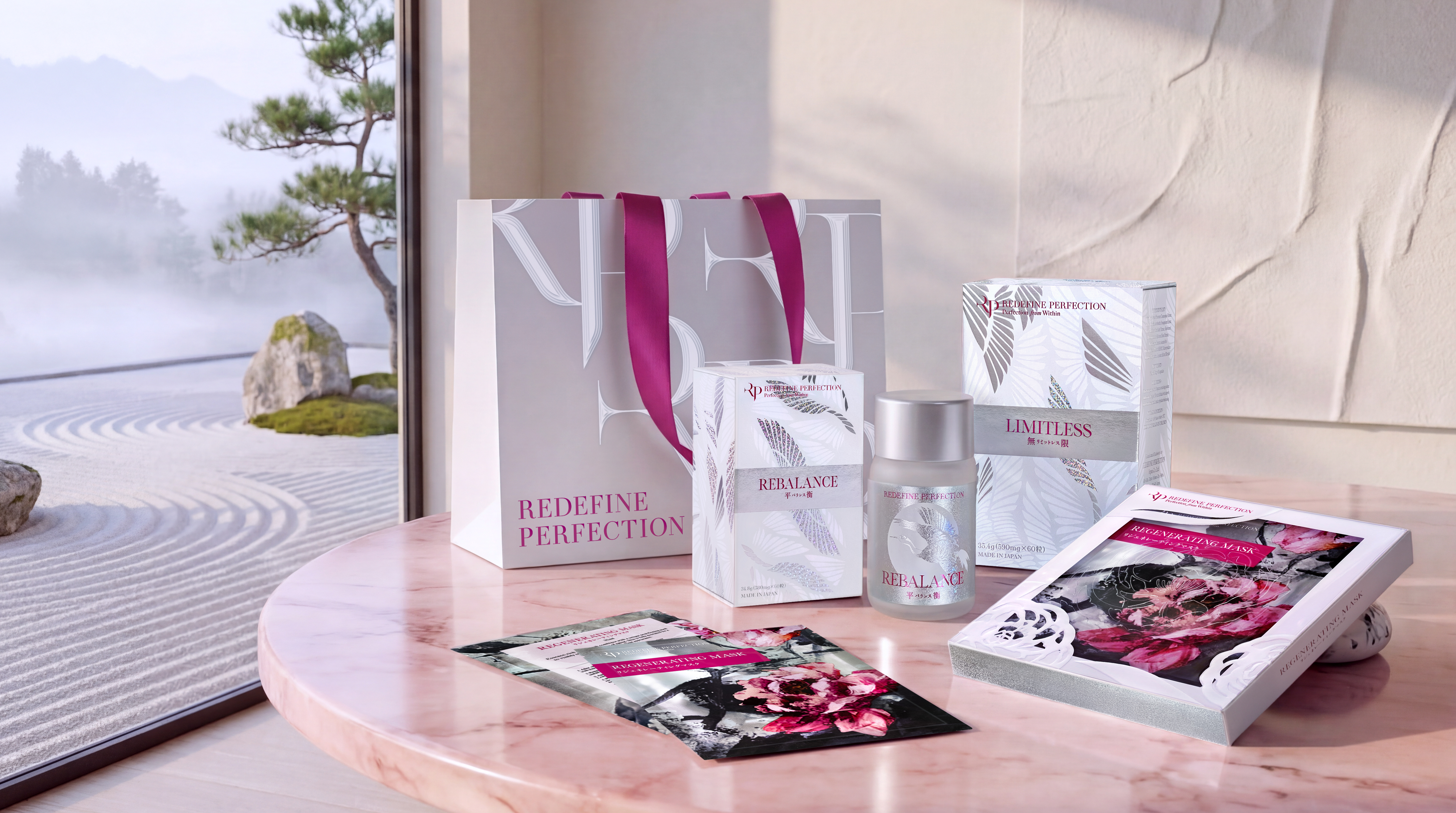
RP TCM CLINIC
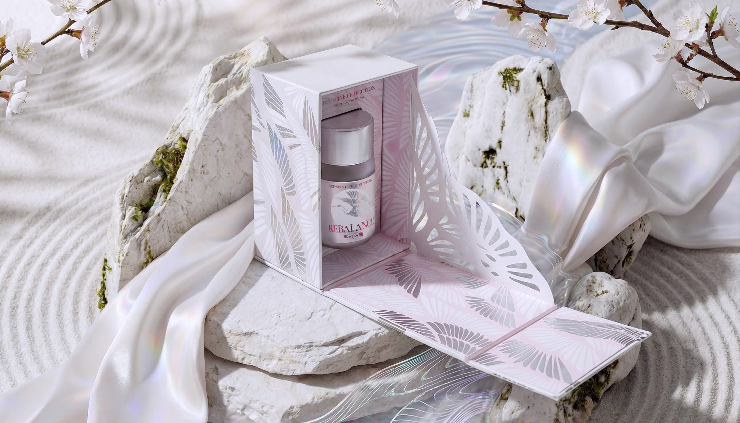
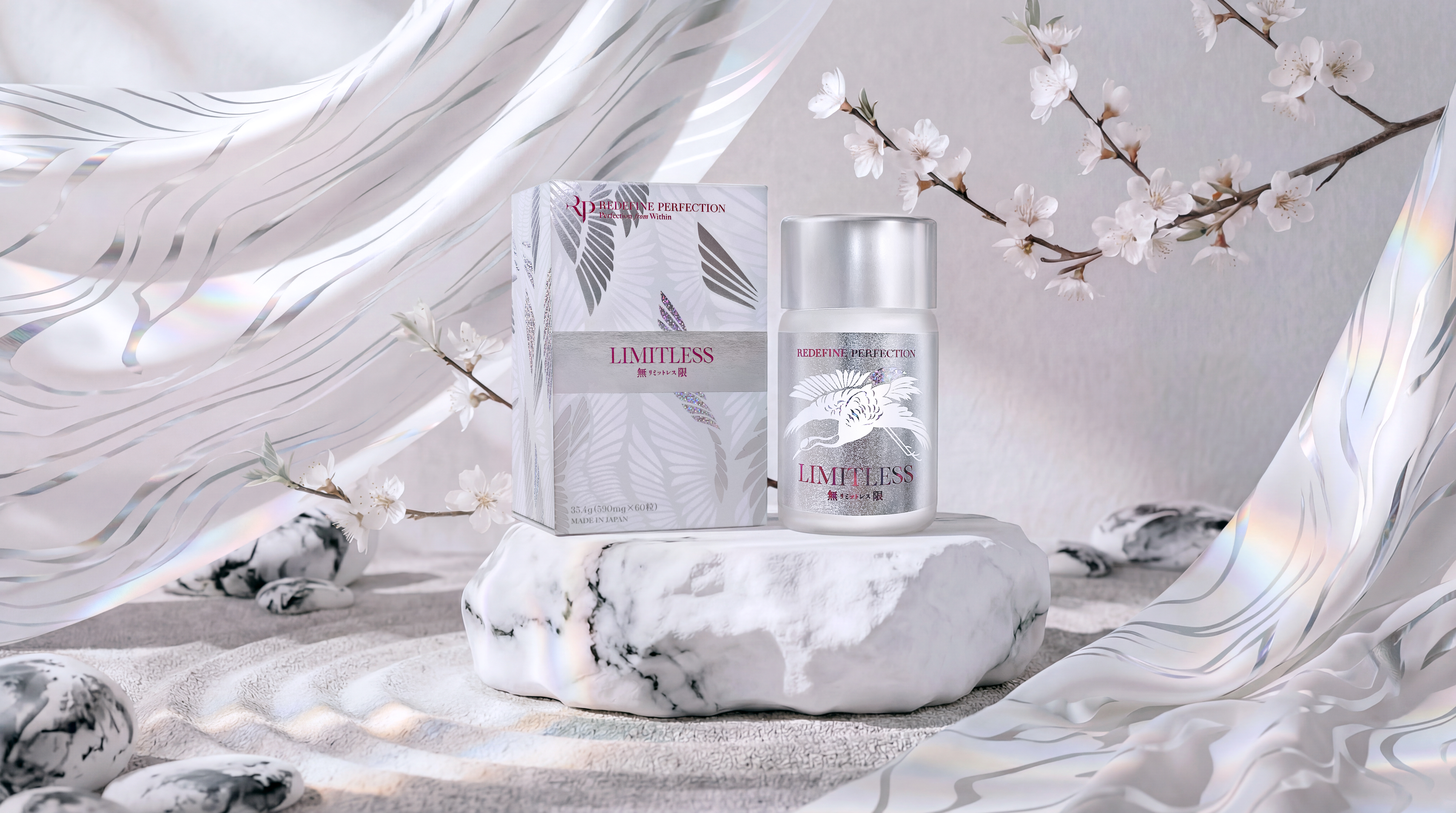
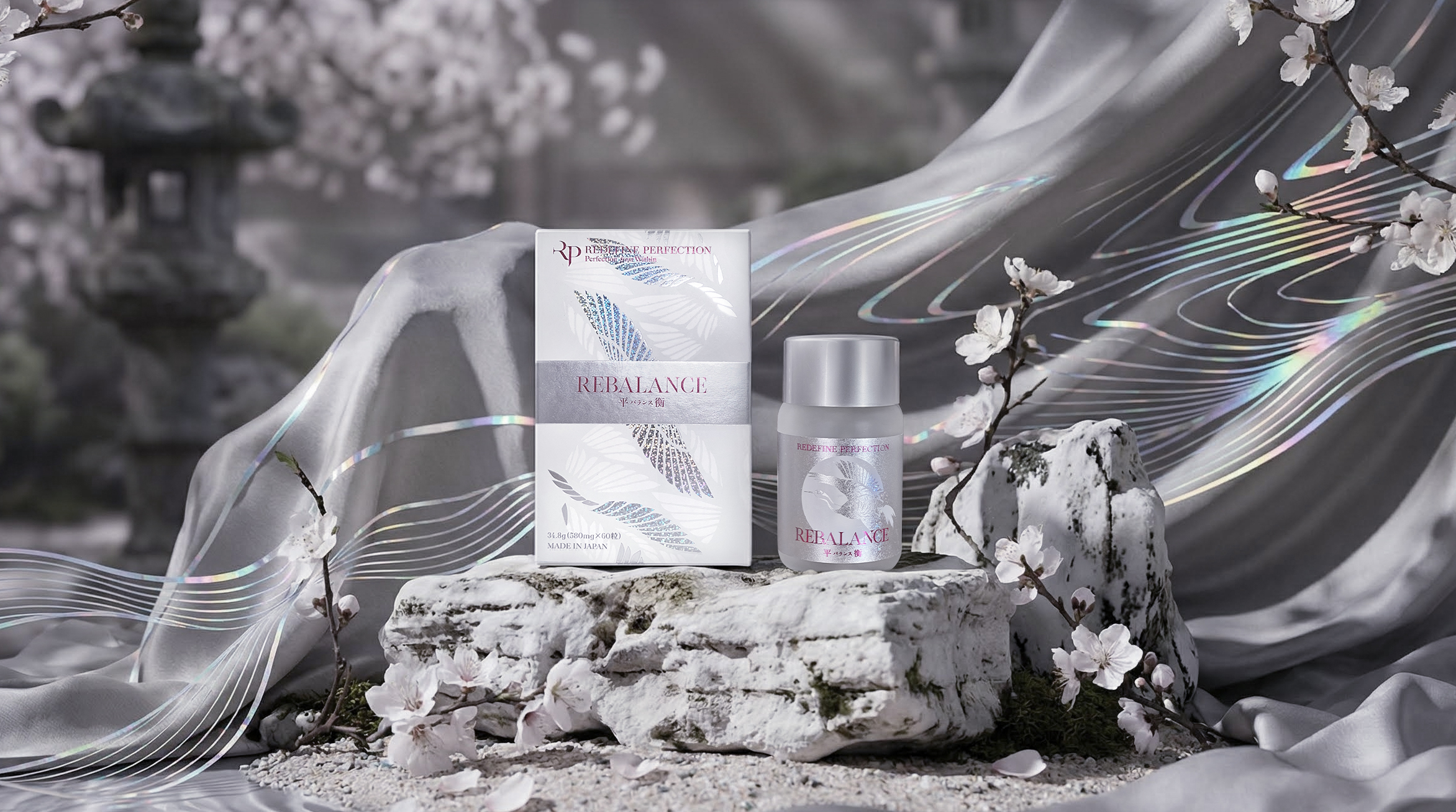
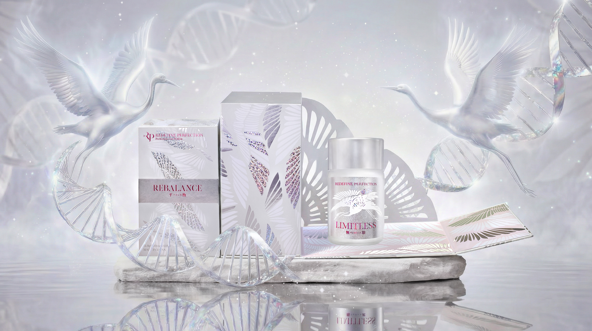
REBALANCE & LIMITLESS
PERFECTION FROM WITHIN
Unveil the natural essence of perfection
White light interweaves, transforming into billions of pristine feathers,
Sealed within a crystalline cocoon, awaiting awakening.
Feathers in the sky weave into a crane,
Gliding elegantly into your inner landscapes.
From this moment, life finds its scale in lightness and limitlessness. You and the light are reborn together.
Sealed within a crystalline cocoon, awaiting awakening.
Feathers in the sky weave into a crane,
Gliding elegantly into your inner landscapes.
From this moment, life finds its scale in lightness and limitlessness. You and the light are reborn together.
We transcend the sterile, scientific imagery of Probiotics and NMN, poeticizing them as the "feathers of the longevity crane." Visually, countless microscopic feathers glowing with an iridescent white radiance (symbolizing super-strains and longevity factors) float and coalesce in the ether.
They are not merely microscopic restorative agents, but the fundamental units that constitute "health and longevity." This process of "transformation from feather to crane" symbolizes how a magnificent vitality is constructed, starting from the most microscopic balance.
They are not merely microscopic restorative agents, but the fundamental units that constitute "health and longevity." This process of "transformation from feather to crane" symbolizes how a magnificent vitality is constructed, starting from the most microscopic balance.
RP TCM CLINIC
REGENERATION


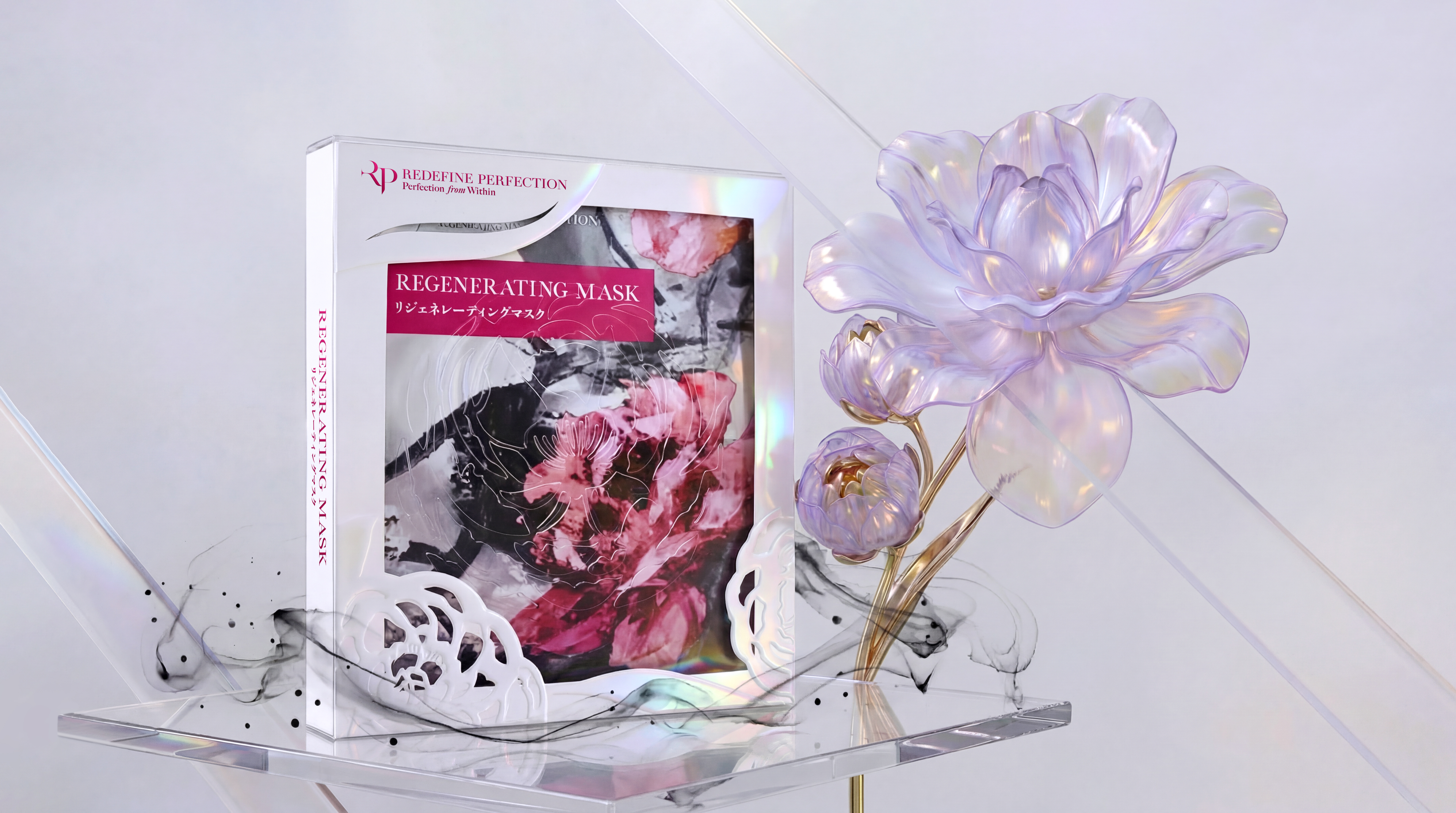
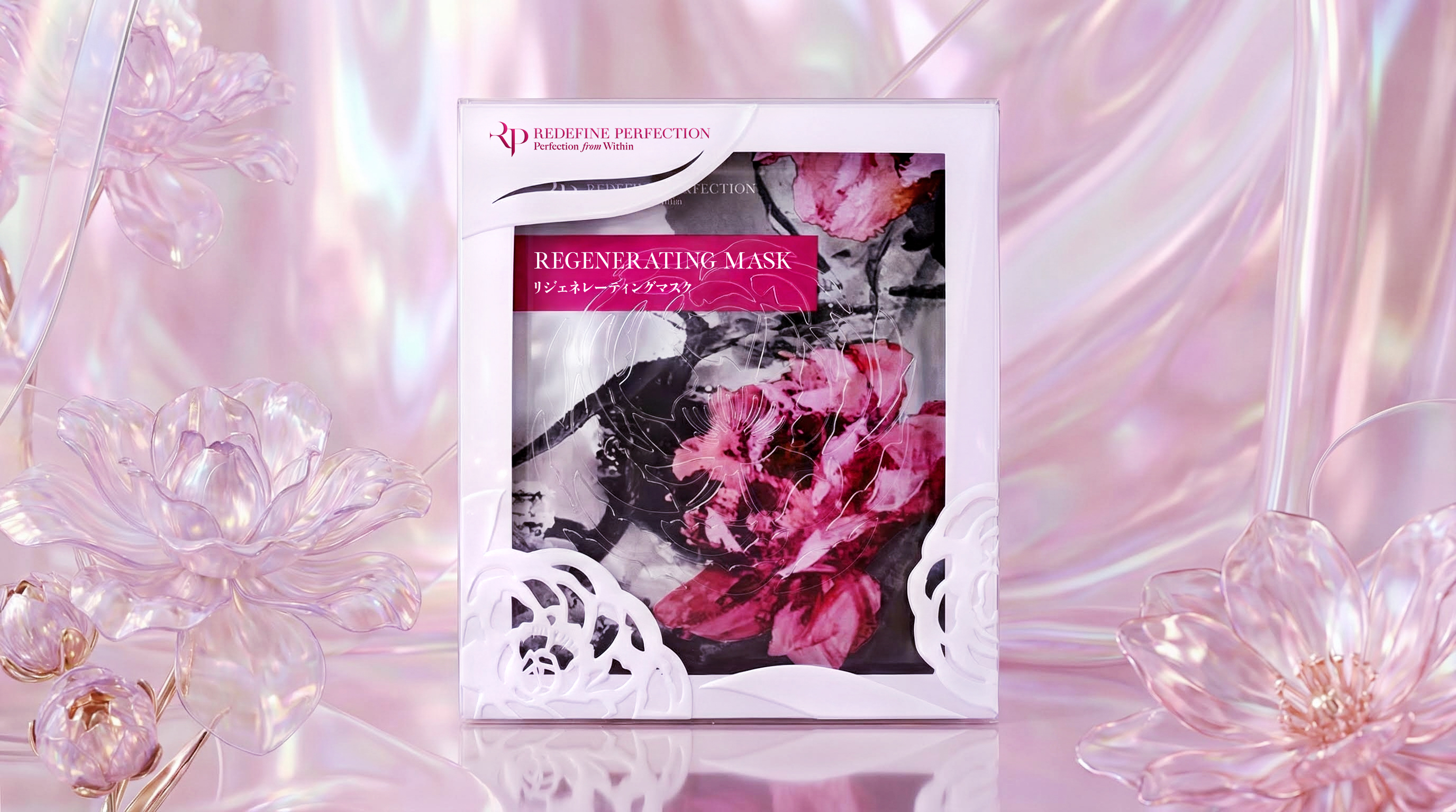
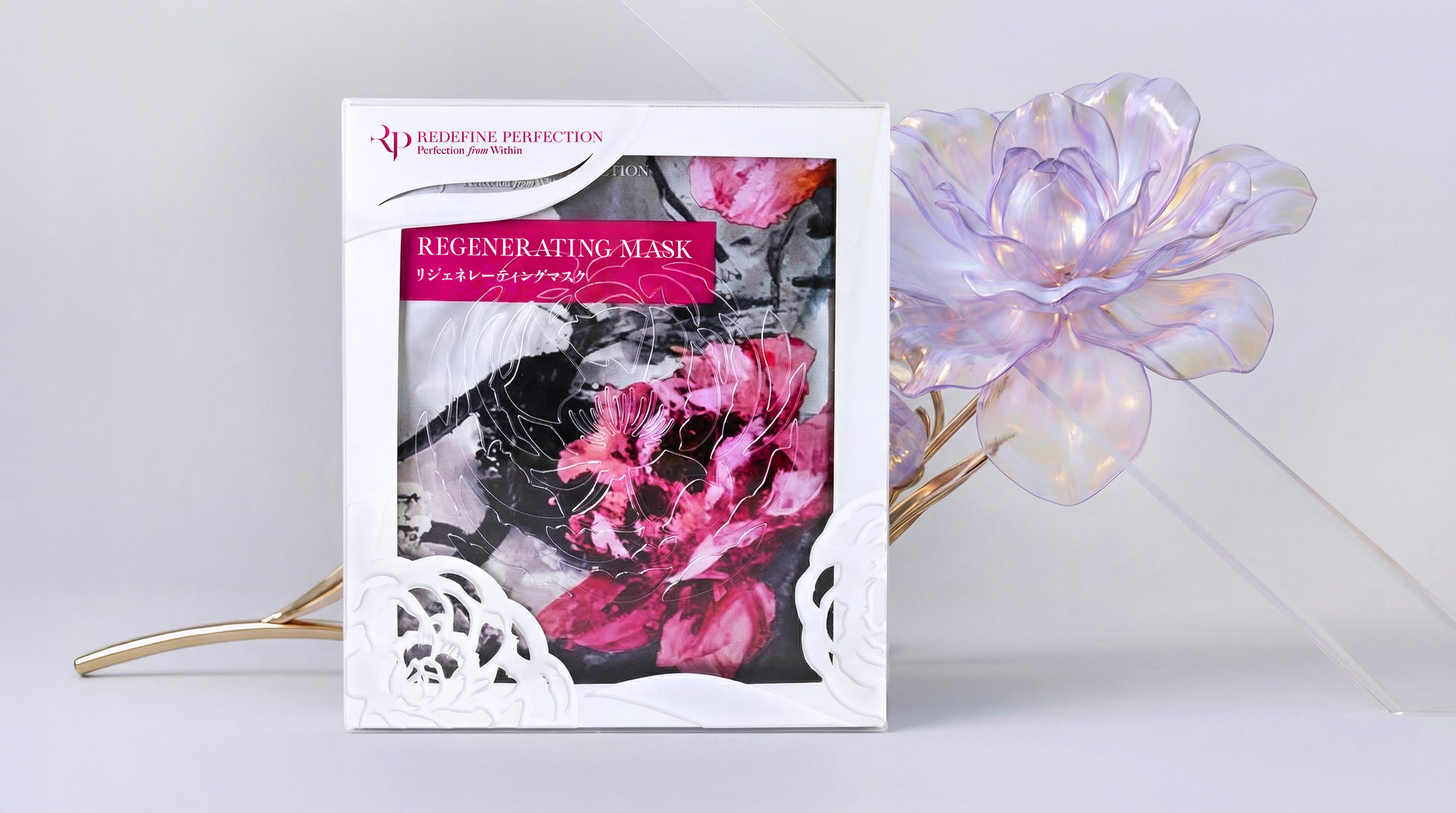
Inheriting Millennia of Wisdom, Redefining Modern Wellness
RP TCM CLINIC dispels the clinical cold, inviting you into a realm of pure white silence. The 'RP' monogram emerges from an architectural sandstone relief, where solid stone evokes a paradoxical softness. This design embodies "Medical Precision"—carving fluid, delicate layers within a framework of rigorous rationality.
As your gaze wanders through the space, a contemporary Karesansui (Dry Landscape) garden unfolds.
As time condenses into ink, beauty blossoms between illusion and reality.
The texture of skin is a poem written by life. We sought a visual language for the REGENERATING MASK capable of bridging "medical precision" and "artistic sensibility." Ultimately, we found our answer at the intersection of the expressive spirit of Eastern ink wash painting and the dimensional tactility of contemporary paper art.
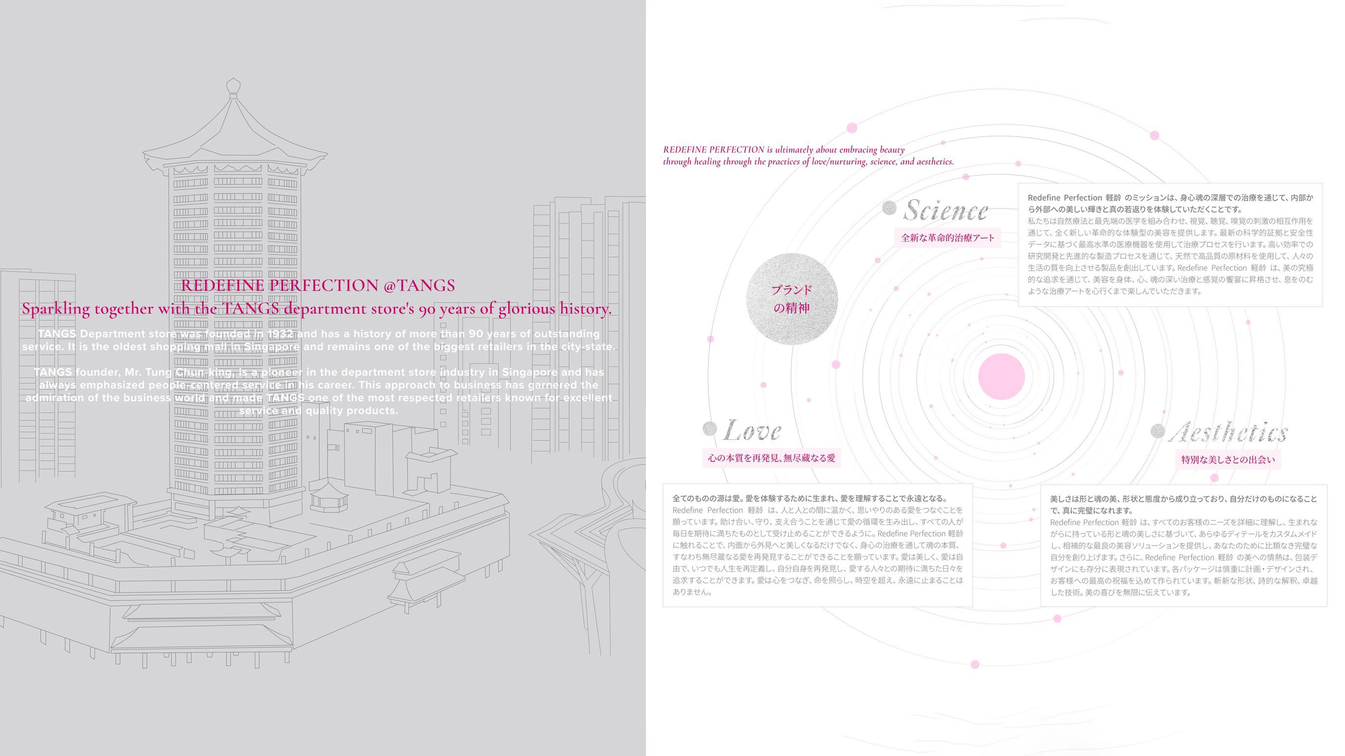
☞ Asian Roots, Global Design. Uniting Singapore, Taiwan, and Japan to reimagine TCM
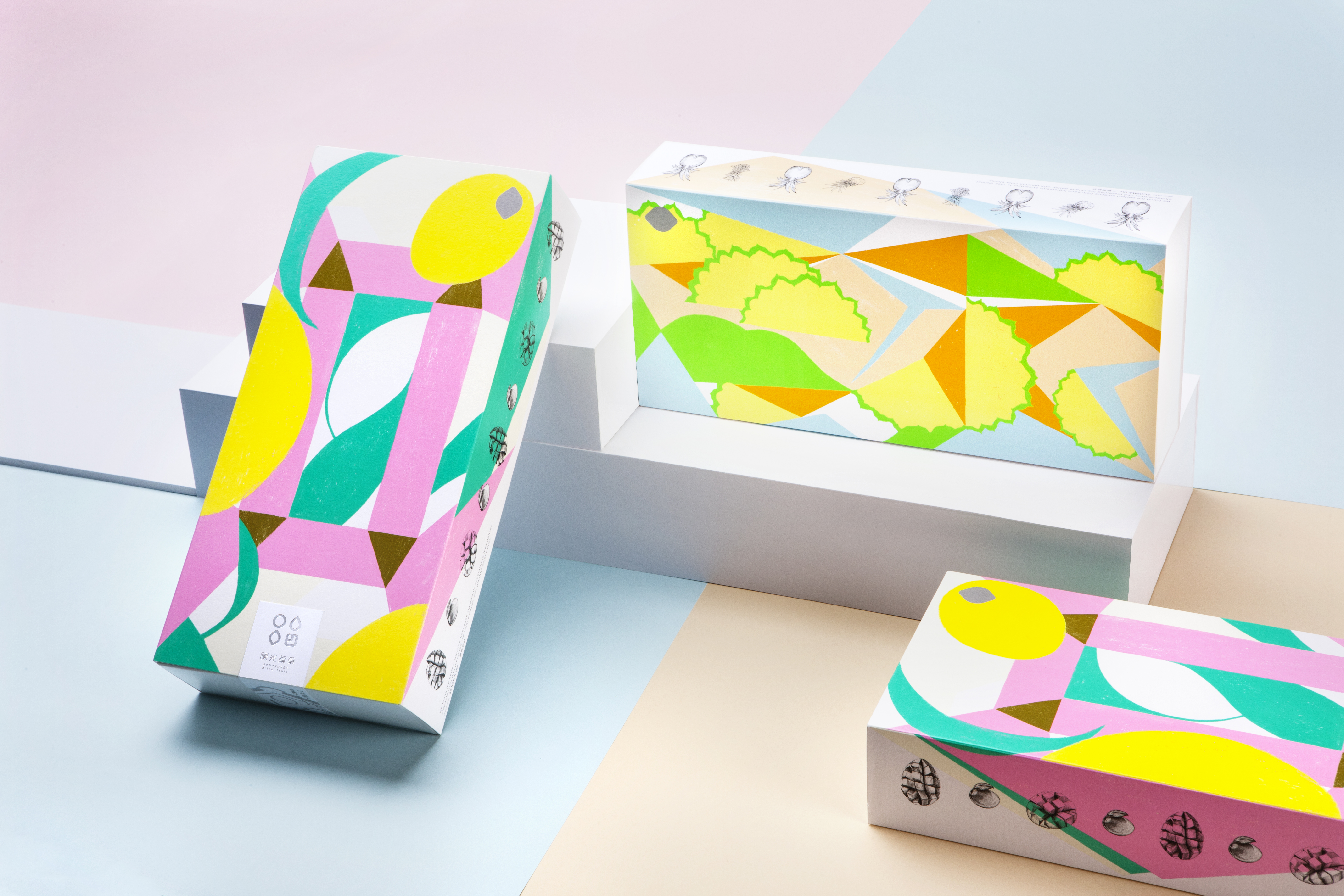
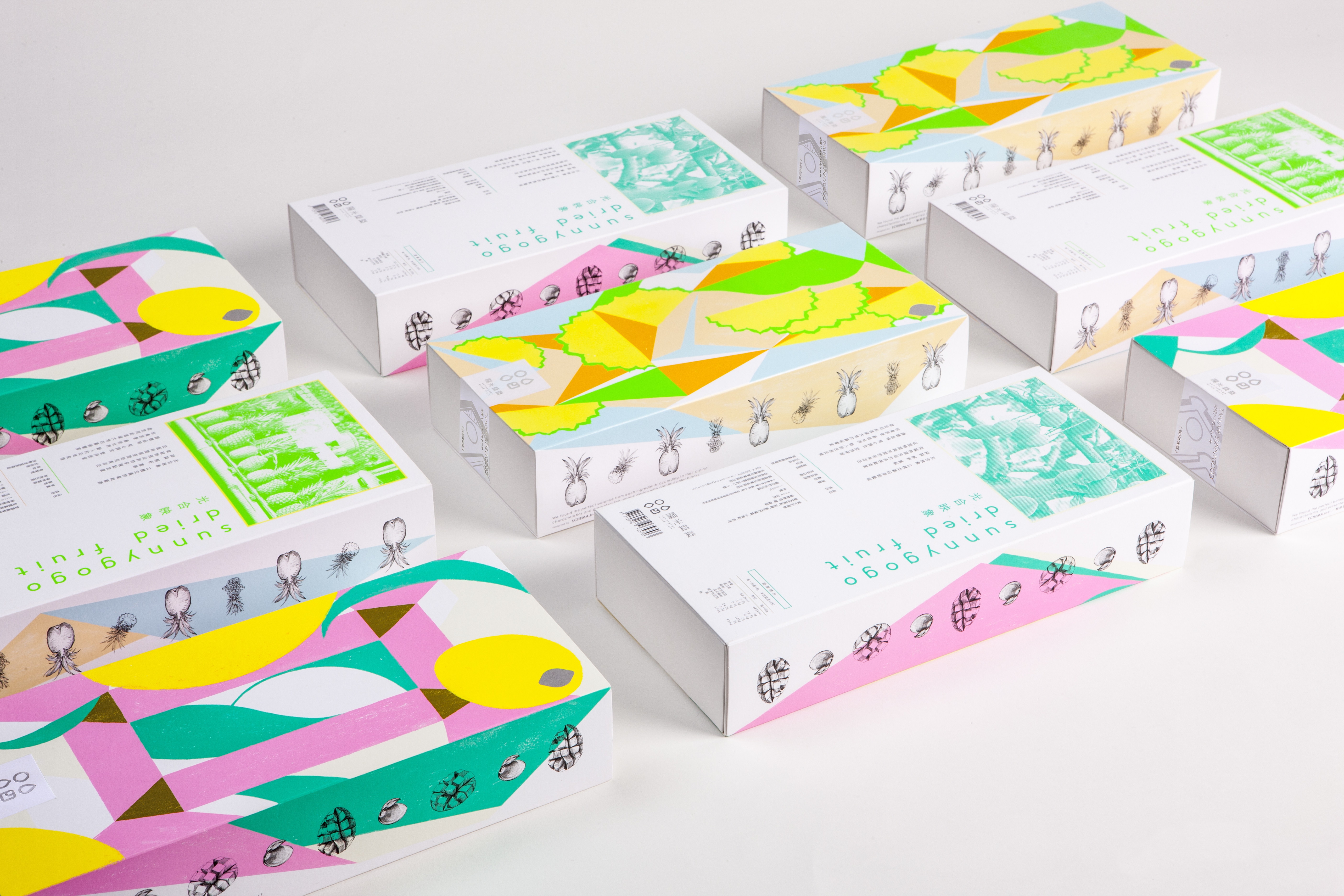
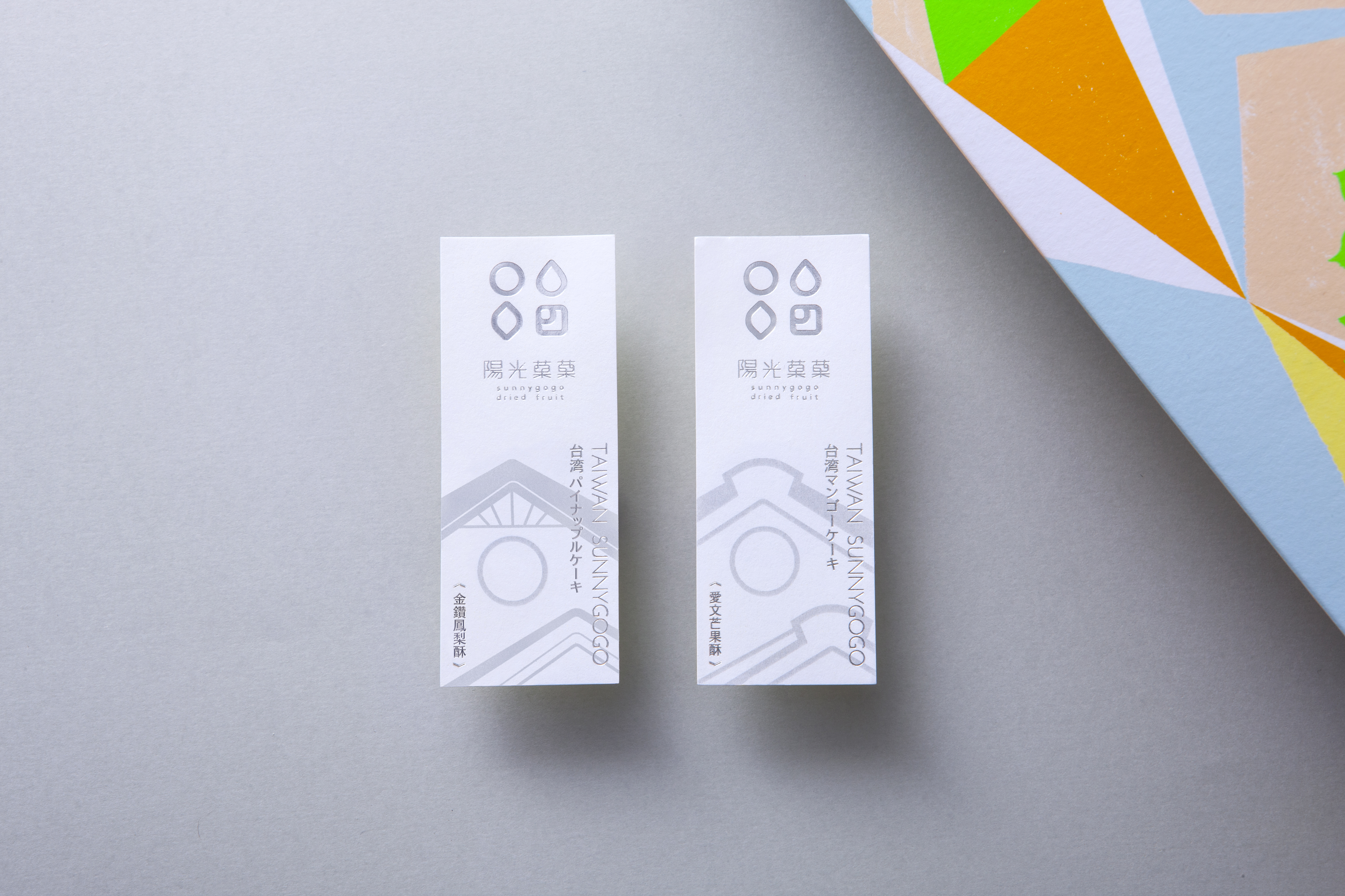
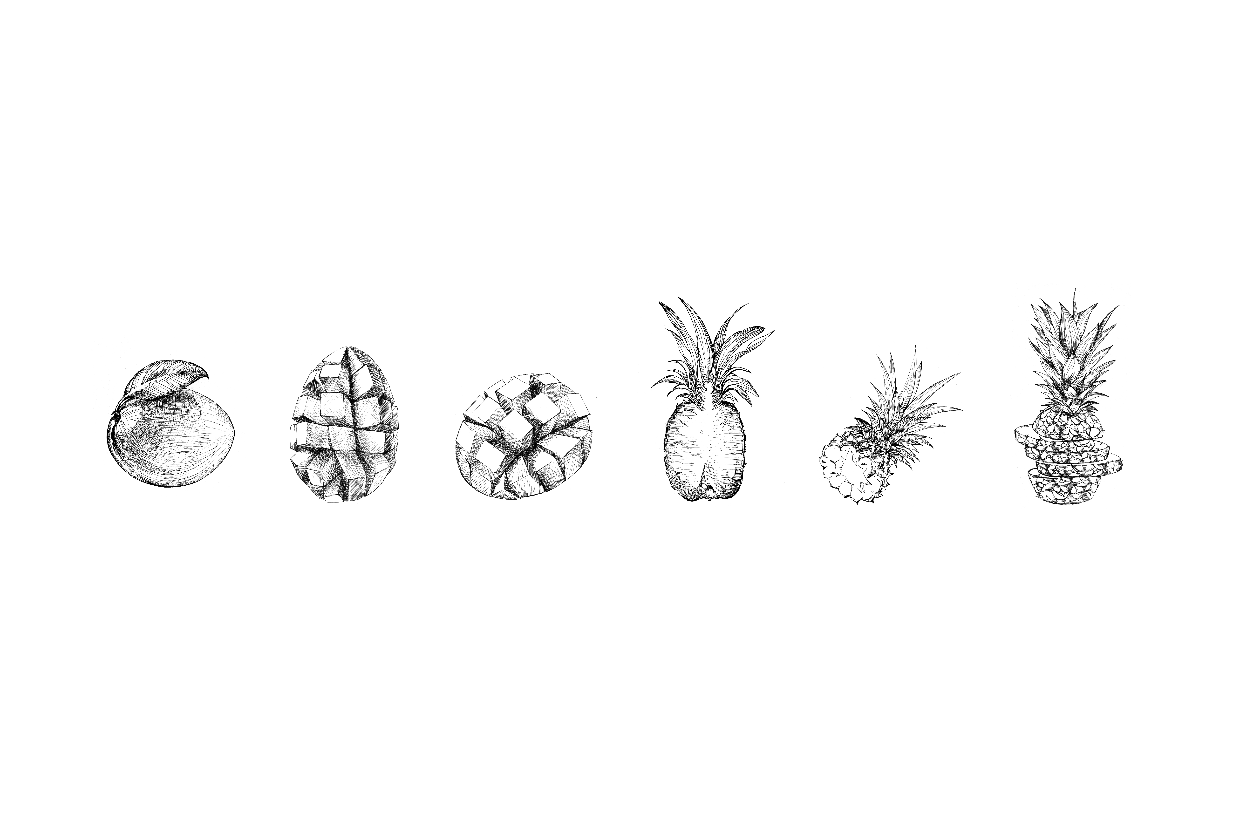
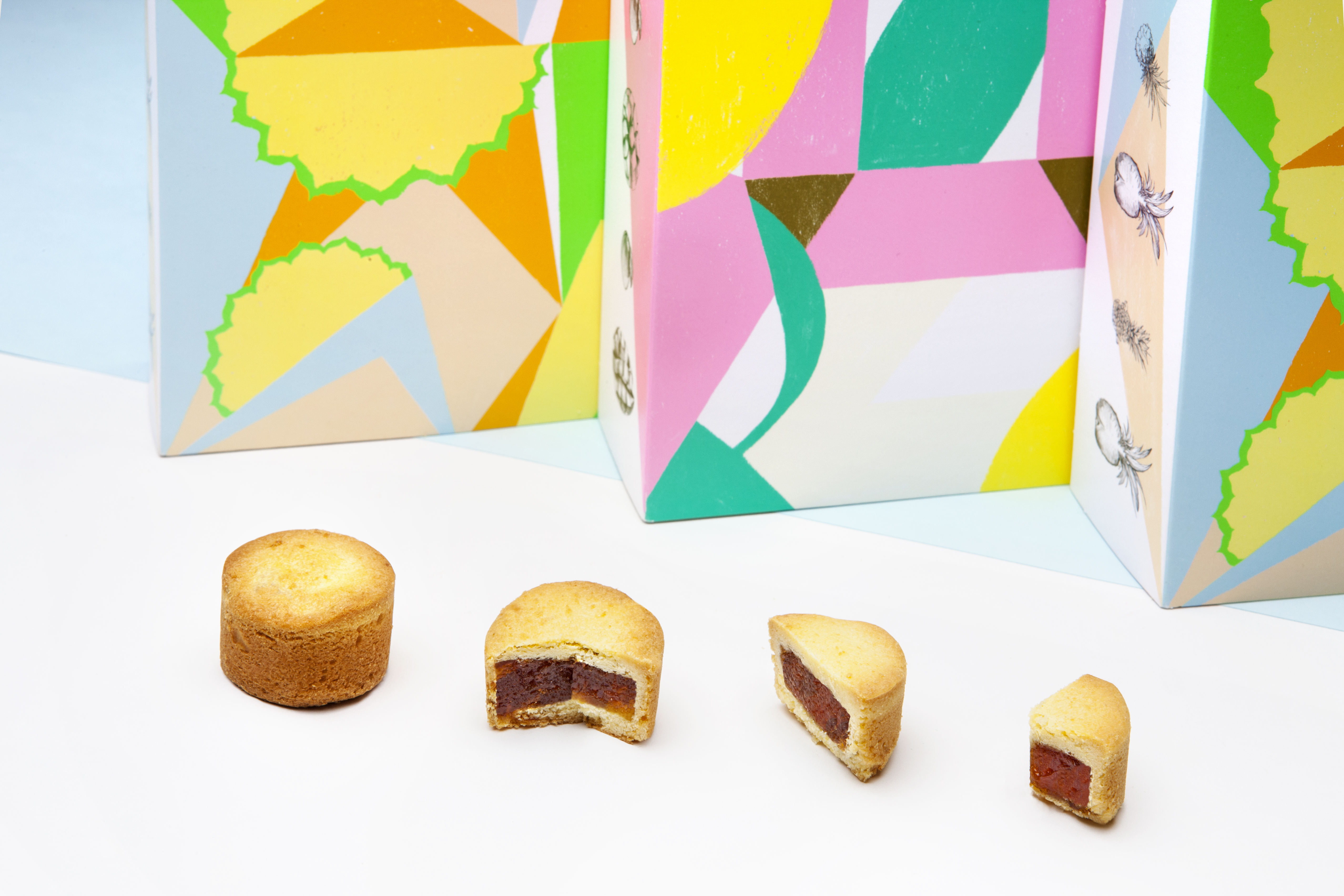
SUNNYGOGO
Dried Fruit
SUNNYGOGO INTERPRETS FRUIT CRISPY WITH ART
Available in department stores and airports as a Taiwanese souvenir, SUNNYGOGO transforms traditional snacks into an artistic experience.
Cubism pursues forms of fragmentation, resolution, and recombination. Artists depict objects in fragmented combinations from multiple angles, placing them within a single picture to present the most complete image of the subject. This technique is applied to reinterpret the fruit crisp making process, involving form, destruction, combination, and transformation.
The packaging for mango and pineapple crisps features geometric fruit cross-sections in four vibrant fluorescent colors, complemented by realistic black fruit illustrations. This optimal color ratio represents the dedication of every craftsman, using colors to bring a sunny and cheerful feeling.
☞ Awards, ‘Indigo Design Award 2018-Gold and Shortlisted Winner for Graphic Design of the Year’
☞ Design website, ‘Destacado en’, ‘Packaging Of The World’, ‘Circle’
☞ Works have been published in, ‘Asia-Pacific Design No14’, ‘DESIGN360° no78’, ‘ [BranD] Magazine Issue43’, ‘Color appeal in packaging’
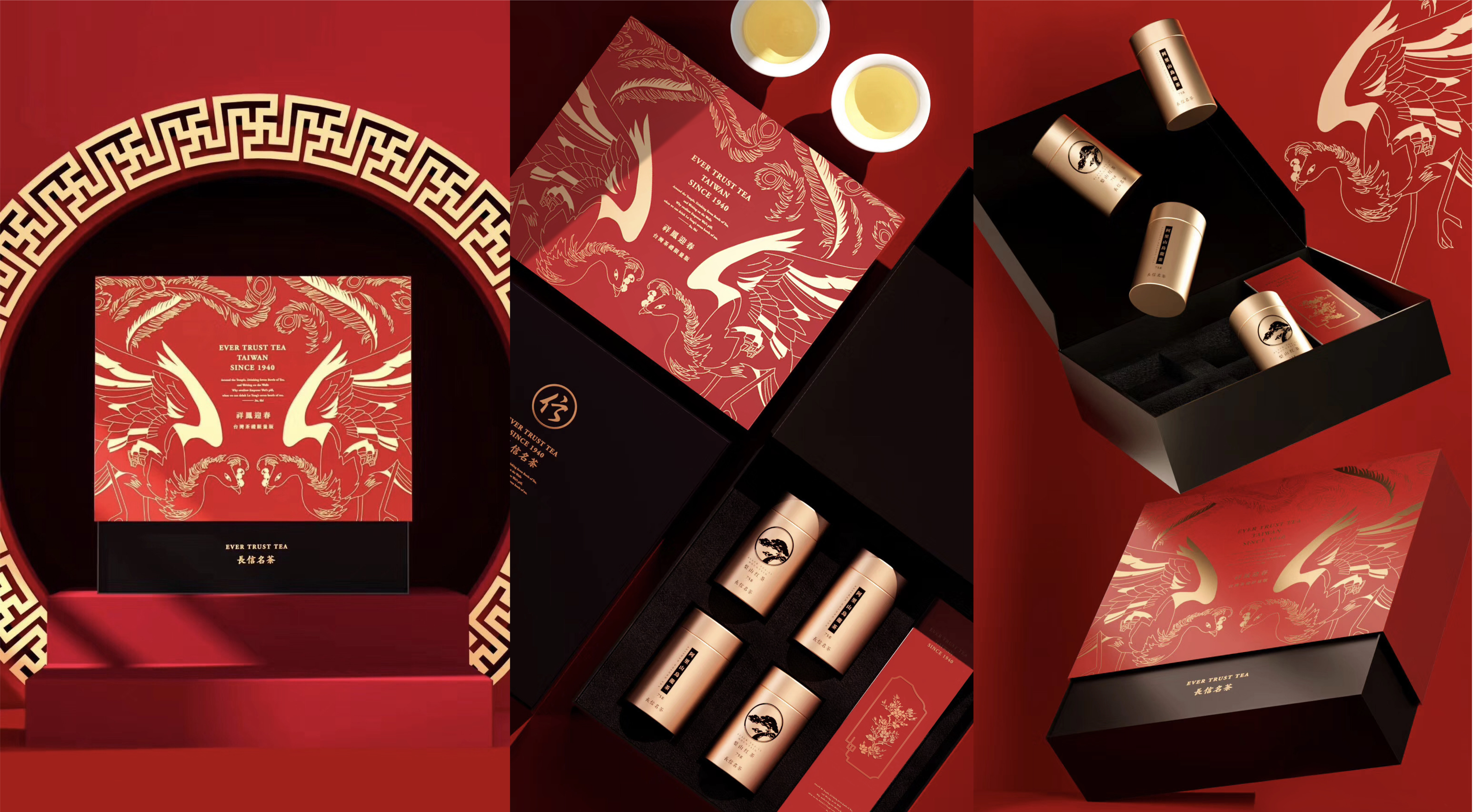
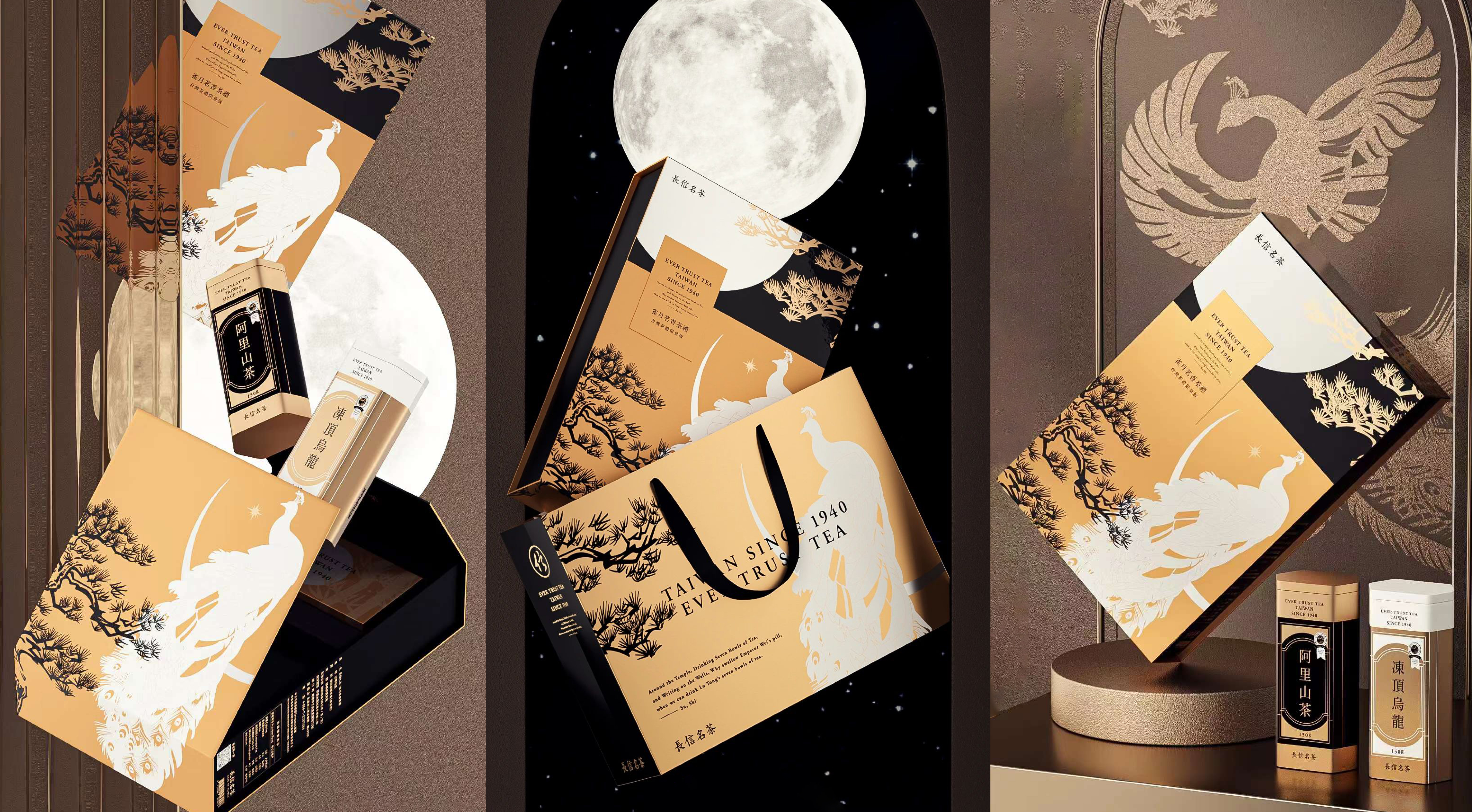
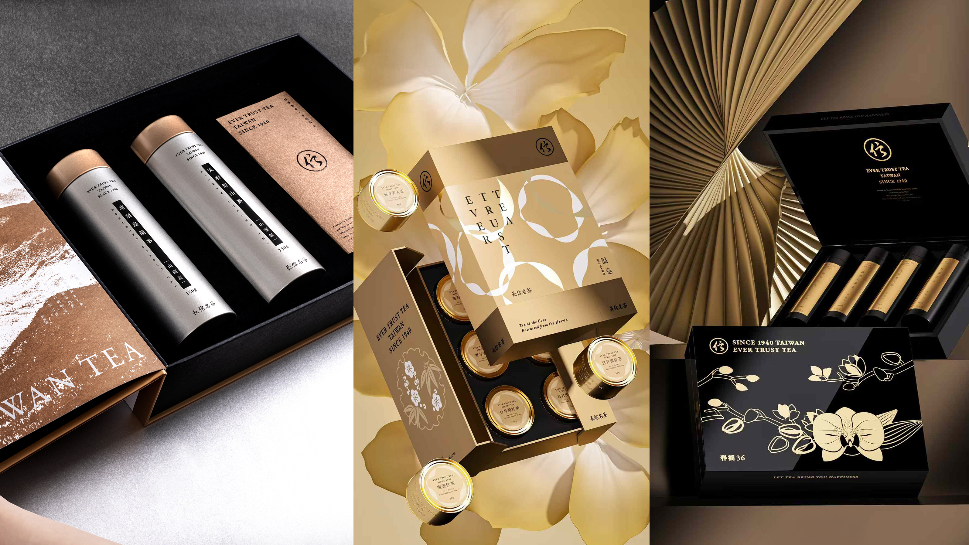
EVER TRUST TEA
1940 TAIWAN Tea
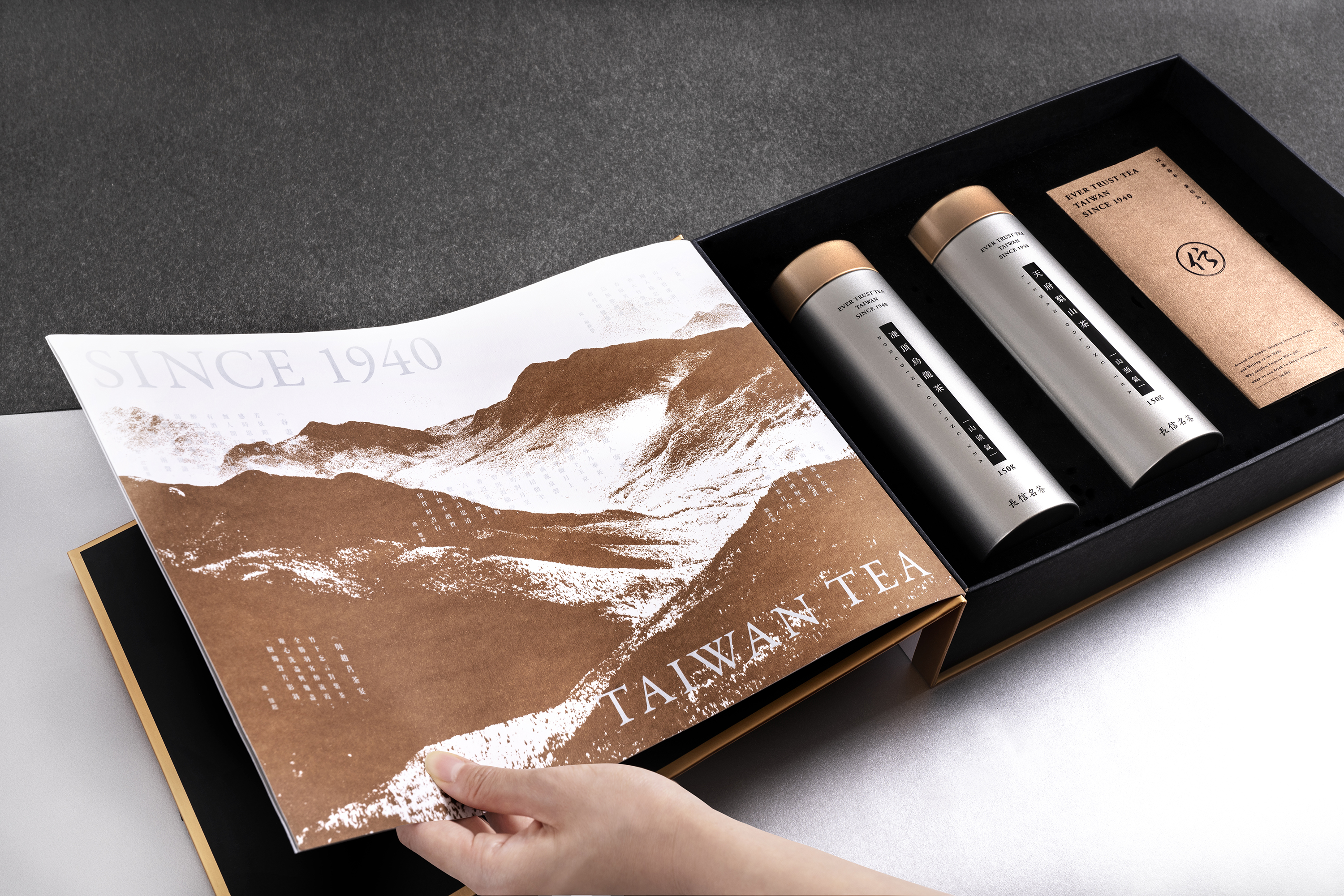
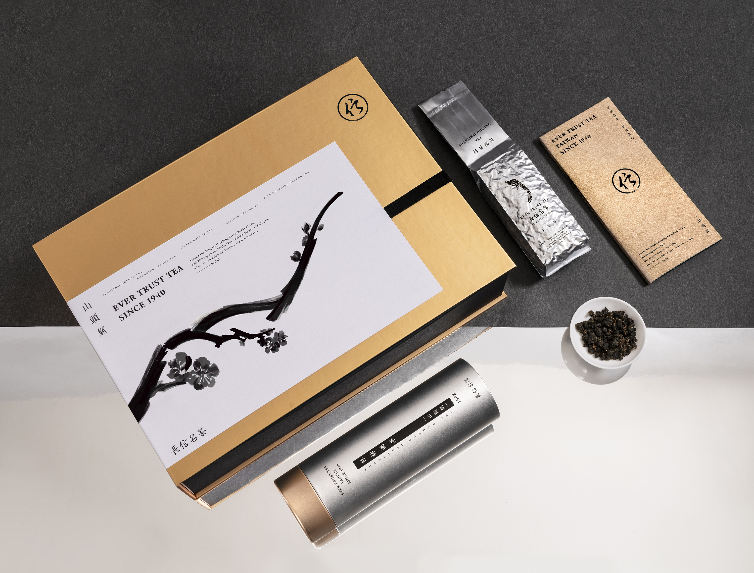
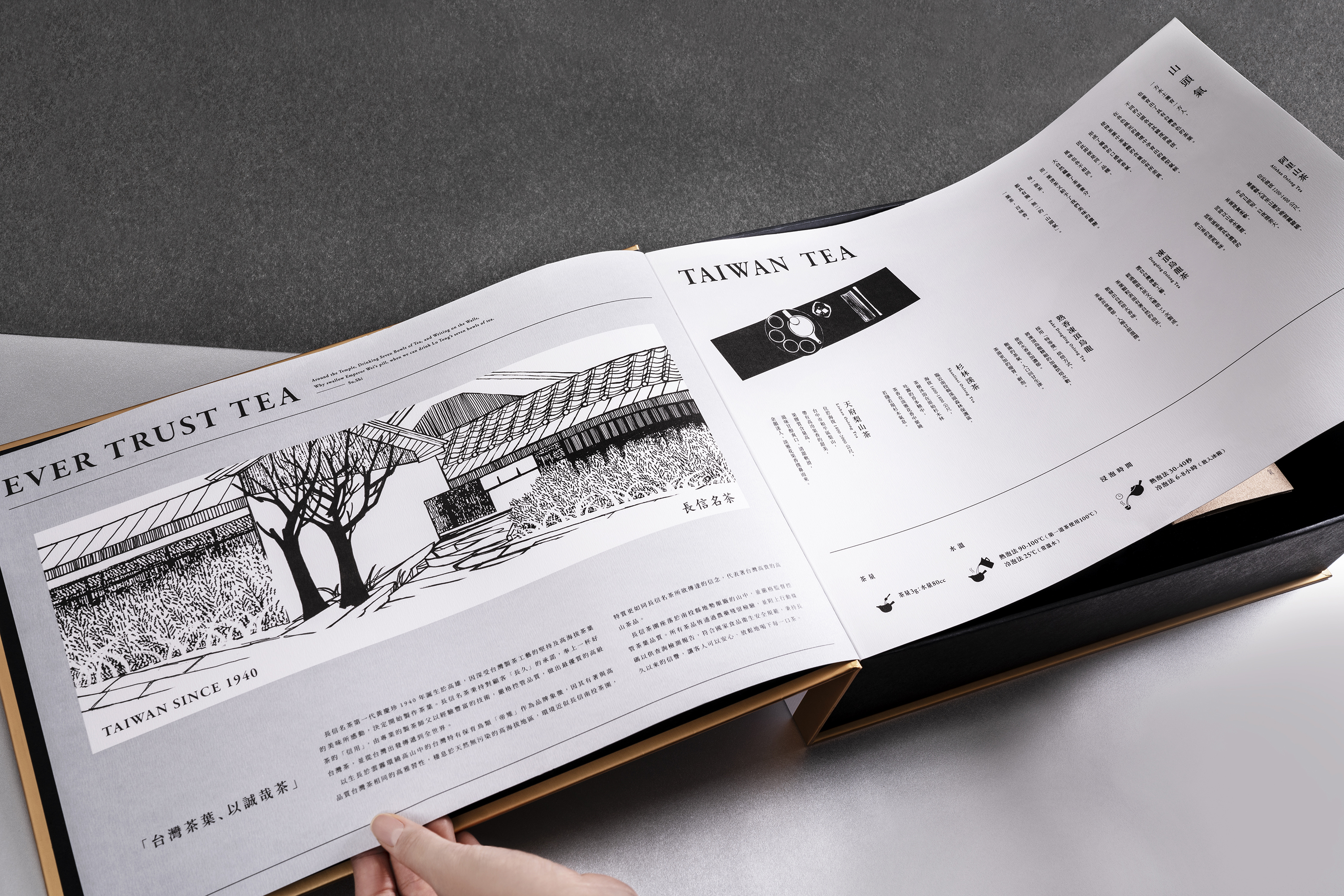
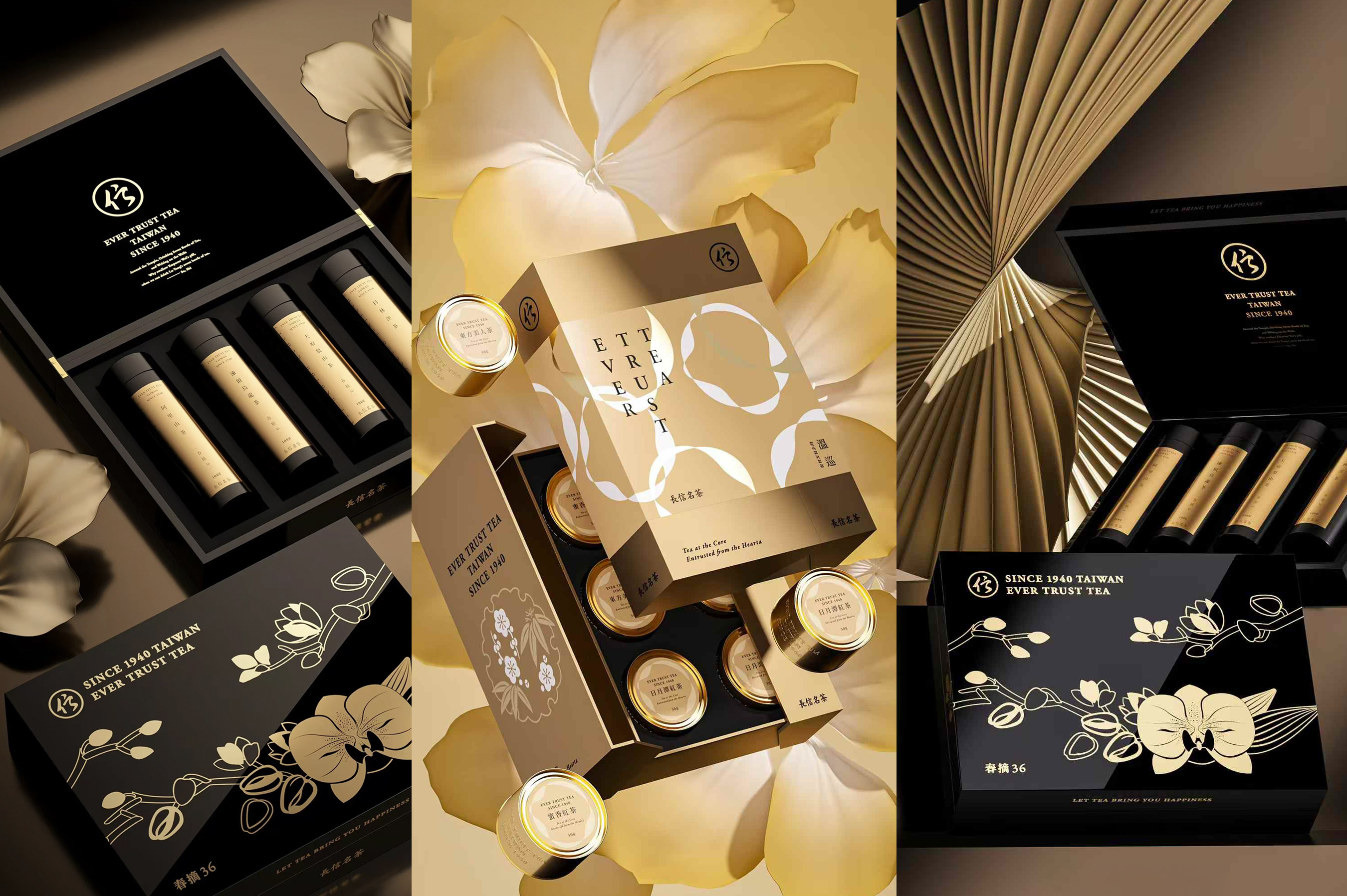
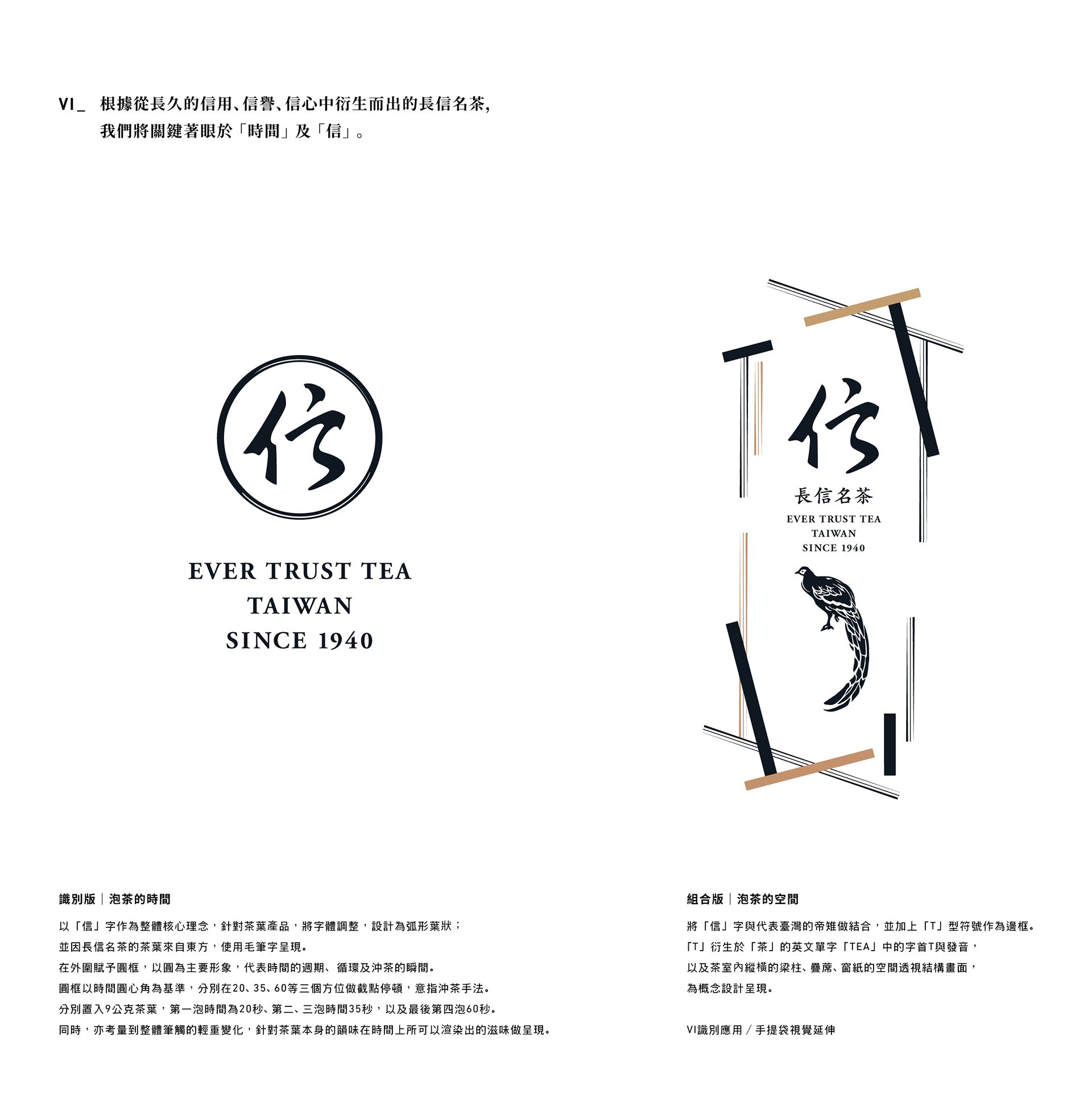
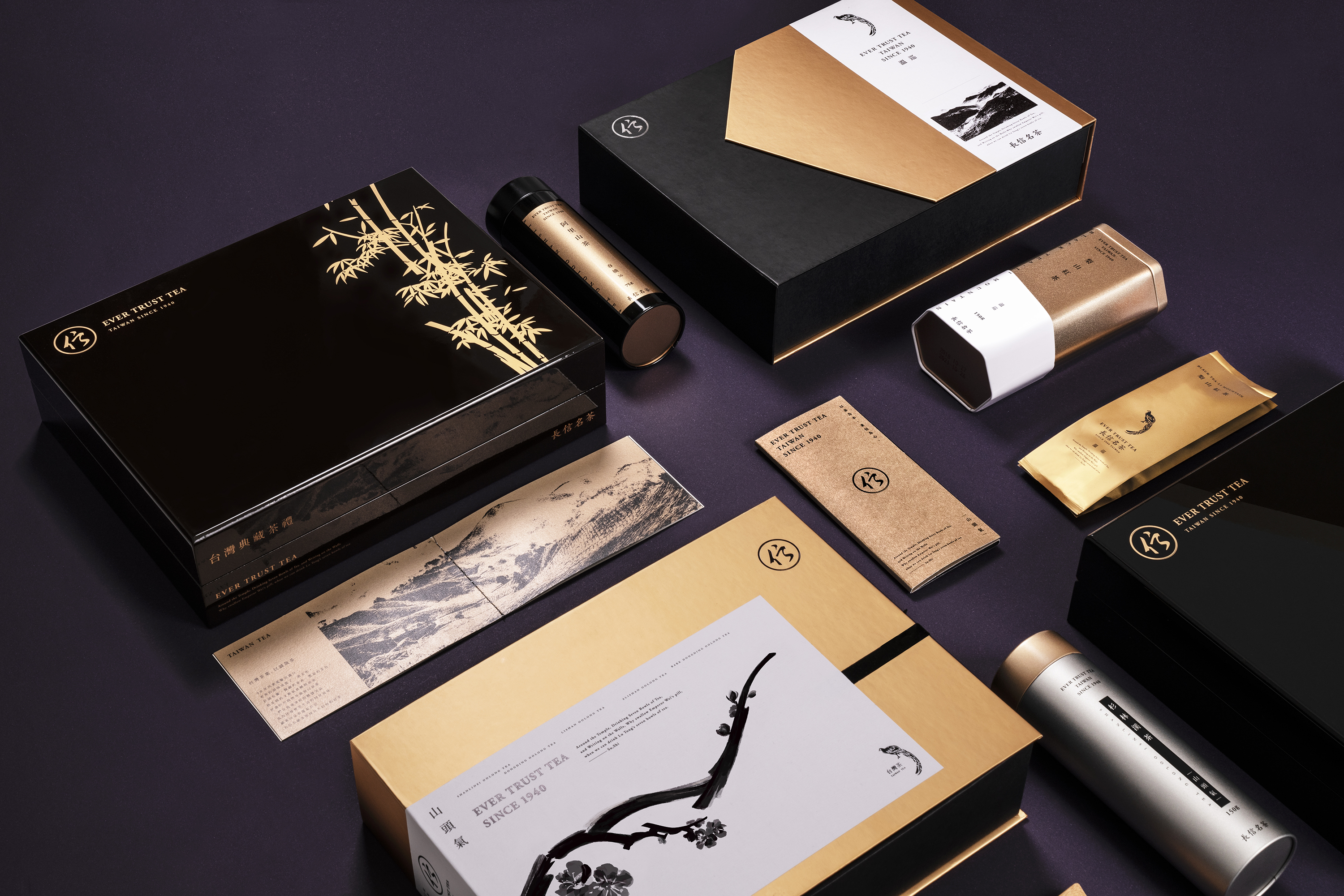
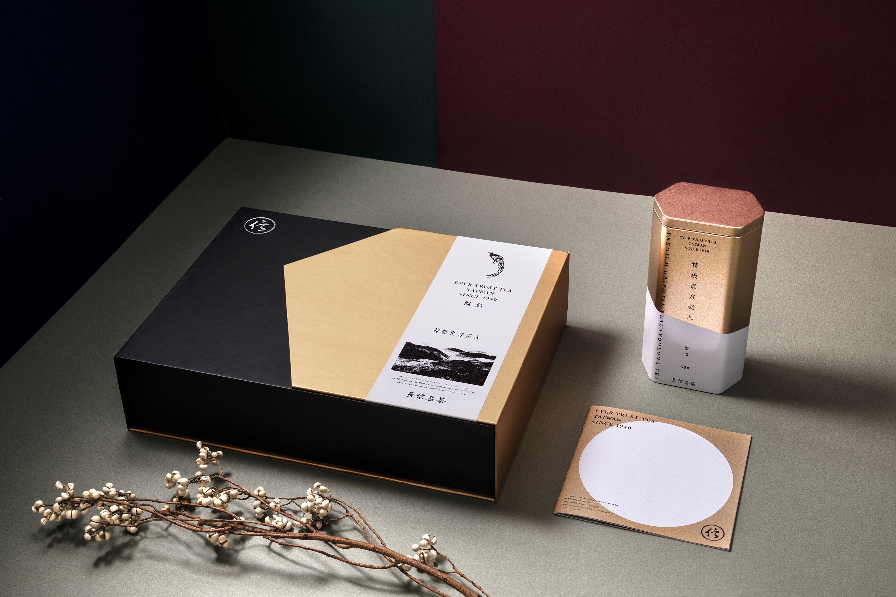
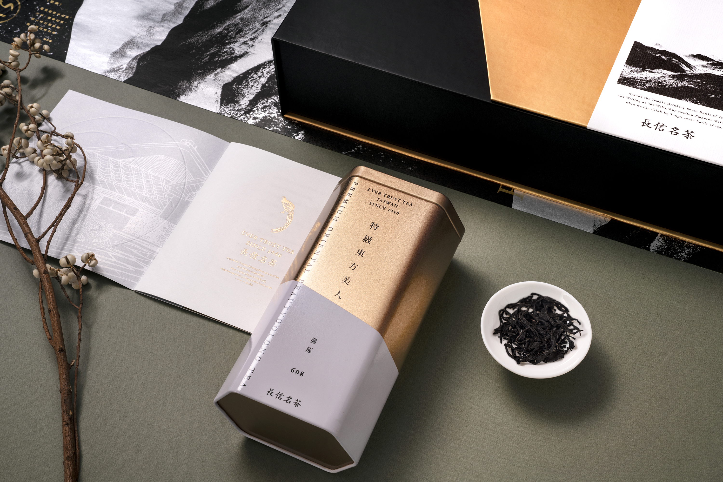
Tea at the Core, Entrusted from the Heart
Fine Taiwanese Tea, Starts from the Heart
In the 1950s, the export of tea was at its apex and the taste of old tea was transformed into a culture. Open the curtains and the aroma and rich colors of tea will instantly bring a flair of sophistication to the tea room. The comfort of the space sublimates the taste of tea, and the laughter and joy of people exchanging pleasantries here becomes a sweet taste of joie de vivre in an unpredictable world. Customers encounter Ever Trust Tea through the art of appreciating tea, and Ever Trust Tea insists on bringing the finest tea to customers with evermore trust and sincerity.
Born in Kaohsiung in 1940, Ching-Jen Huang, the first-generation founder of Ever Trust Tea, was touched by the persistence and craftmanship of Taiwan's tea-making masters and the profound flavors of Taiwanese tea from high altitude regions, so he decided to start making tea. With the promise of "Ever" to customers and the "Trust" in serving good tea, Ever Trust Tea's professional tea masters strictly control the quality with their seasoned techniques to make the best quality Taiwanese tea and share it from Taiwan to the world.
☞ CIIE-China International Import Expo 2020
☞ China Xiamen International Tea Industry Fair 2019
☞ Published in Sandu Culture Media "TIMA for TEA-Branding&Packaging Designs of Tea" 2021
BBH GRP
B-WHITE
BBH“Miracle of beauty brought about by the cutting-edge technology of the product.”
Art & Science: Grounded in Science. Bringing innovation through the spirit of scientific inquiry and challenge. Wonder and excitement, with every product design our customers encounters. Duality of art and science has shaped everything we create.
The design of BEAUTE WHITE is a micro-architecture dedicated to light.
The Dimensional CornerThe typography does not remain confined to a single plane; instead, it flows and extends across the folded corner of the packaging.
This design transcends planar limitations, symbolizing that the efficacy of science is multi-dimensional—penetrating from the epidermis deep into the dermis, constructing radiance from every angle.
We use pristine paper textures to lay the foundation of a snow-white canvas. Ultimately, allowing the skin to reclaim its emotional radiance under the structural support of rationality.
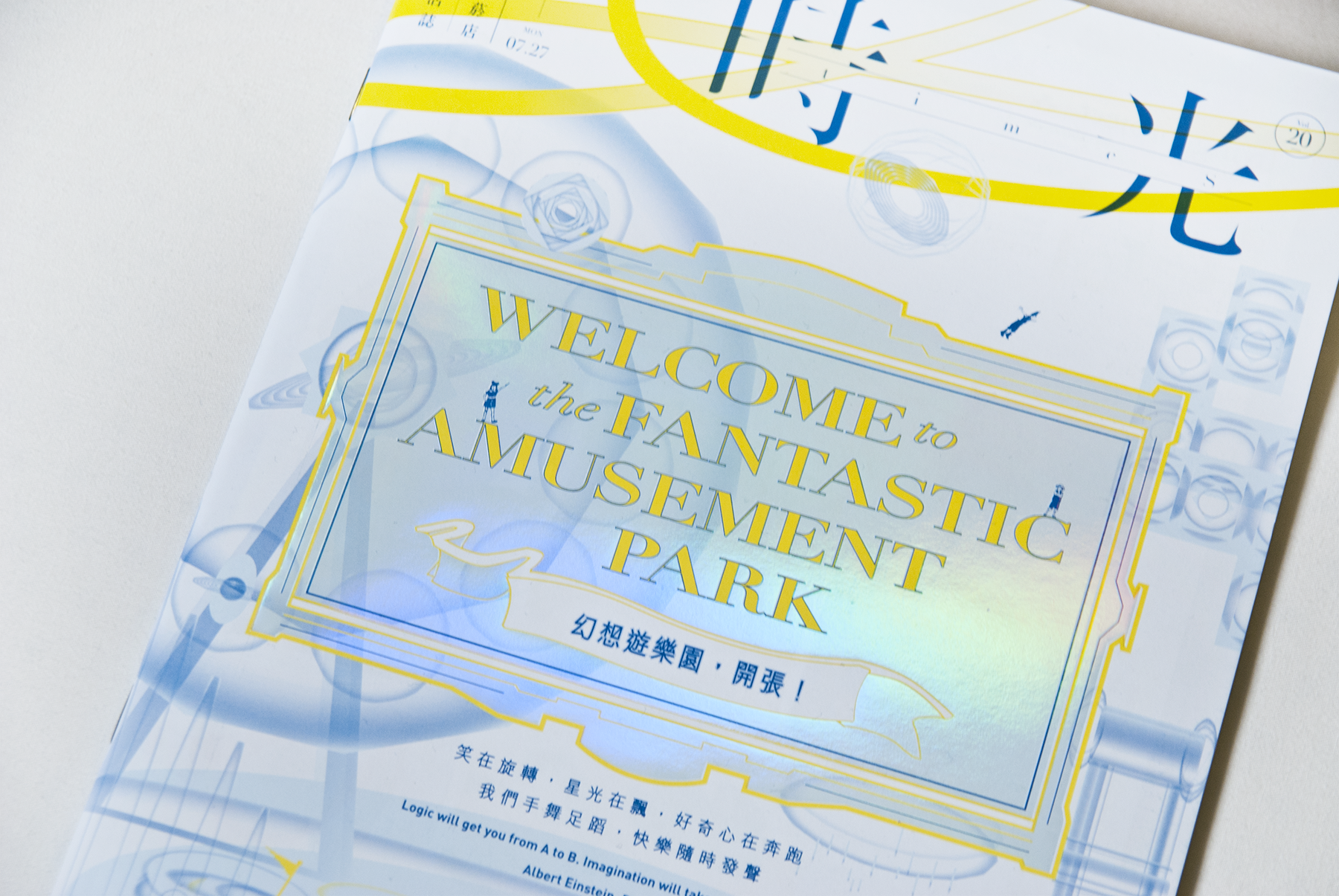
ESLITE BOOKSTORE
eslite Design Work
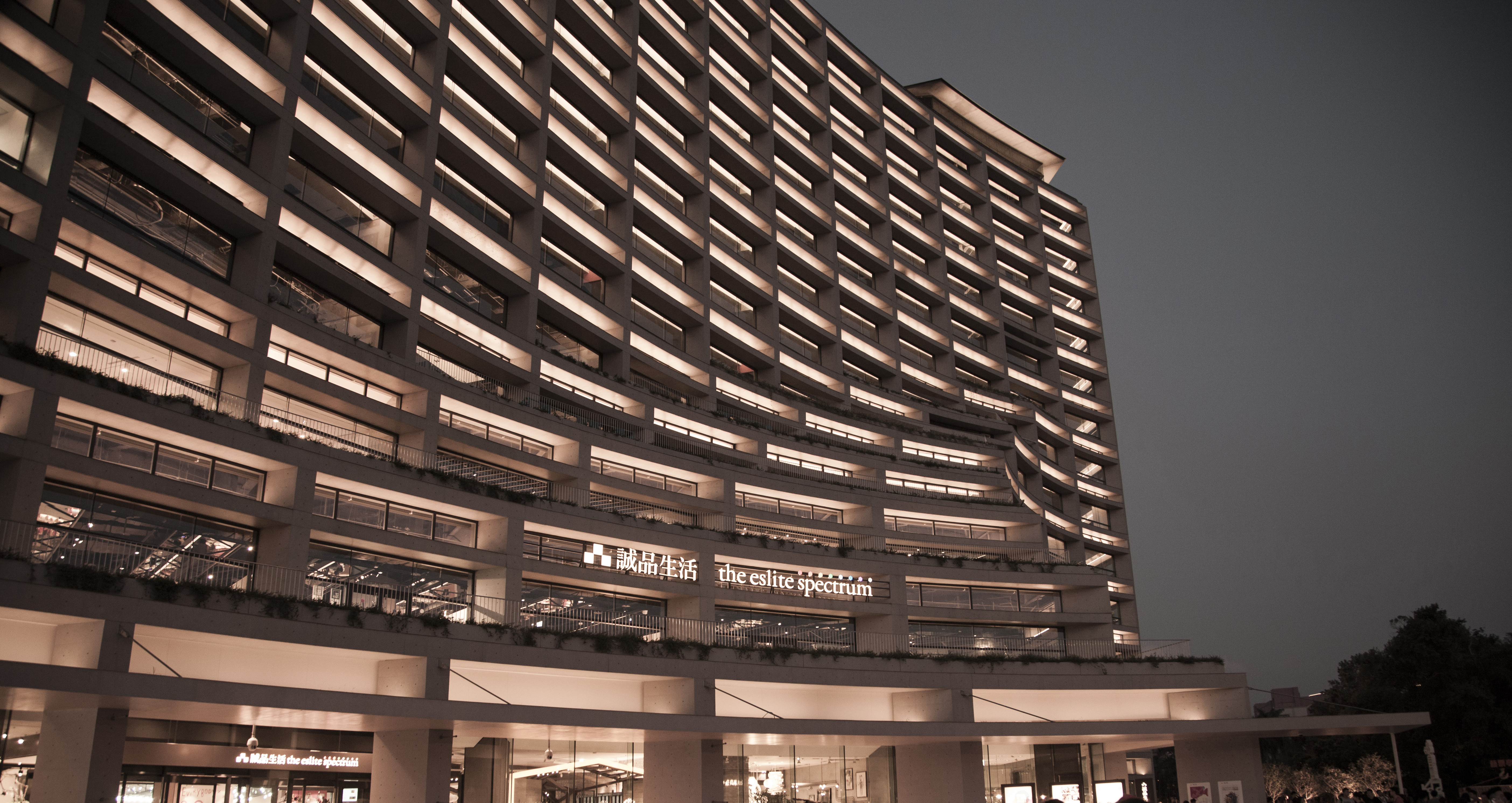

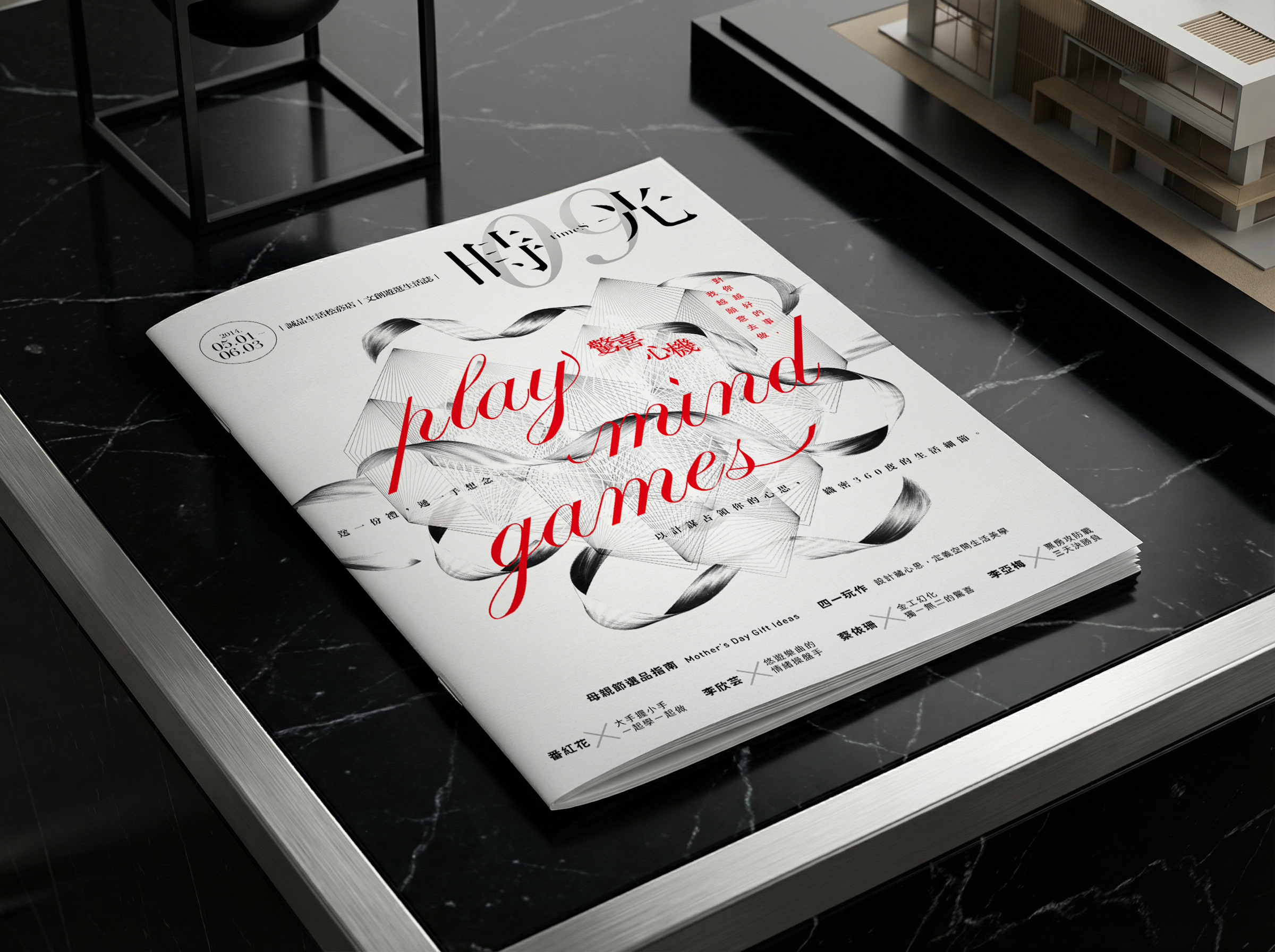
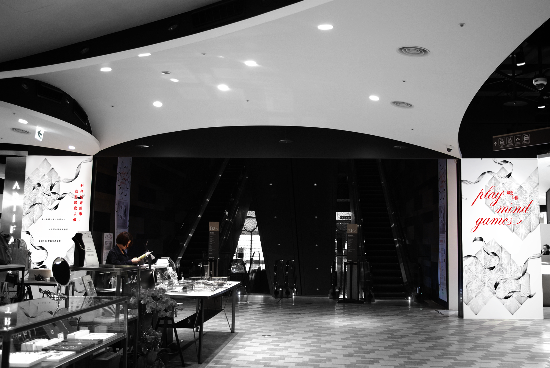
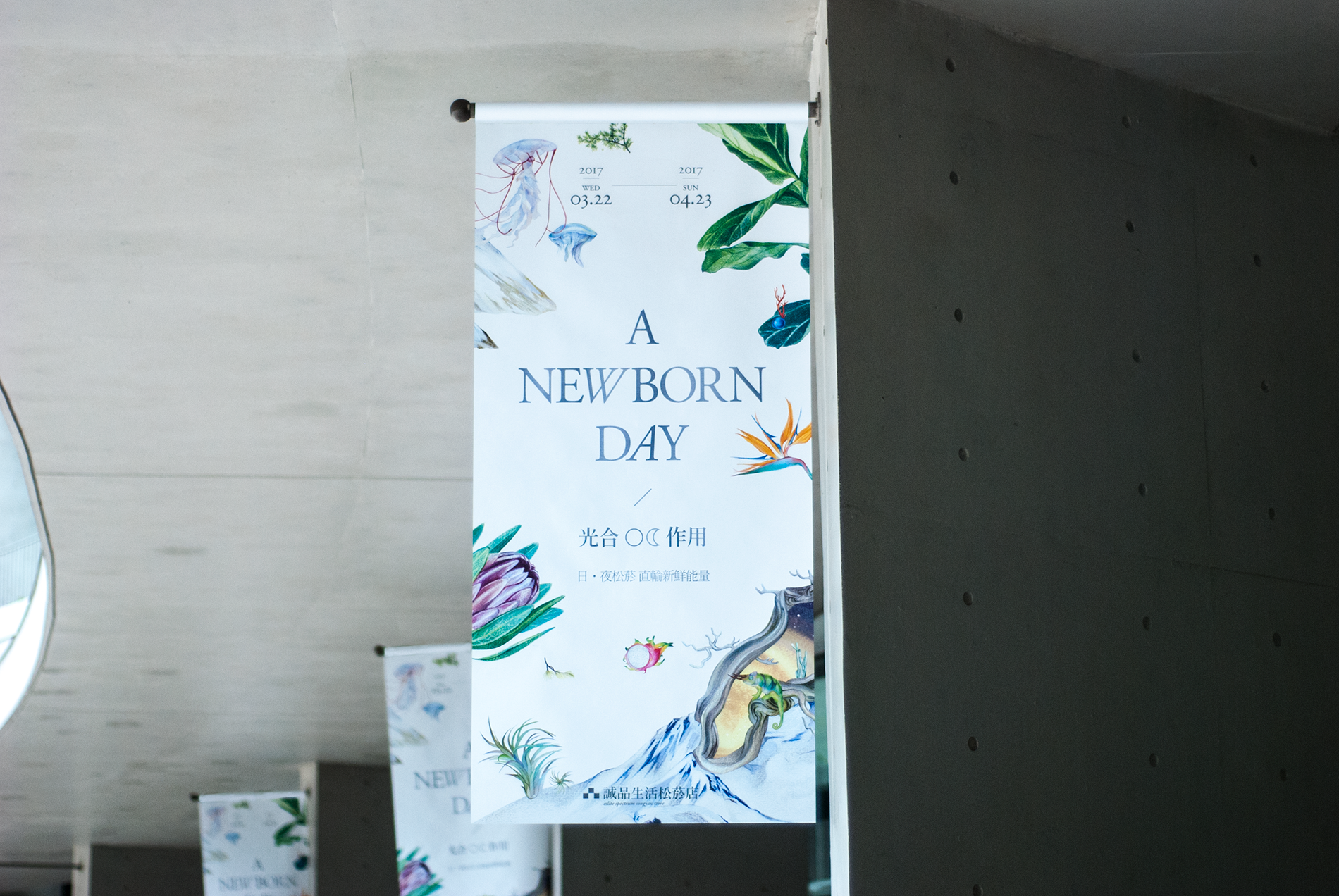


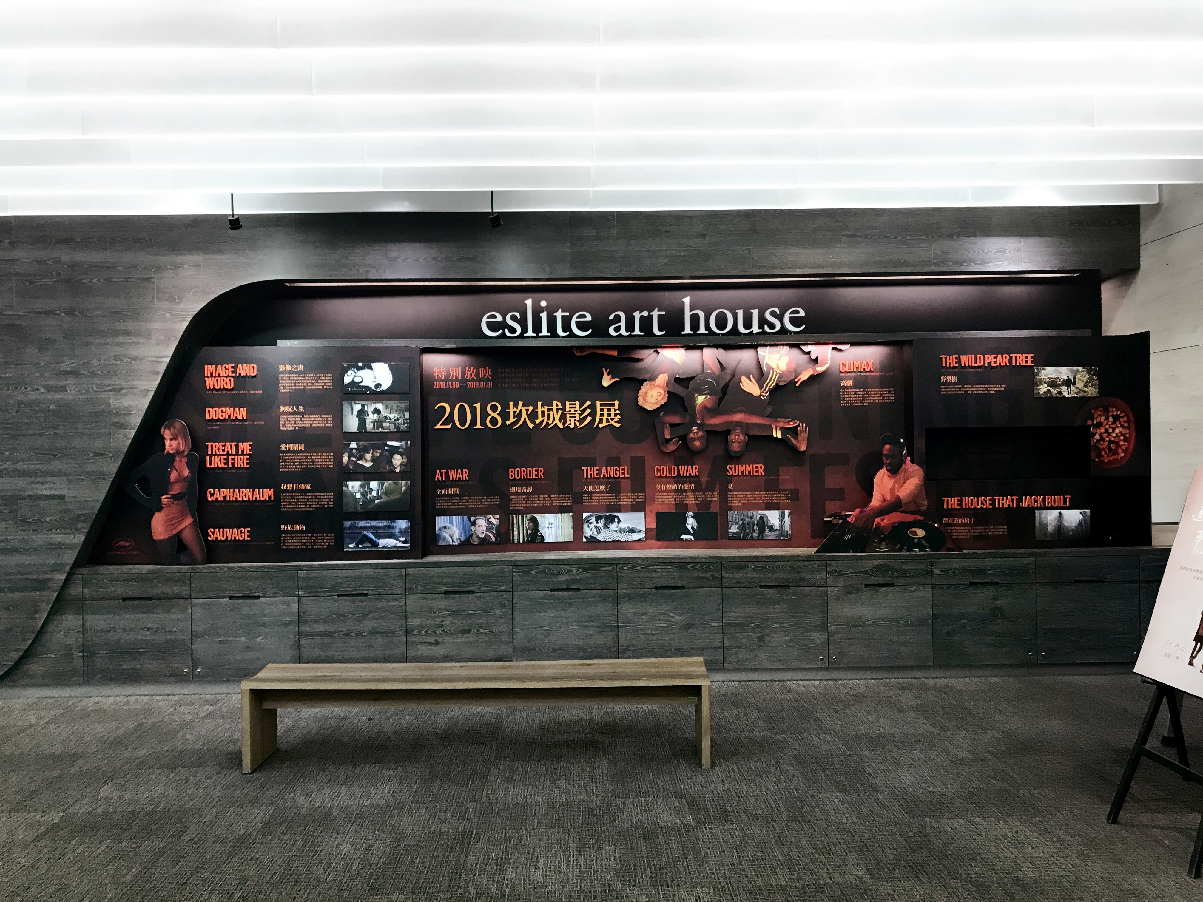
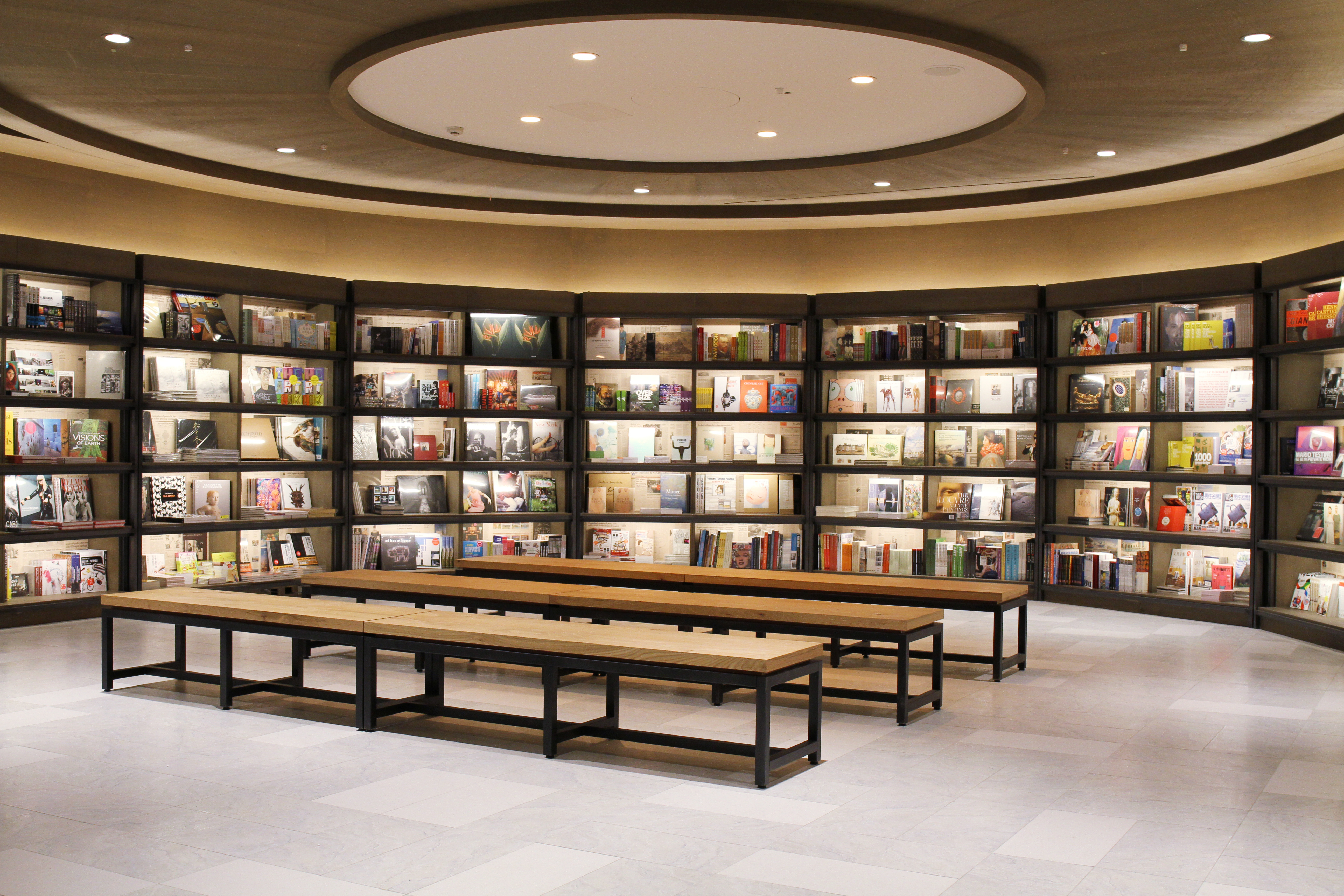


eslite Bookstore: A Cultural Sanctuary
Established in 1989, eslite Bookstore derives its name from the ancient Greek word "élite," symbolizing the pursuit of excellence and the cultivation of a better society.
More than just a bookstore, eslite serves as a sanctuary for the soul. Centered on the core values of "Humanities, Art, Creativity, and Life," it transcends traditional boundaries by seamlessly integrating reading with diverse cultural exhibitions. With its unique spatial aesthetics—characterized by warm wooden flooring, ambient lighting, and an extensive literary collection—eslite offers a quiet spiritual haven for the busy urbanite.
From pioneering the "24-hour bookstore" model to its composite business approach featuring performances, galleries, creative commerce, and dining, eslite has become Taiwan's definitive cultural landmark. It stands as a pivotal force in promoting reading culture and lifestyle aesthetics across the global Chinese-speaking community.
International Recognition: eslite was named Asia's Best Bookstore by TIME Magazine and recognized by CNN as one of the World's Coolest Bookstores.
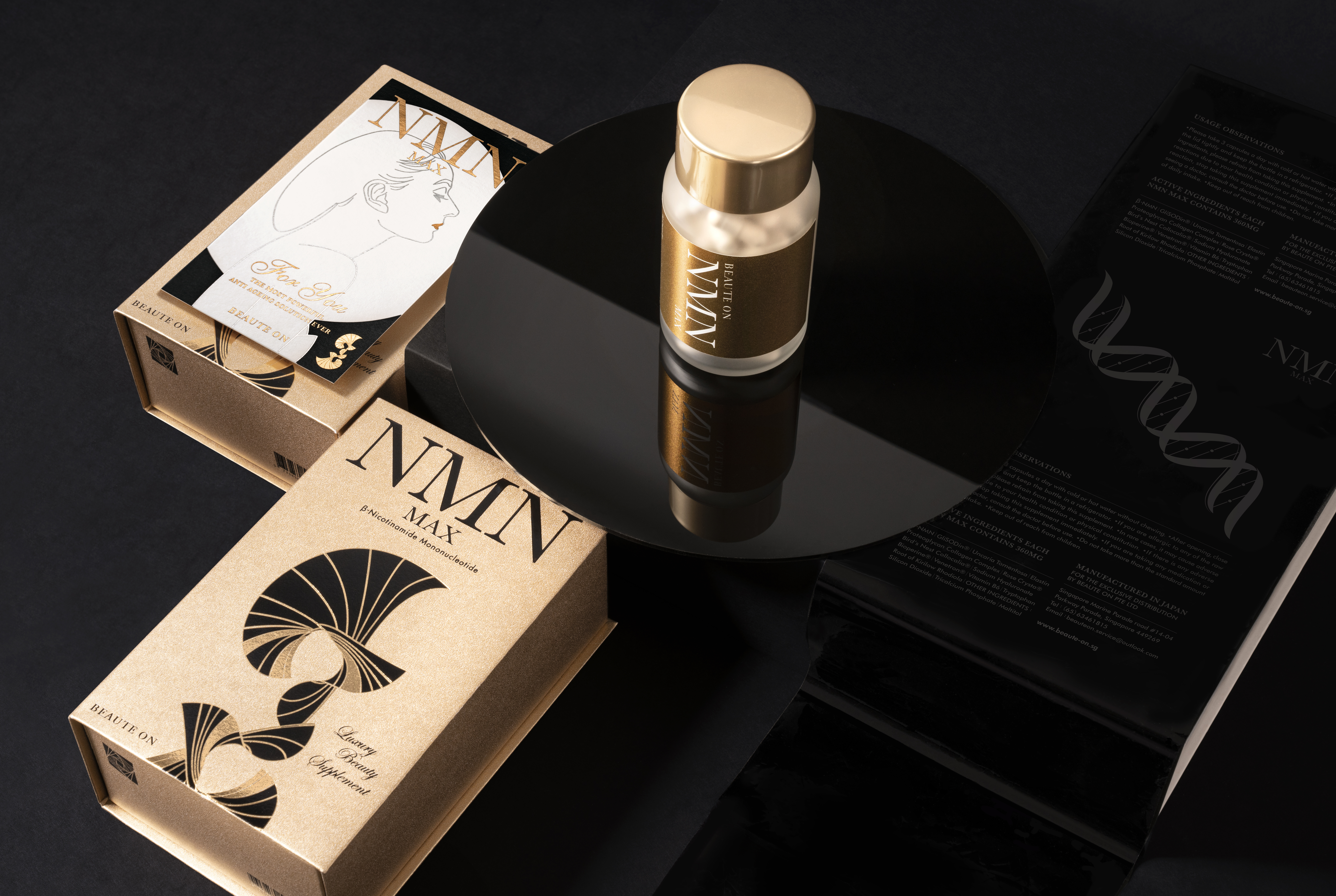
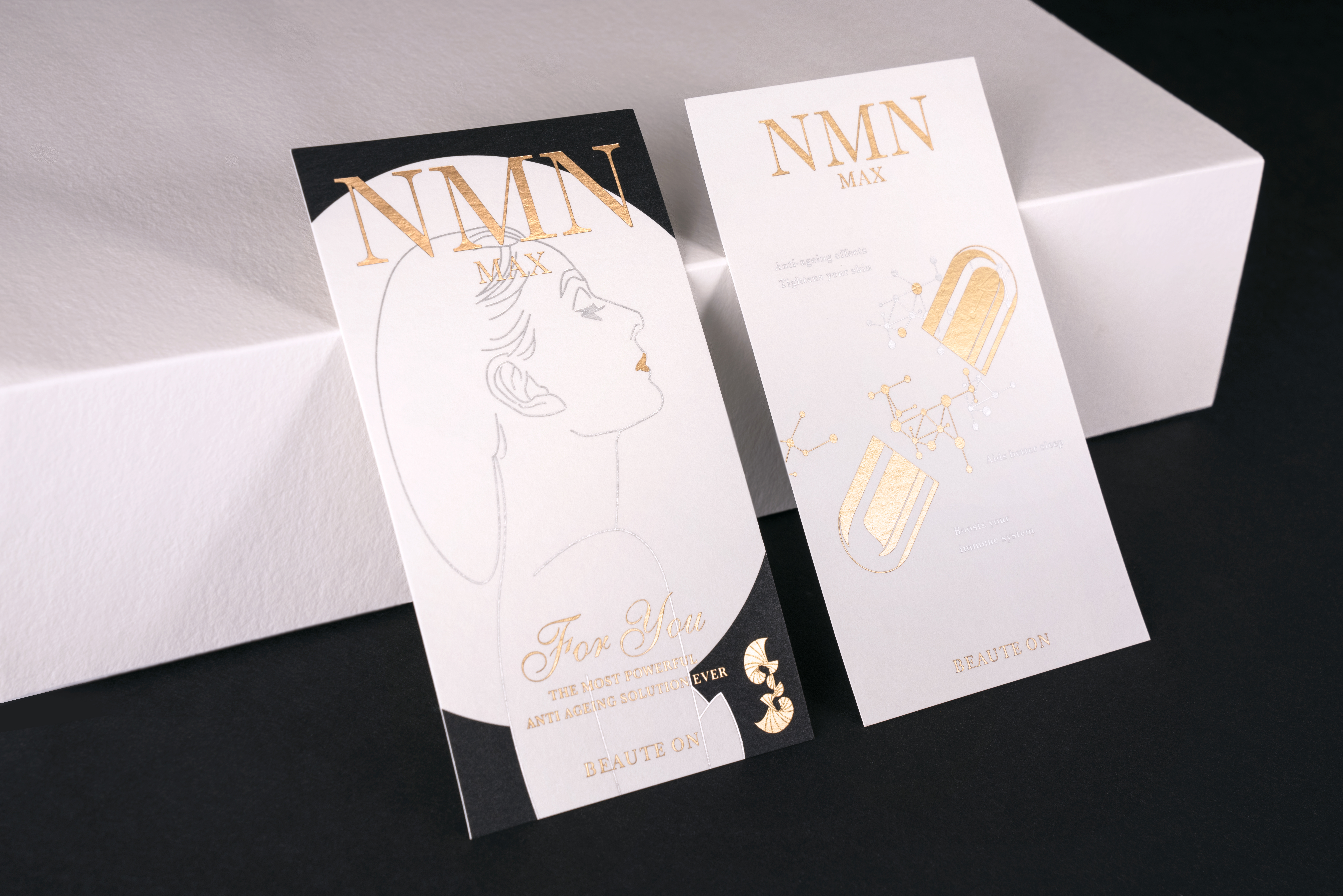
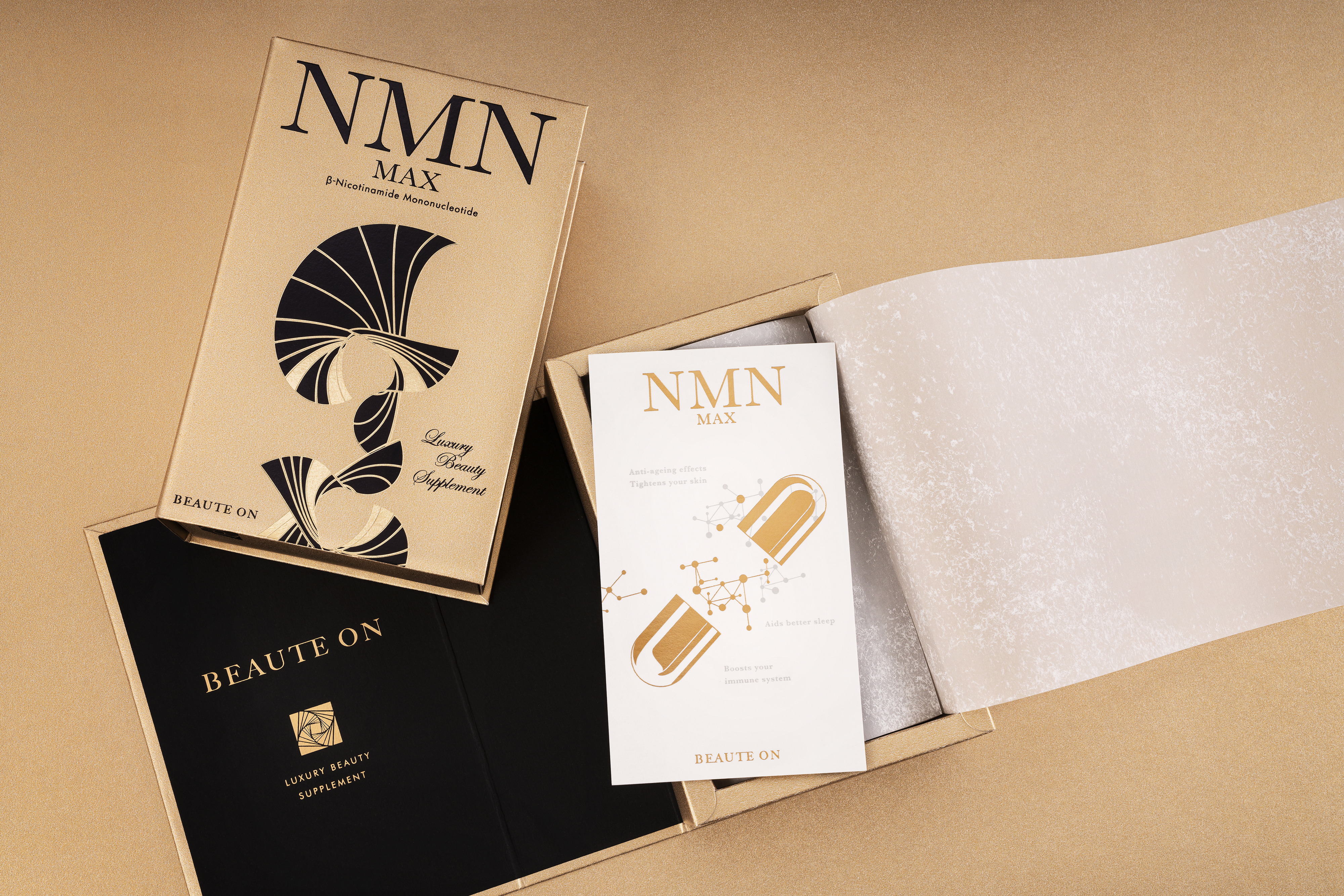
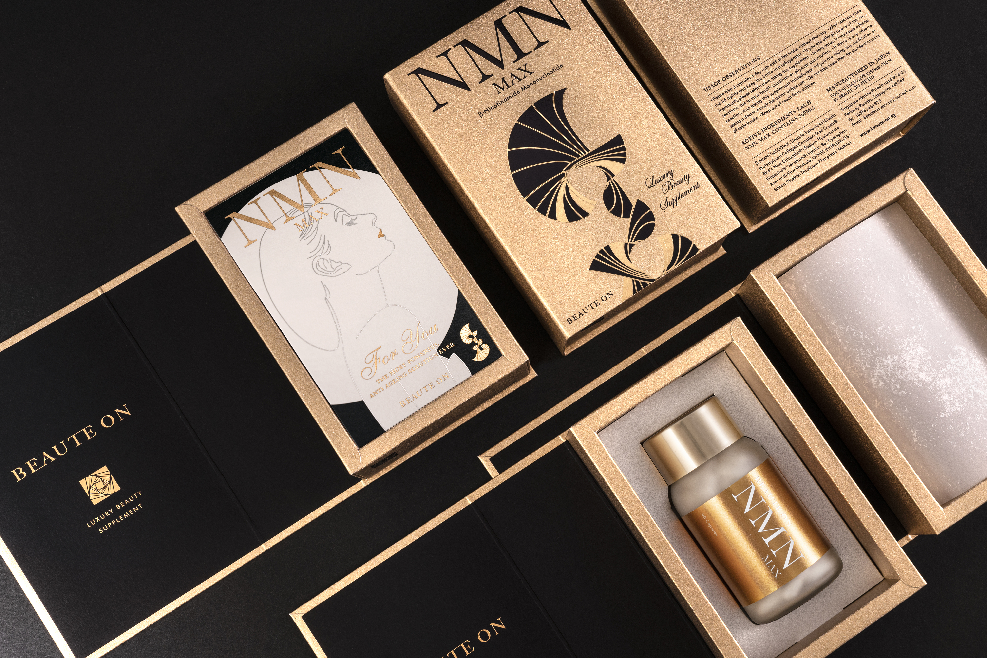
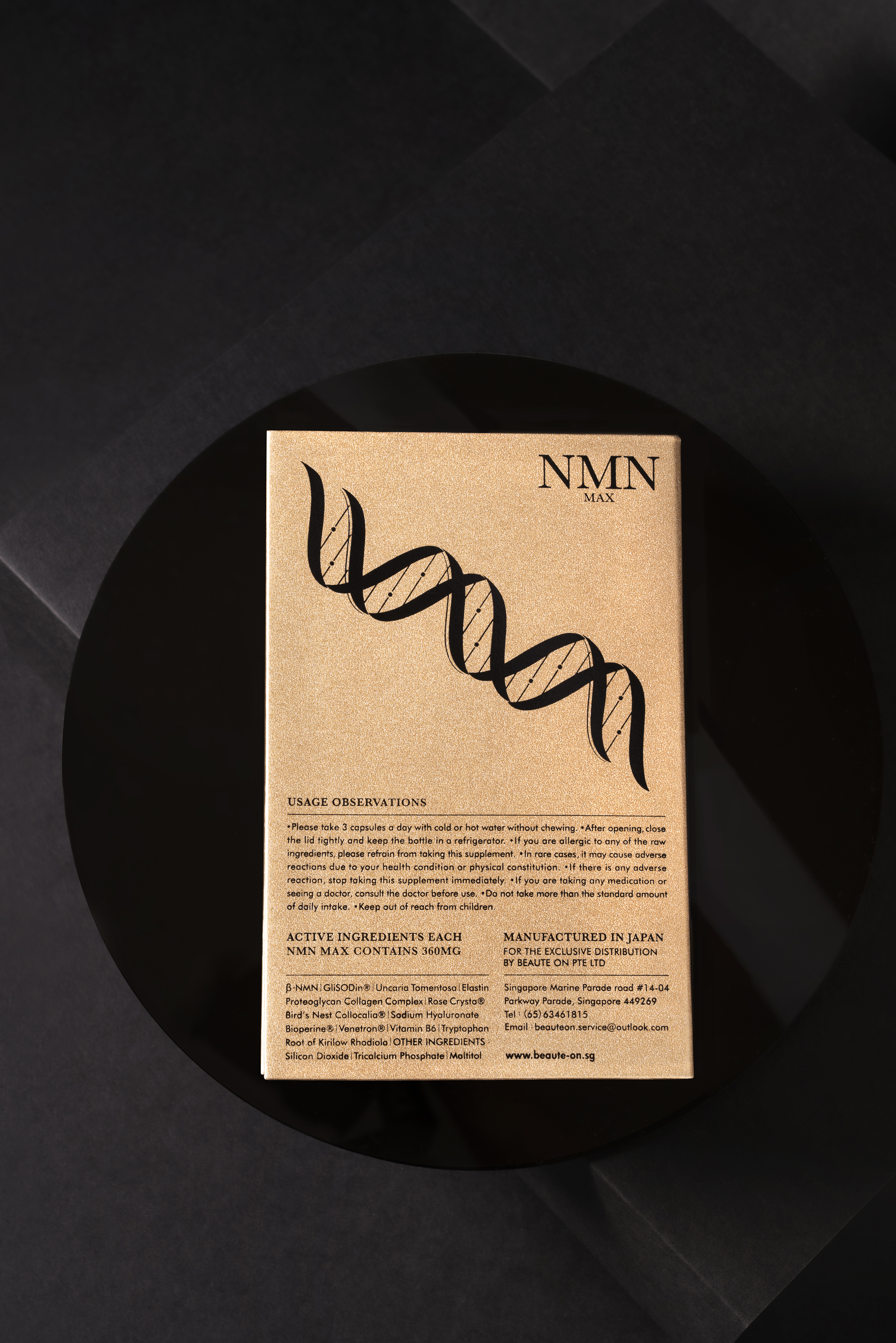
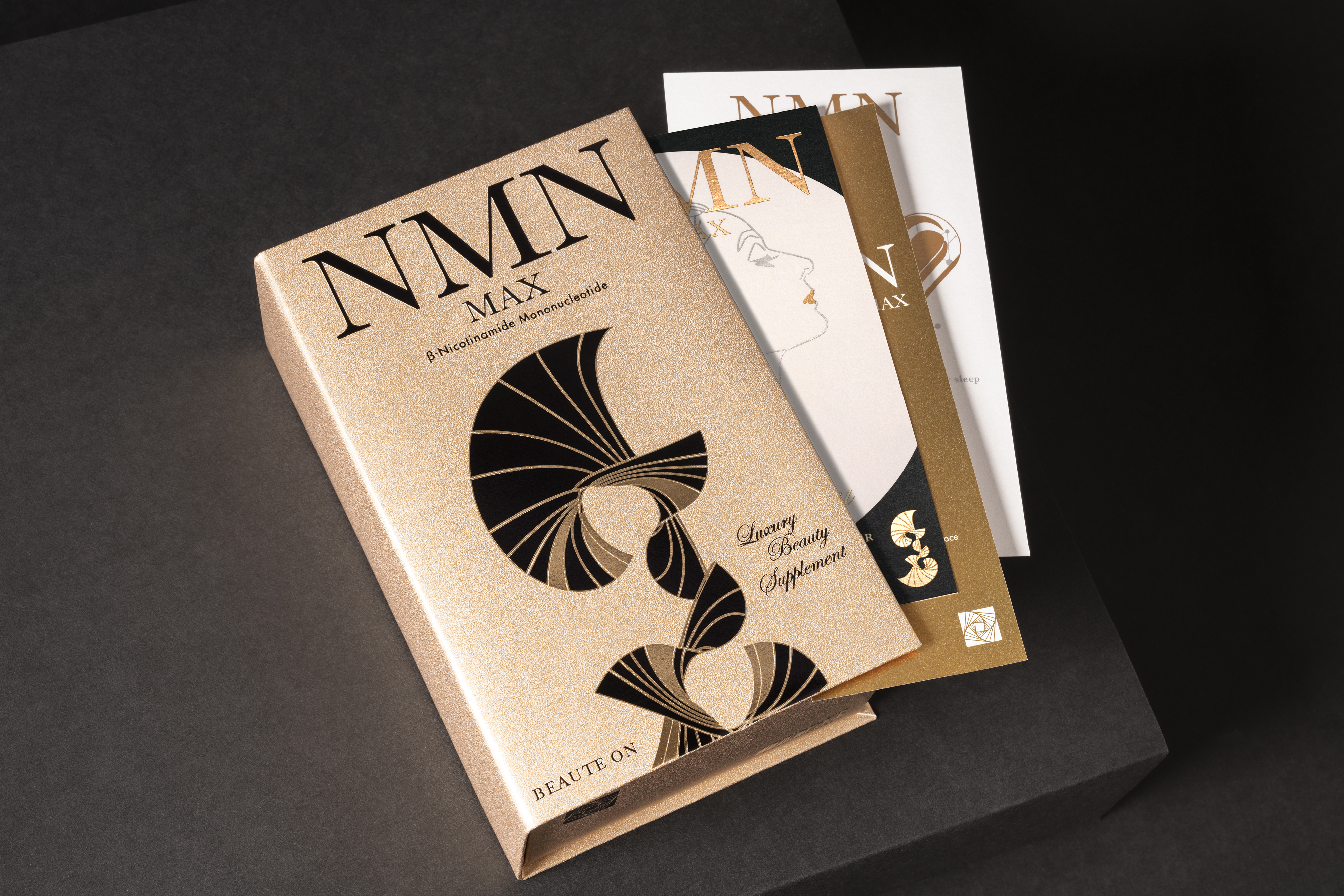
BEAUTE ON
BEAUTE NMN
The golden dawn light that symbolizes the golden age of the sun and the moon, presented through cutting-edge technology.
The packaging is based on the rationality of high-tech, golden ratio and other elements that constitute the theme of youth, beauty and other sentimental outcomes.
The box is made of high quality pearlescent aluminum foil materials imported from Japan that can reflect various metallic colors. On the front cover, is presented a flower blossoming freely, as well as a dancer moving gracefully onstage. Presented in a gold segmentation technique, the DNA symbols are interspersed with images of beautiful elements on the back, presenting a perfect combination of technology and life.
A card is included in the box, with a pattern is made of hot-stamped gold and matte silver, outlining an enchanting beauty under the bright moonlight on the front. The French word "BEAUTE", which symbolizes allure, beauty and nobility, is taken as the brand name. The NMN time capsule is presented on the reverse side, both of which are full of artistic visual effects, dramatically demonstrating the brand's commitment to bringing consumers the most advanced technology to travel through time and space, and to return to youthful vitality that stays.
☞ Market Impact: This differentiation propelled the brand to become the industry's No.1 best-seller immediately upon launch.
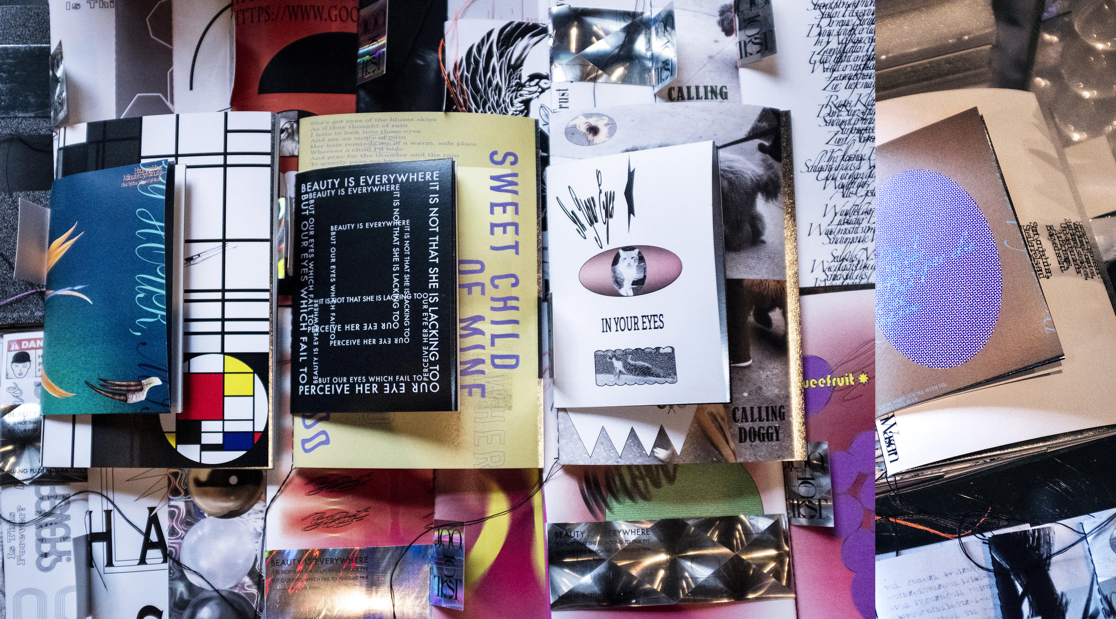
100TEST
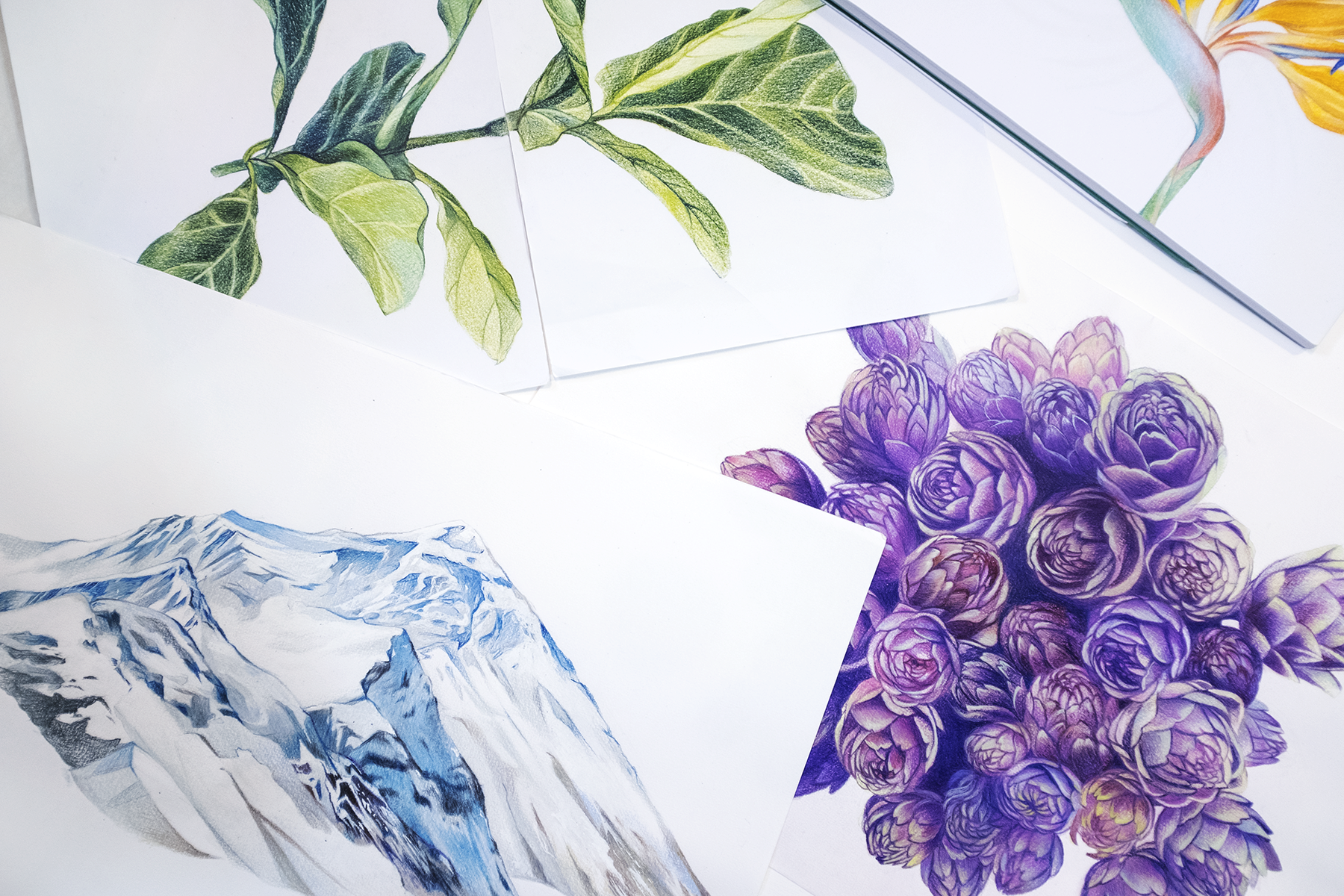
ART JOURNAL
Beauty is everywhere.It is not that she is lacking to our eye, but our eyes which fail to perceive her. Auguste Rodin
The genesis of everything in the zero-dimensional space. Because of the desire to experience oneself, the soul is projected in the material world. If a book were to present a hundred scenic lookouts,what colors of life would be observed?
1OO TEST: An Experiment in Visualizing Inspiration.
This project redefines the notebook: it is no longer just a passive carrier for writing, but an active source of creative energy.
1OO TEST "Art Journal" is an experimental project by our art R&D team. Through exploring 100 combinations of visual design, mixed media, and binding techniques, we elevate the notebook from a simple carrier into a source of inspiration. It aims to visualize the beauty of life to awaken the user's creativity.
☞ 2018 Taipei Art Book Fair–First Exhibitio
☞ 2020 Asia-Pacific Design Collection No.16
NSS INT'L
TAROT CEO
Faith is the bird that feels the light and sings when the dawn is still dark.
In tarot, the scepter symbolizes the element of fire and is the first of the four elements, representing creativity, growth, action and enthusiasm, as well as possessing infinite potential and creativity, courage to accept challenges and willingness to interact with others.
The TAROT.CEO logo is inspired by the Ace of Wands, forging the letters "T" and "CEO" into a masterfully crafted scepter. By blending ornate classical metallic inlays with elegant modern typography, the interlocking design symbolizes the cosmic interdependence and mutual prosperity of all things. The inlaid spheres, representing both celestial planets and crystal balls, embody the power of purification and positive energy.
The design of the website is based on the concepts of occult, astrology, Pegasus and mythology, and the brand concept and visuals are exquisitely designed to strengthen the professionalism of TAROT CEO, showcasing the details and the overall image of the company.
LOVISM
BOTANICAL Skin Care
ENJOY IT,BECAUSE THE WORLD IS SO BEAUTIFUL
Embark on a journey to release your soul, the source of life is the sun and sea, as nature is always the deepest self - and the best healer.
LOVISM is a quality skin care brand full of pleasant surprises and high anticipations. The brand has developed highly effective skin care products for different skin types, creating both "skin-friendly" and "environment-friendly" skin care products based on plant extracts. Girls experience the joy of receiving each LOVISM product as if receiving a gift.
Project Achievements Following the brand rebranding strategy, the business achieved breakthrough performance:
☞ Accumulated product sales across Taiwan exceeded 900,000+ units.・Received over 3,000 positive customer reviews. ・Attracted proactive partnership invitations from major live-stream platforms, department stores, and distributors.
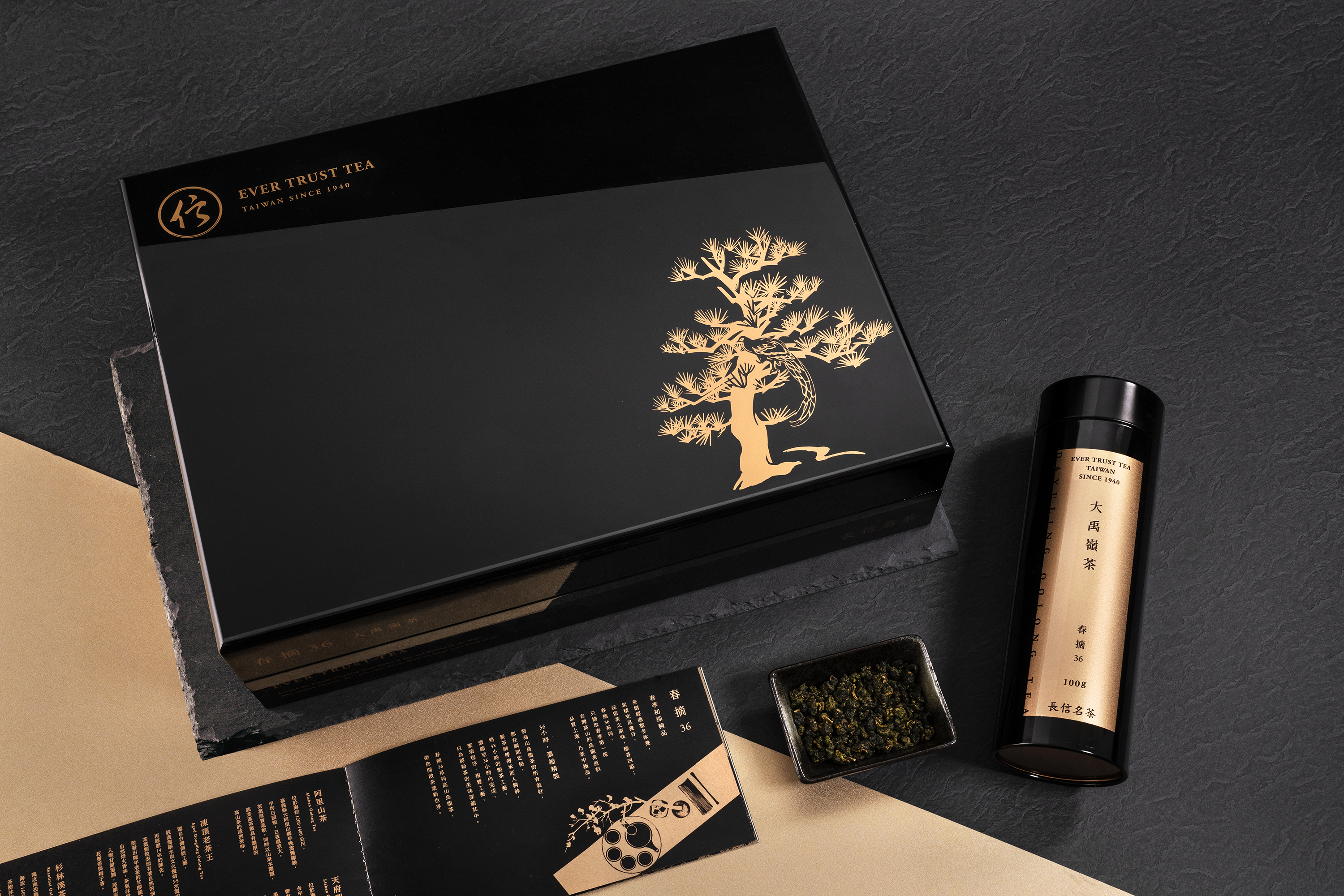
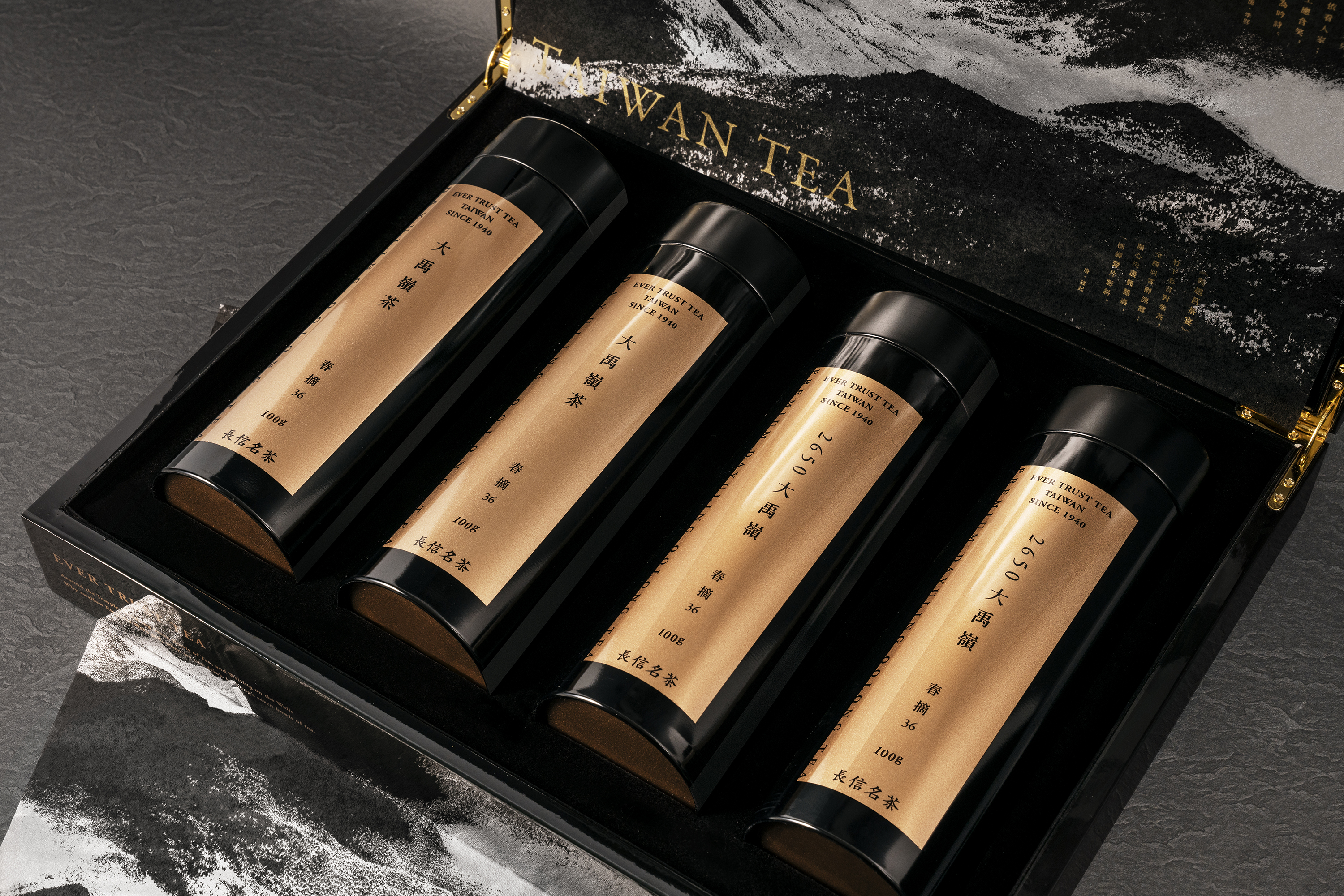
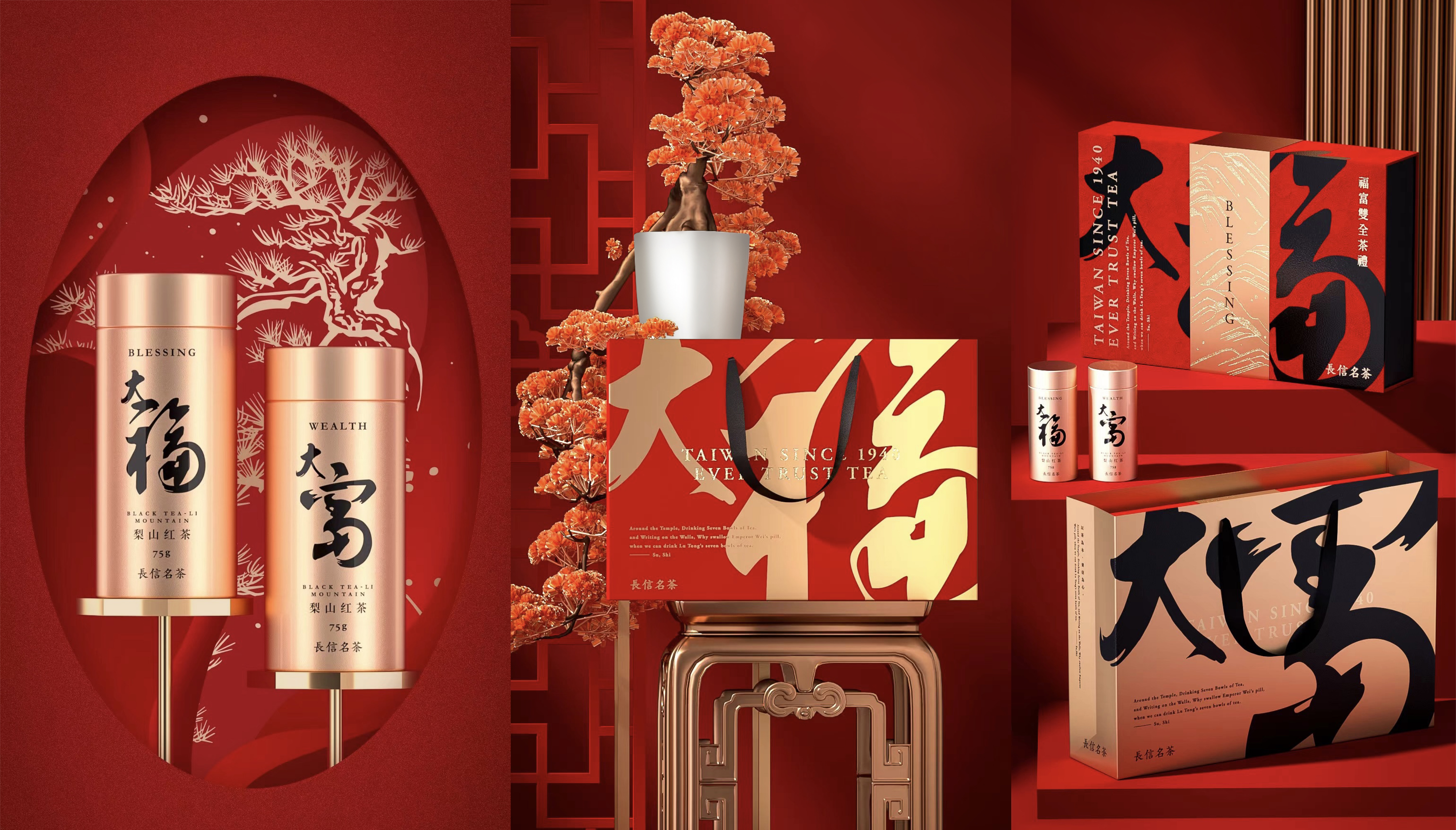
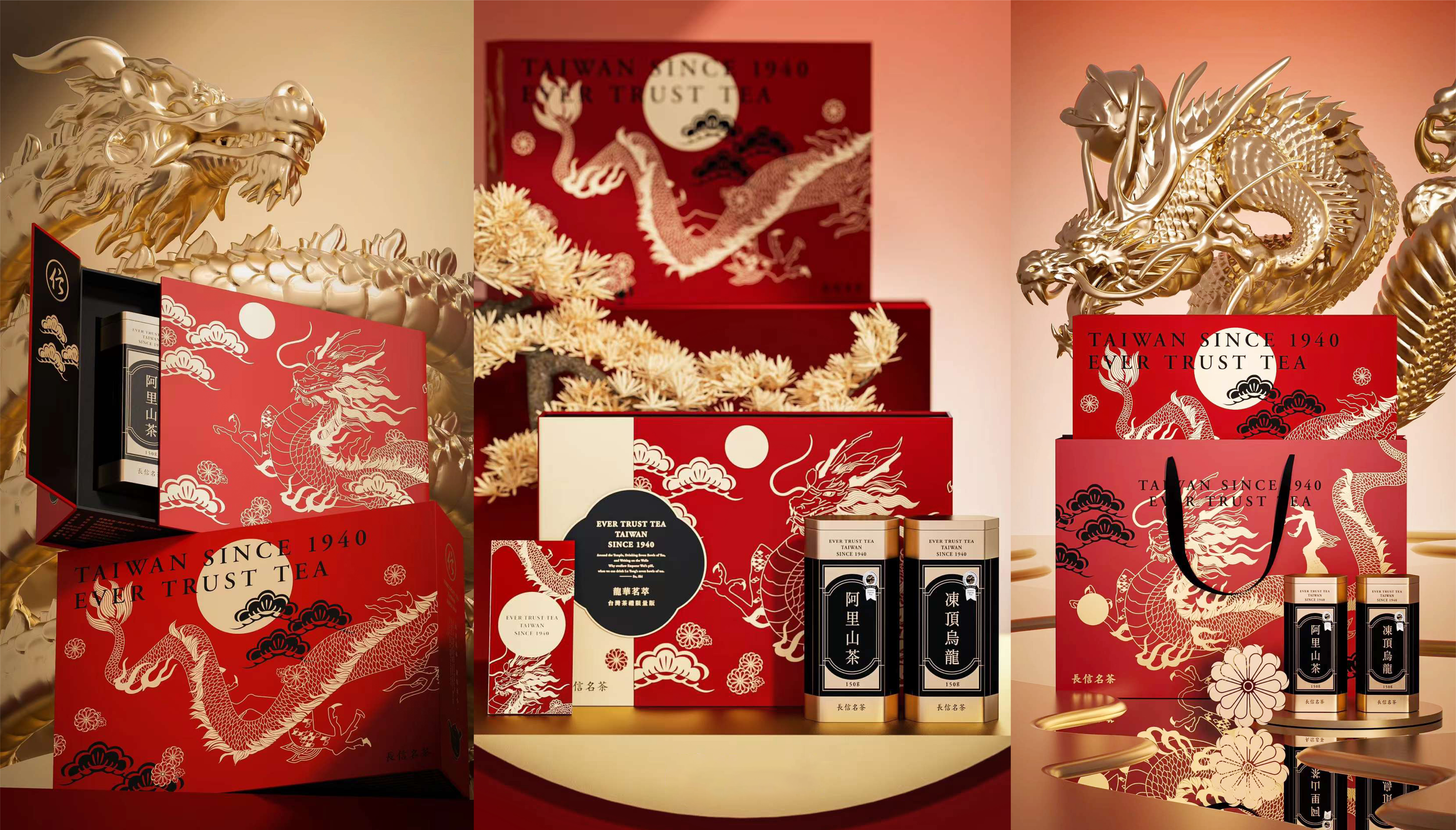
EVER TRUST TEA
NEW YEAR Tea
EASTERN LEGENDS: A NEW YEAR TRIBUTE
In Eastern tradition, tea is a medium of connection holding deep sentiments. To celebrate the New Year, we draw upon majestic mythical imagery to create a gift of unparalleled elegance.
Inspired by guardian beasts and auspicious symbols, this collection is a dialogue between history and the present. Featuring the majesty of 'Phoenix Welcoming Spring' and 'Dragon Splendor Tea', the vitality of 'Prosperous Tiger' and 'Galloping Horse', alongside 'Koi of Good Fortune' and the calligraphy of 'Great Fortune'. Each motif is carefully sculpted to convey exclusive blessings, elevating tea drinking into a warm connection of sincere sentiments.
We invite you to brew a pot of fine tea, letting the aroma unfold like a scroll. Amidst the rising steam, may you welcome a New Year filled with prosperity, harmony, and infinite possibility.


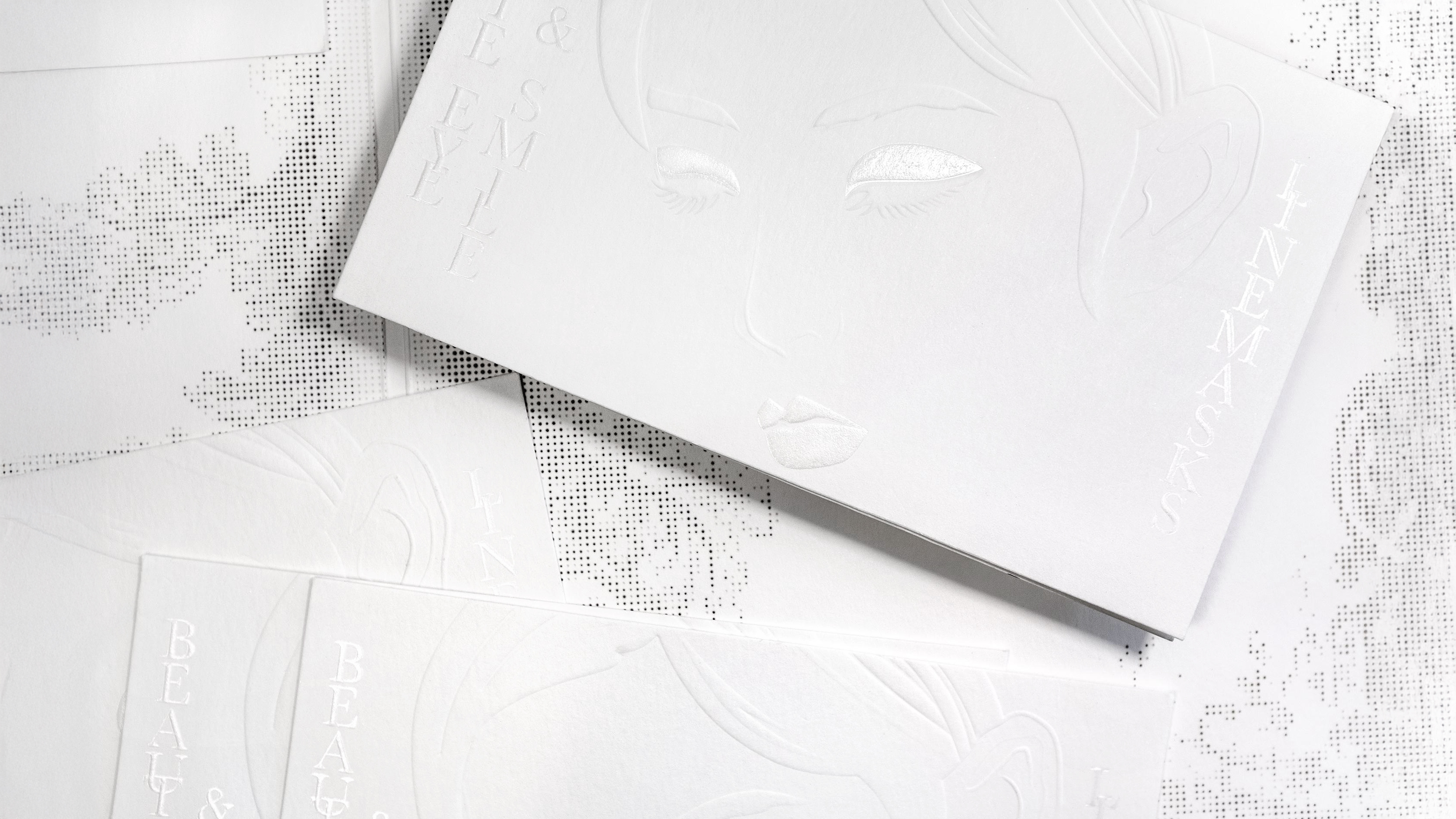
BEAUTE ON
BEAUTE EYE
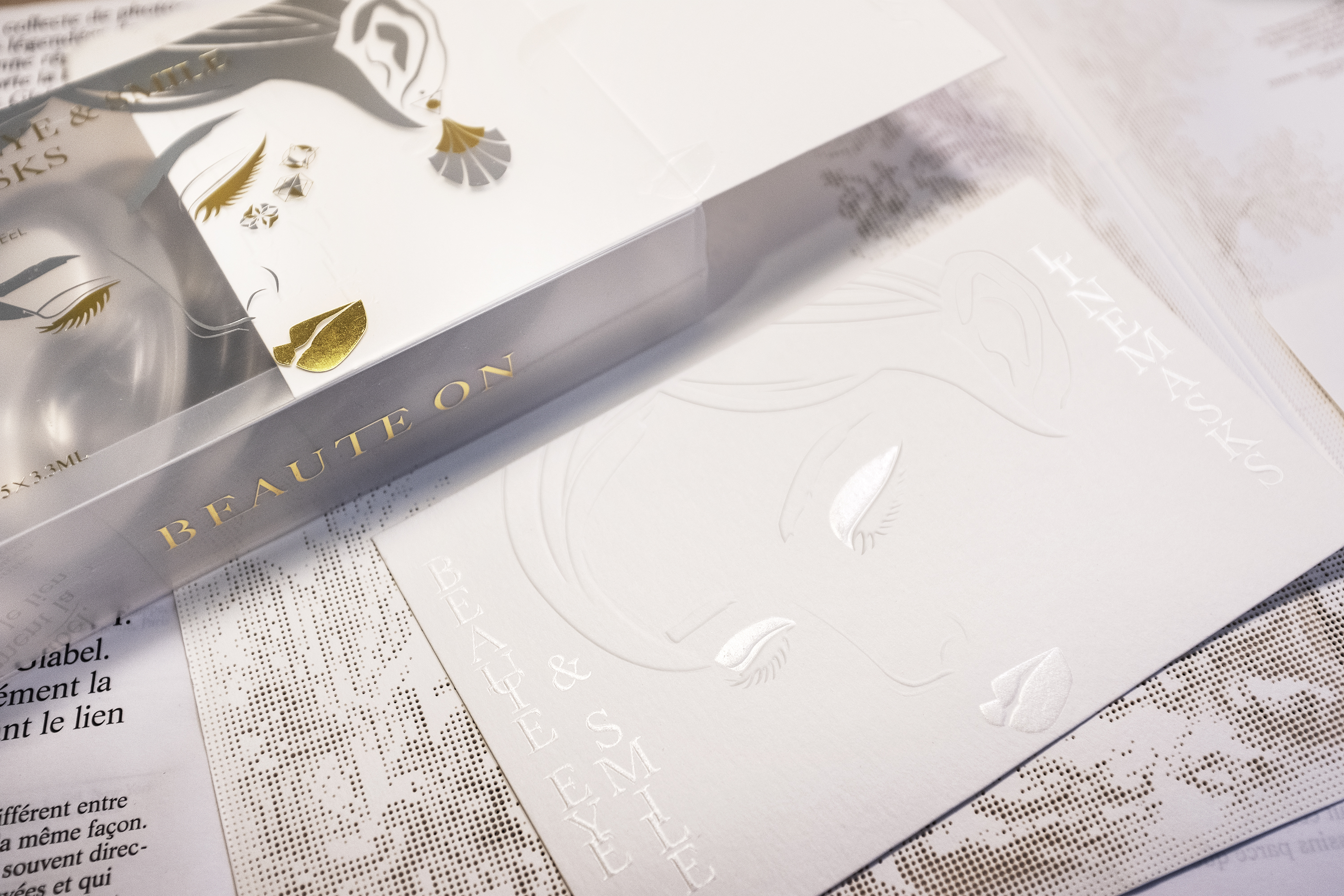
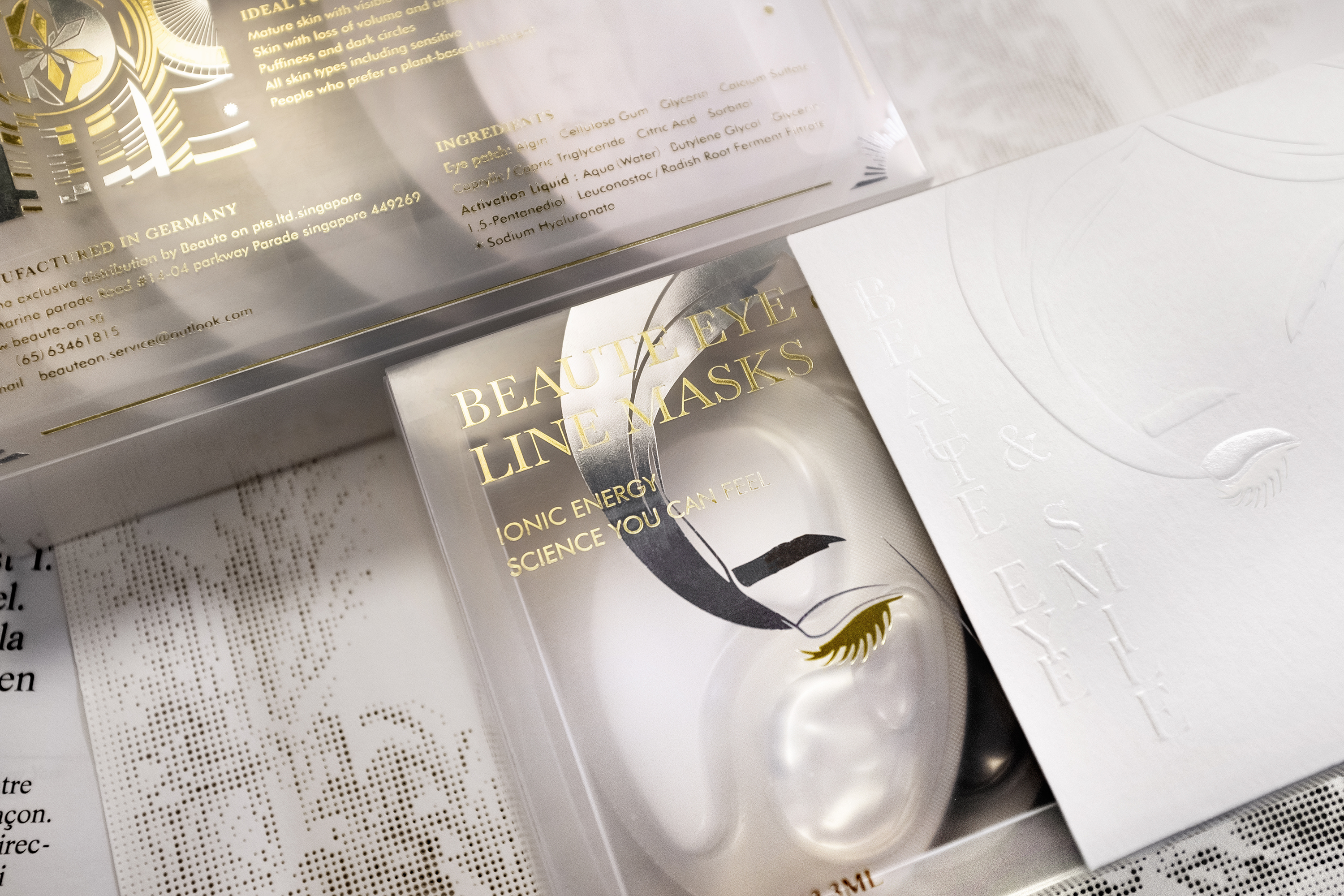
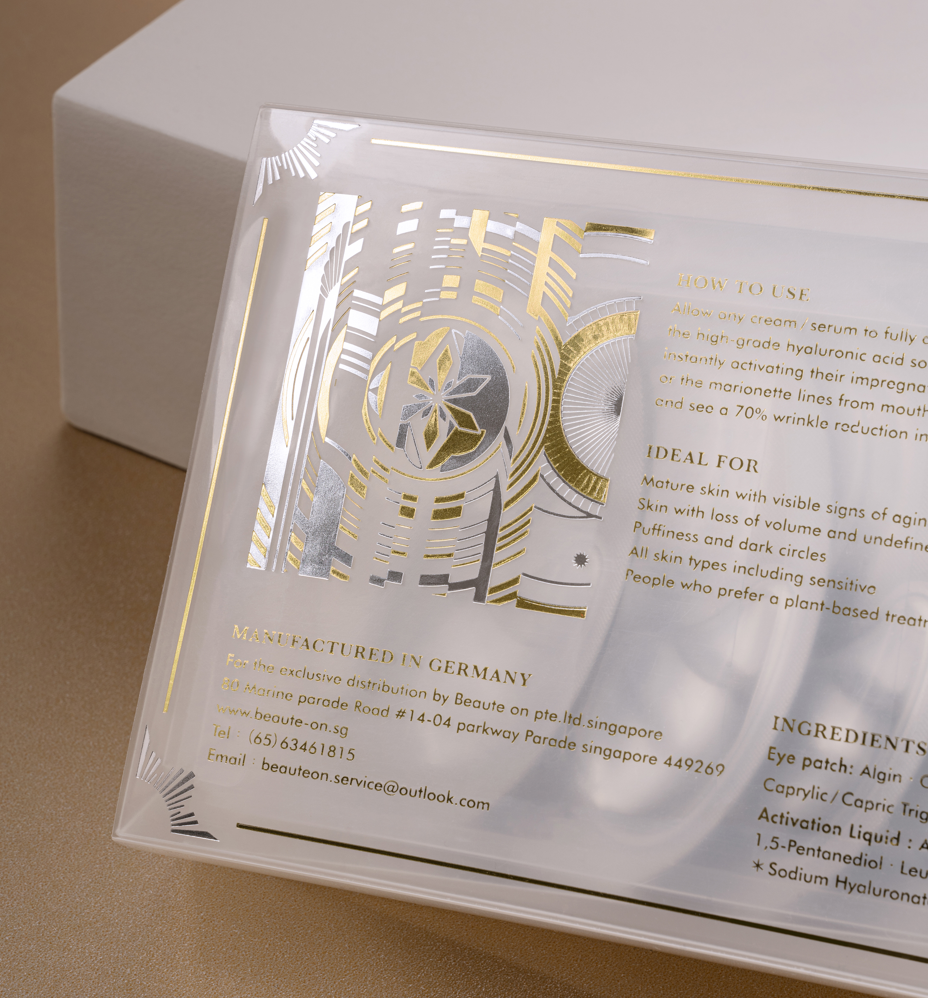
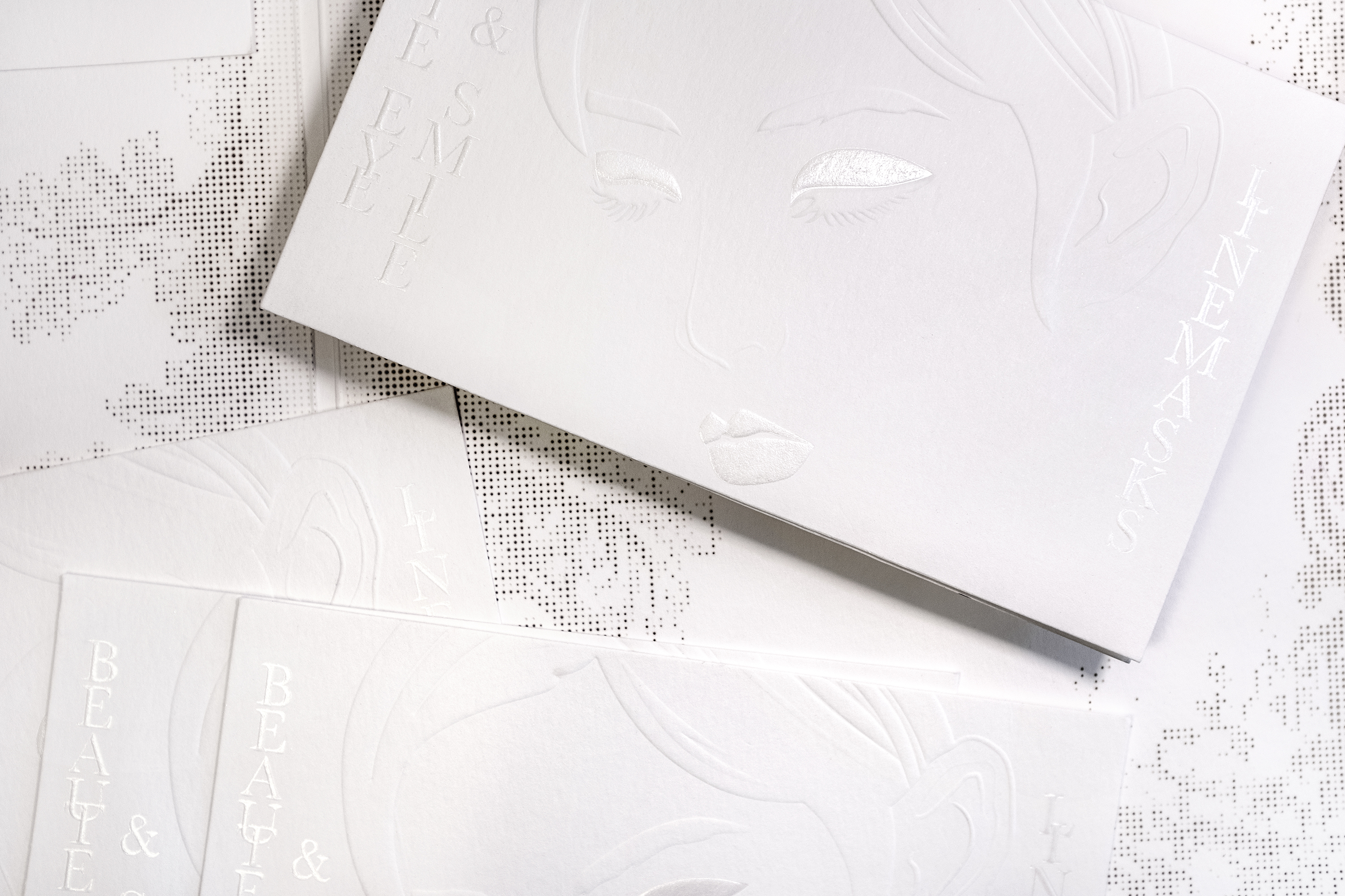
WATER AND REVERSE AGING
BEAUTE ON, Singapore's leading anti-aging care brand, is proud to launch “BEAUTE EYE & SMILE LINE MASK” a profoundly powerful dual-use eye and lip mask enriched with highly effective and soothing ingredients. The brand's new luxury packaging is made of composite materials and features a beautiful female face as the main visual. It carries the brand's spirit and the word "BEAUTE", which means beautiful, a beauty, and sublime in French. It also conveys information about the use and efficacy of the product in an easy-to-understand manner.
The box is made of translucent PP, which is a metaphor for water-like radiant skin through the translucent effect on the face and the texture through its reflective light. It also conveys the image of moisturizing and premium extracts contained within. Three symbols representing "beauty, technology and energy" are embellished below the eyes to convey the message of the product's use and efficacy. On the back, a flower blooming in the wheel of time represents the reversal of time and youthful rejuvenation. Through the precise structure and expressive visual effects, it epitomizes breaking of the shackles of time, and is a metaphor for the miracle of beauty brought about by the cutting-edge technology of the product.
☞ Premium Skincare Products
Mid-Autumn Festival Tea
On this day, no matter where you are, hearts meet under the guidance of the moon.
The bright moonlight gently illuminates the horizon when the night is nigh.
Day and night take turns, every autumn harvest season, under the bright night of the stars and moon.
On this day, no matter where you are, hearts meet under the guidance of the moon.
Combining textured gold and deep indigo paper with traditional gold foil stamping, the packaging recreates a shimmering night sky, transforming the moment of reunion into a tangible texture.
☞ A Record-Breaking Success:
After rebranding, we achieved over 10,000+ monthly retail sales and sold 20,000 units in a single livestream session.

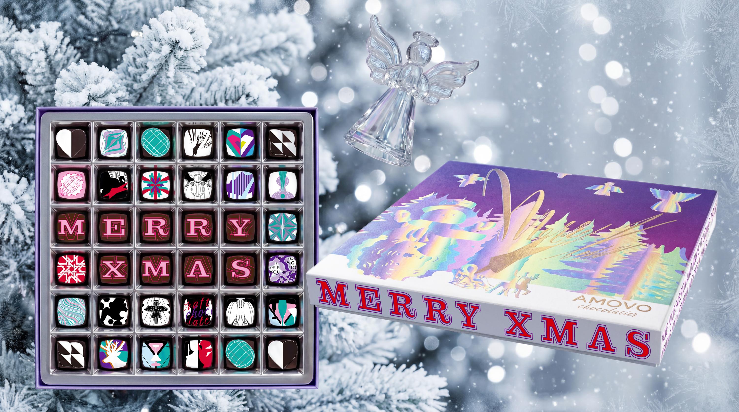
AMOVO
Xmas CHOCOLATE
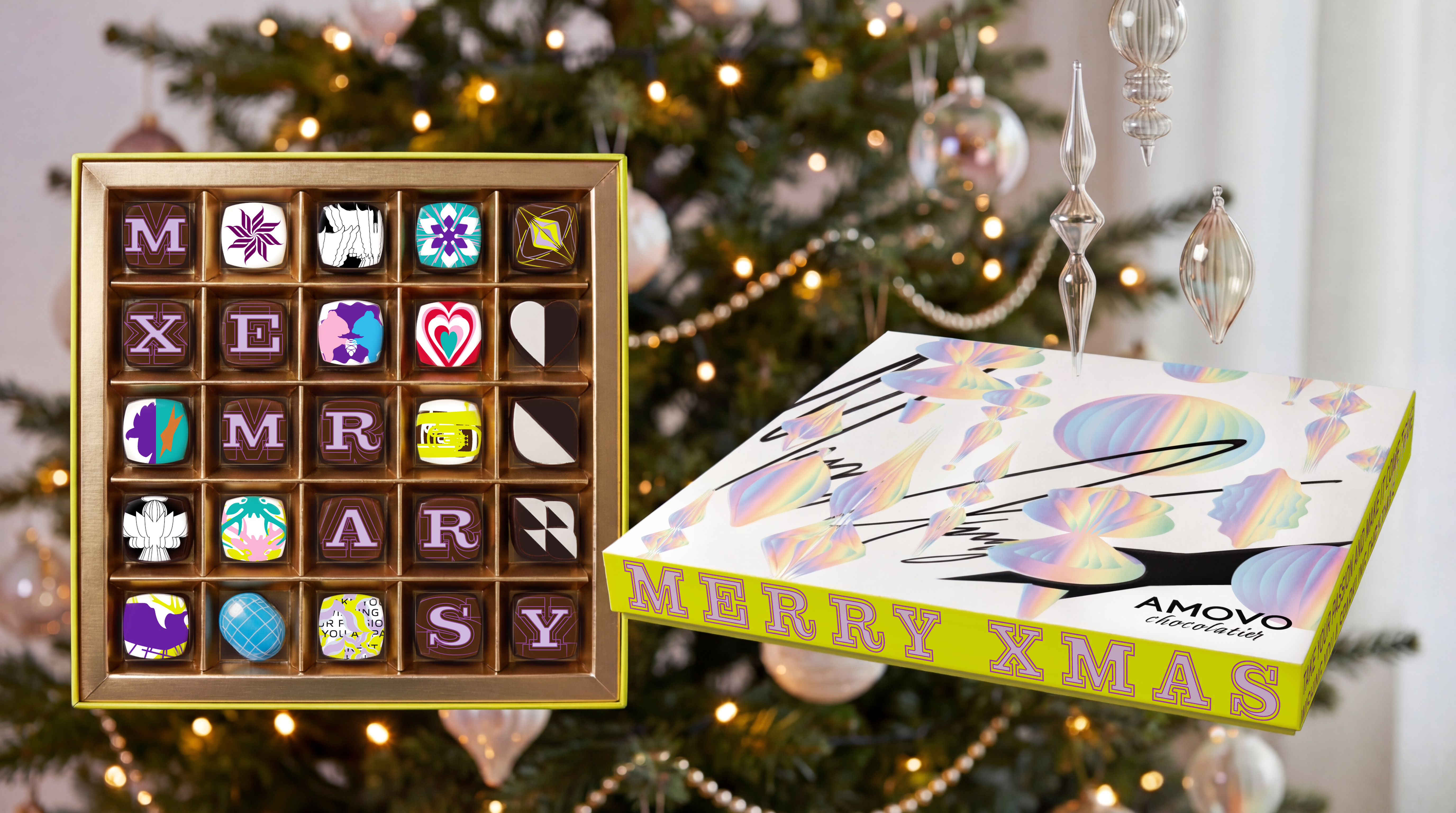


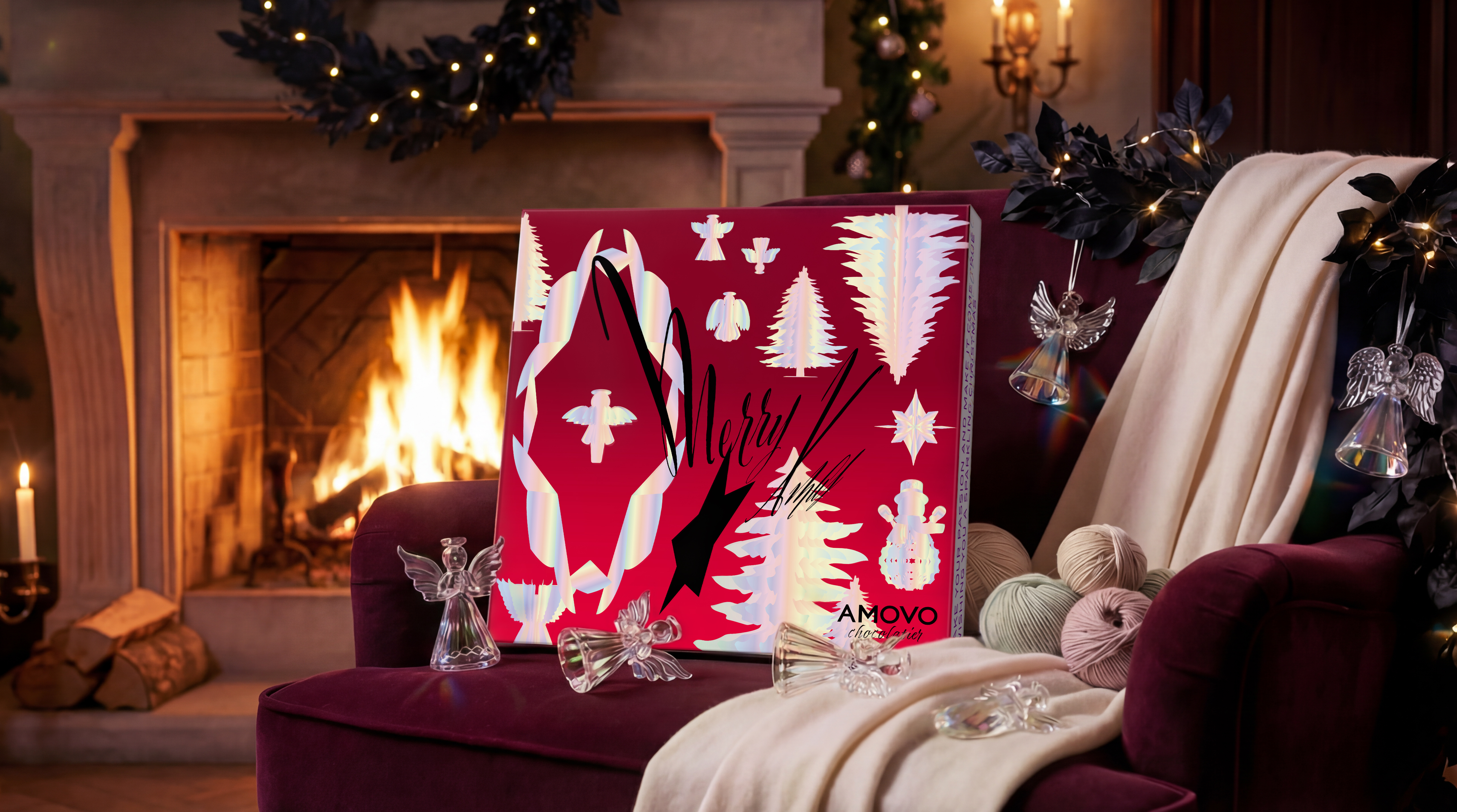
Wishing you a sparkling Christmas
A Winter Reverie Reflected in Light
This gift box serves as a prism of dreams, designed to bring consumers a Christmas full of passion and vivid fantasy. Through Holographic Spectrum technology, the packaging captures the elusive light of a snowy Christmas night, mimicking the dancing aurora that shifts with every angle.
The color palette weaves a festive narrative: Midnight Purple heralds the mystery of Christmas Eve; Celebration Red embodies the passion of the feast; and Classic Green represents the eternity of tradition. These colors intertwine within the iridescent light, creating a rich and layered festival atmosphere.
The body features a 30x30 cm grand thin box, housing 25-36 gem-like chocolates printed with Christmas imagery. Their rhythmic arrangement perfectly fuses modern geometric aesthetics with classical festive warmth, creating a melodic visual rhythm. It is not just a collection of colors, but a bold visual symphony dedicated to dreamers.
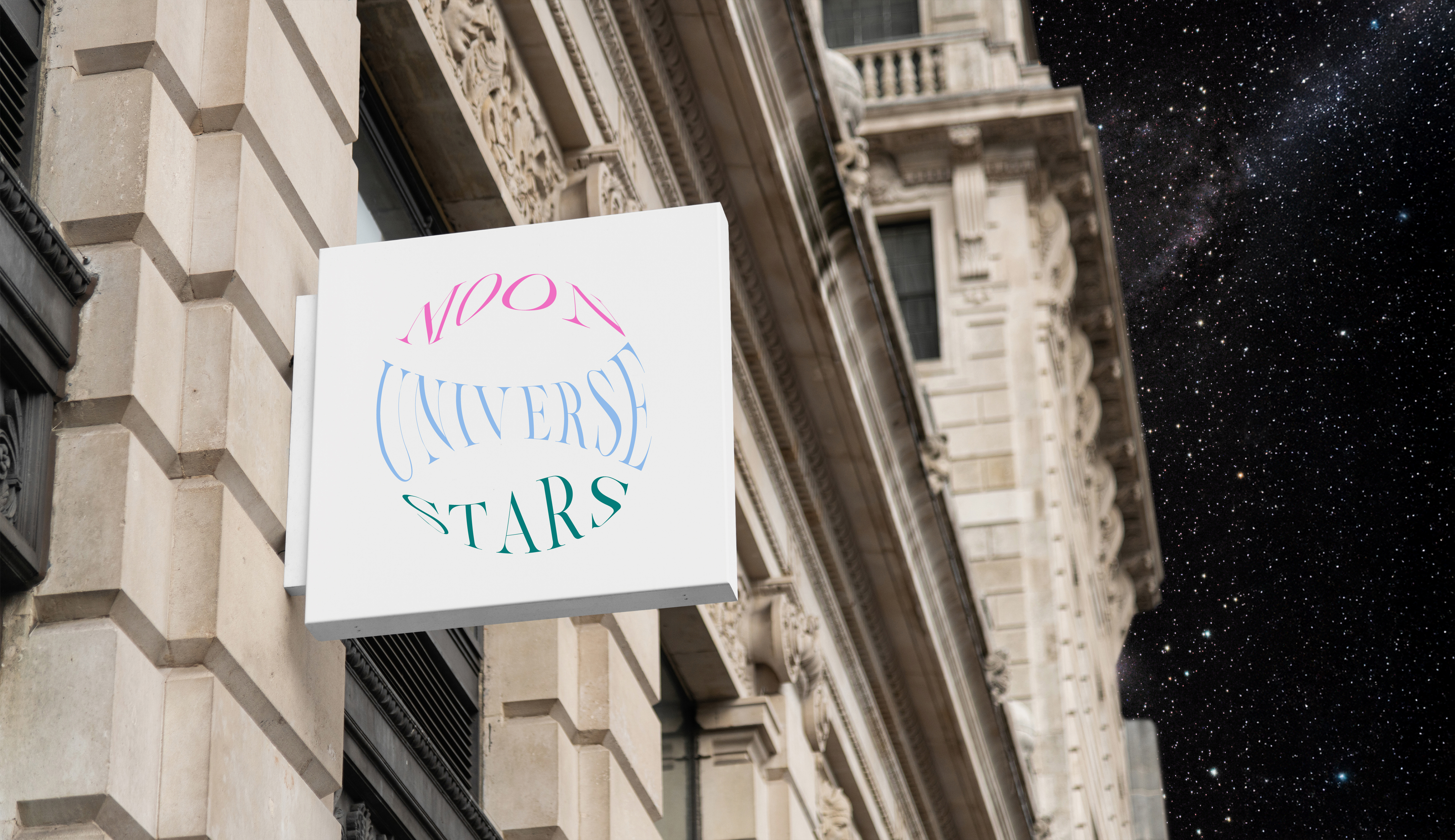
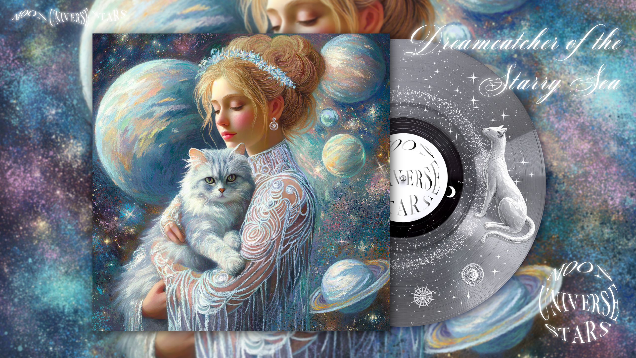
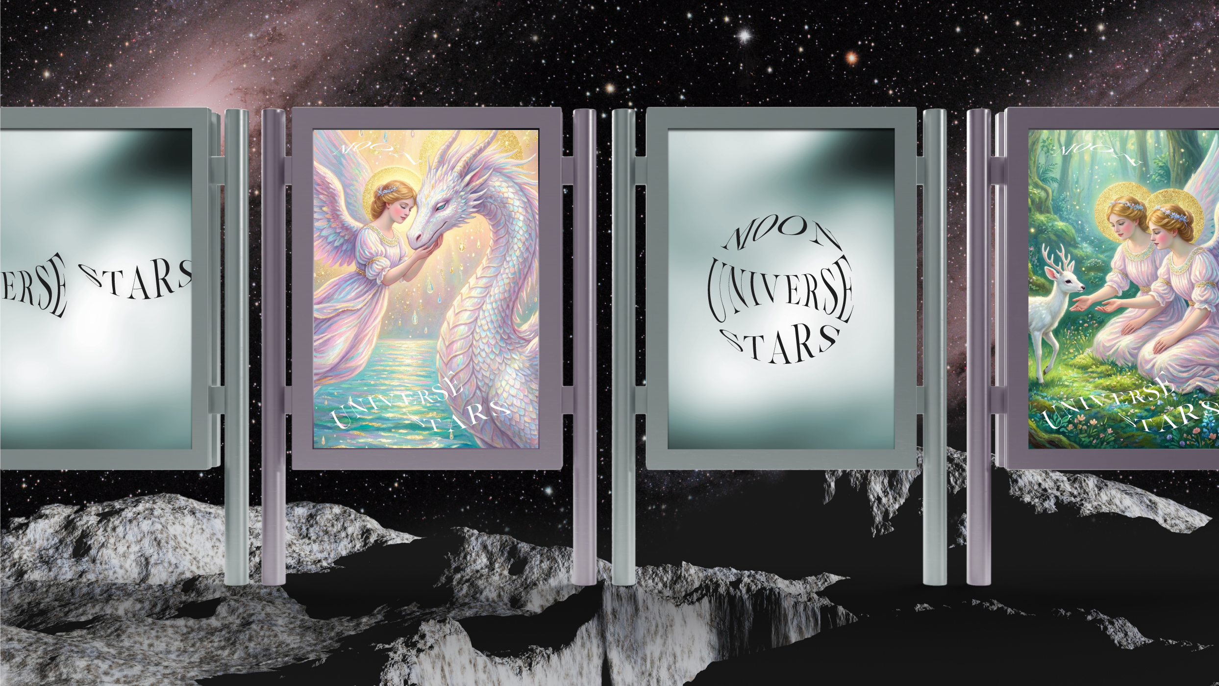
M-U-S MoonUniverseStars
Future Soul Art & Music Gallery
Here, art is the language of the soul, healing is the ink, and music is the poetry of the spirit.
Healing × Poetic × Future Inspiration
Inspired by "the serenity of the moon, the vastness of the universe, and the brilliance of the stars," we weave poetry, sound, and art into a healing journey for the senses and the soul.
Our frequencies focus on:
Immersive healing music ─ A gentle companion for the late night and a grounding focus for the day.
Meditation • Relaxation • Inner peace ─ Stabilizing frequencies to release daily stress.
Poetic artistic inspiration ─ An artistic feast blending impressionism with fantasy visual poetry.
Every melody is a story, and a journey of the heart.
BRAND IDENTITY
LOGO VI Design
Holistic Brand Design & Strategy
BRAND IDENTITY/LOGO/VI/PACKAGE/WEBSITE
We translate business strategy into visual language that builds lasting brand equity.
15+ years of commercial strategy refined by artistic discipline.From the cultural depth of Eslite and the strategic precision of Tokyo to the global stage. Crafting distinct brand identities through sharp insight and refined execution.
☞ Works have been published in ‘Asia-Pacific Design’, ‘Design360°’, ‘BranD Magazine’, ‘Typography in Graphic Design’, ‘Color Appeal in Packaging’, ‘TIMA for TEA: Branding & Packaging Designs of Tea’, ‘Packaging of the World’, ‘Circle’ and other major magazines, design books, and domestic and international design websites.
☞ INDIGO Design Award Gold Winner for Graphic Design, IDA International Design Awards Silver Winner, Taipei Art Book Fair, FOODEX JAPAN, CIIE (China International Import Expo), Beautyworld Japan, China Xiamen International Tea Industry Fair, etc.